
Portrait of someone famous or yourself, no fictional characters. The size is 9 by 12 inches, horizontal or vertical. The illustration is full color, which as most of my students know means any color, in any combination or limitation.
So, to the meat of the matter …
I challenge you to create a portrait of this person without using a likeness. Can you show me who this person is without a likeness? So, you may or may not use their face. In any event the viewer, me, should learn something about the subject that is not common knowledge, or learn something new about the person more than the obvious. No singers with microphones! I further challenge you to use symbols and objects to create or suggest an essence of the subject and add to the understanding of the illustration.
The final presentation must include, the name of the subject, pertinent and relevant facts.
Along with the final art include your roughs and sketches. There is no deadline for roughs or sketches this time, but I encourage you to submit them for critique, as you would for an art director to review.
Finished art is due by the last day of class during finals week, or anytime before.
Live fast, draw hard.
Thursday, April 27, 2006


Thursday, April 06, 2006
Petite experiments.
I've been looking back over a lot of my work lately. Sometimes depressing sometimes invigorating.
Looking over work, you notice the little changes that mark tuning points in your illustration. Sometimes visible only to the artist or a tuned in art director. These petite experiments can appear small but may have large repercussions.
My experiments have been with collage. An effect that I have incorporated, using what I have learned in Photoshop. Also not being a bull headed neo-Luddite. Just kidding.
My in-house Art Director has been after me to experiment with collage for a while now, and recently suggested that I do so to bring in more texture. I admit I was reluctant, since to MY eyes, the airbrush work had plenty of nice texture as it was. But I thought better, and decided to experiment.
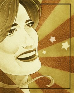
The first experiment was in the illustration of Bluegrass singer, Alicia Nugent. I brought in a texture, the embossed leather pattern, that was added specifically to focus and enhance the concept. The color was a "happy accident".
 In the illustration of singer Cassandra Wilson I wanted storm clouds and had planned to airbrush them. But I HATE my clouds, I'm never happy with them. So I decided to get good photo reference. The reference looked so good I thought, why not just place it over the tonal area. So I did. I had to actually use two masked layers to get the look I wanted.
Both uses of collage in each illustration were relatively small and insignificant…to most everyone but me, and my In-house Art Director. The petite experiments worked, I liked the results and the journey along the way. Definitely invigorating and fun.
I'm sure I'll do more petite experiments.
Live fast, draw hard.
Looking over work, you notice the little changes that mark tuning points in your illustration. Sometimes visible only to the artist or a tuned in art director. These petite experiments can appear small but may have large repercussions.
My experiments have been with collage. An effect that I have incorporated, using what I have learned in Photoshop. Also not being a bull headed neo-Luddite. Just kidding.
My in-house Art Director has been after me to experiment with collage for a while now, and recently suggested that I do so to bring in more texture. I admit I was reluctant, since to MY eyes, the airbrush work had plenty of nice texture as it was. But I thought better, and decided to experiment.
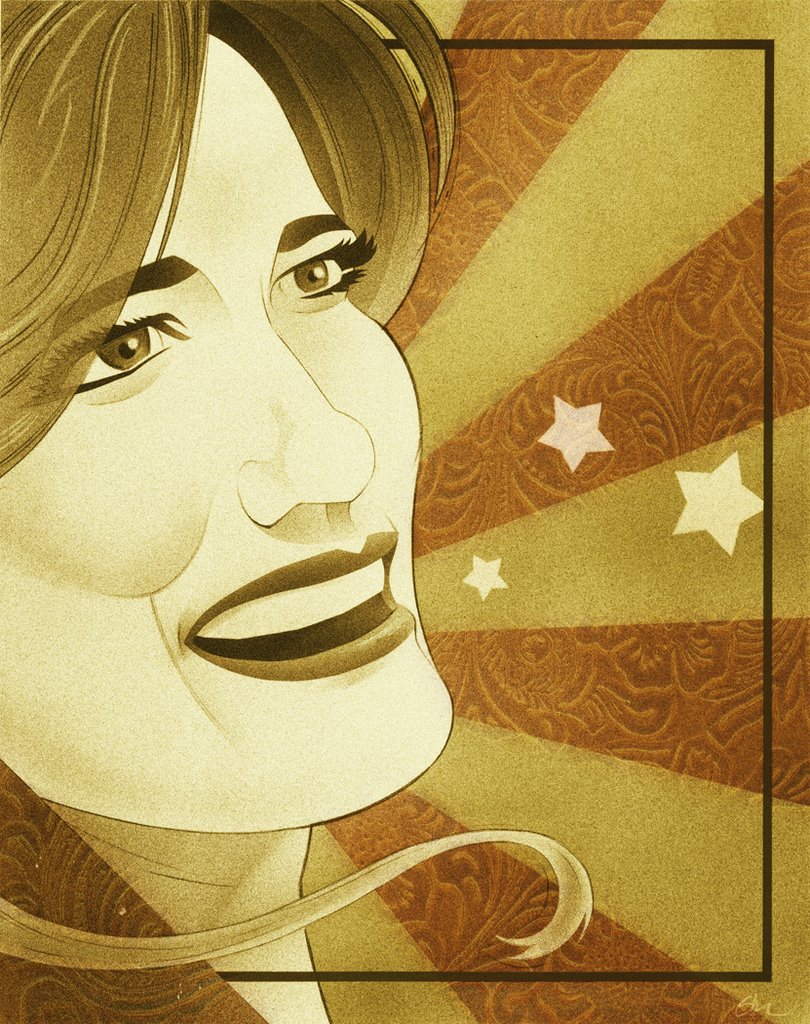
The first experiment was in the illustration of Bluegrass singer, Alicia Nugent. I brought in a texture, the embossed leather pattern, that was added specifically to focus and enhance the concept. The color was a "happy accident".
 In the illustration of singer Cassandra Wilson I wanted storm clouds and had planned to airbrush them. But I HATE my clouds, I'm never happy with them. So I decided to get good photo reference. The reference looked so good I thought, why not just place it over the tonal area. So I did. I had to actually use two masked layers to get the look I wanted.
Both uses of collage in each illustration were relatively small and insignificant…to most everyone but me, and my In-house Art Director. The petite experiments worked, I liked the results and the journey along the way. Definitely invigorating and fun.
I'm sure I'll do more petite experiments.
Live fast, draw hard.
Friday, February 10, 2006
The Rules of Art Direction
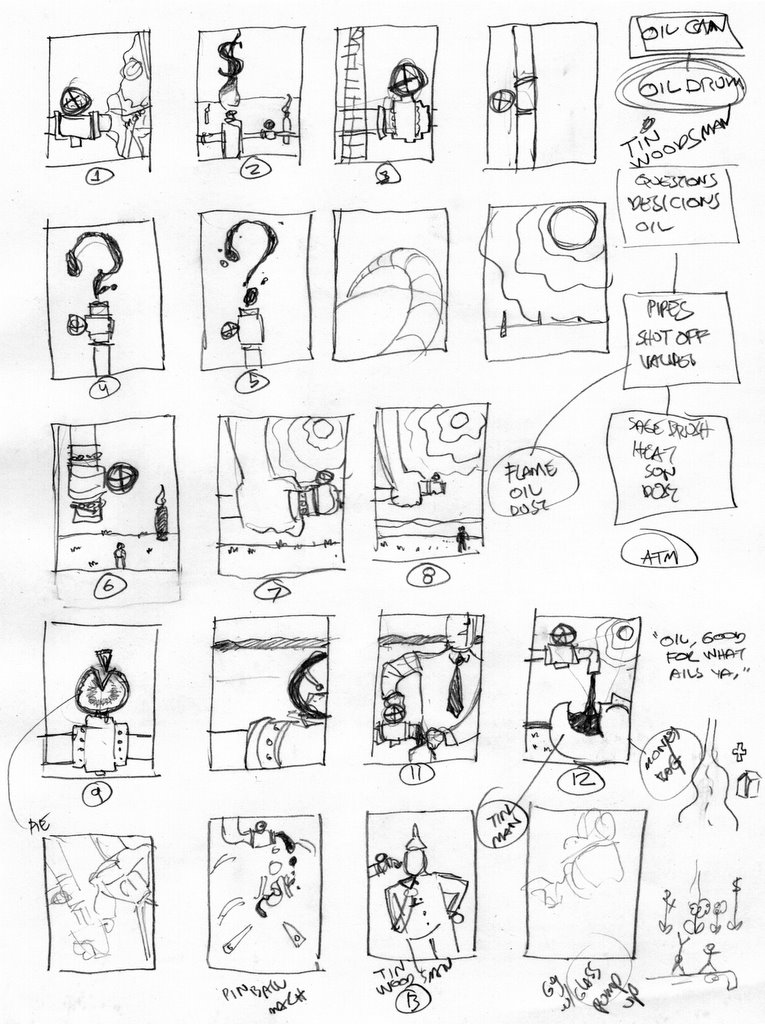
A while ago, when I started teaching Illustration, I realized that while some of my students wanted to become illustrators, others were planning on going into design. I also realized how at times younger art directors, and a few older, seemed at a loss as to how to direct art and work with illustrators. In school you’re taught to be an illustrator or designer, but not how to work with one another. So, I asked a few art directors I knew, who worked well with Illustrators, if they had any rules for art direction. What follows are their answers.
I plan to expand on this and collect as many rules as I can from other art directors and illustrators. If you have any comments about this post, or rules of your own, feel free to chime in.
The relationship between the art director and illustrator can make or break both the design and the illustration. It’s a living thing that holds the potential to create great work. It’s a part of the business that seems to get little attention in schools and in real life. I think we can change that.
Live fast, draw hard.
-----------------------------------------------------------
Florian Bachleda
Vibe Magazine
Well, a lot of it depends on who the illustrator is. In many ways I’ve always considered the AD/Illustrator relationship to be like that of the film director and actor. If you’re a good director, you tailor how you deal with the illustrator, depending on their talent, temperament and strengths. Overall the director should point where he or she wants to go and what solution needs to be solved, then leave the rest to the illustrator. Here’s point A and point B, take me there. If you don’t trust your Illustrator, you shouldn’t have picked them. This is assuming there is not an overbearing editor somewhere who can ruin the process entirely—no matter how good the AD and Illustrator are.
Half the battle is choosing the right Illustrator- and not always the most obvious- for the assignment. At New York Magazine, Bob always had us choose an illustrator that didn’t automatically come to mind. For example, we would have Steve Brodner do concept illos, and Sue Coe do likenesses. Again, The editor is the most important factor here—if they’re brave enough and trust their AD to work like this.
An illustrator should never, ever call up an art director and ask him or her for information such as the address of the magazine, the spelling of the art director’s name, who else is in the department, etc. Basically, any information the illustrator can get on their own from some basic research (picking up the magazine and looking at the masthead, address, etc,) It may sound snooty, but to me it says this illustrator is unprepared.
----------------------------------------
Katherine Topaz
Topaz Design
1. Don’t assume anything. Be clear. Use specific language, i.e. don’t say "Okay, you want it to look 'hip', " say, “Okay, when you say hip you mean like…”
2. Sometimes art directors have no clue what they want and they want you the illustrator to come up with something, but art directors usually have something in mind. Make sure you understand which is the case. If the art director wants you to come up with the concept, make sure that is clear what they are asking for, because obviously you are more vulnerable for the amount of alterations needed. If the art director knows what he wants, then, listen, ask questions, be clear and specific.
3. Art directors want to give criticism. Make them feel comfortable by not being defensive. The more the art director feels comfortable, the more the art director will give—which is good, because the more they talk, the more specific and clear they are, and the happier you are with the end result. The easier the process is, and the more comfortable the art directors are with the process the more they want to use you again—or recommend you.
4. Don’t assume art directors know all of your styles if you have multiple styles. Send samples. When art directors talk about “your style” make sure sure you know which “style” they are talking about. Many art directors think of illustrators as having one style, the one the art director is familiar with. Thusly they expect that style when they assign work. The art director might not assign other projects because he doesn't know the illustrator can do that style. On the other hand, the art director won’t assign a project because he knows the illustrator will try to “talk them into” their other style which the art director may not like.
5. Remember the art director is more aware than you of internal politics. For example: if the editor likes or hates illustrations. Sometimes this means the art director knows what types of illustrations can be used in order to get more in the future. Or what styles/elements/ colors set the owner/client off. See #1.
6. Don’t assume they don’t like your work because they haven’t used you. It might be a situation where they’re waiting and hoping, months (and yes, years) might go by. Make sure you continue to send samples and keep your contact number, email and address information current.
7. Do not bother them. Again, you have no clue what’s going on at their end. So contact them in non-threatening ways. E-mail is good. You can call, but be aware of their deadlines, press days, etc.
-------------------------------
Bob Newman,
Fortune
It’s funny, because my only philosophy is to call the right people, people I like and like working with, and give them as much freedom as possible. If there’s anything I can say that works best from my end is that an art director be as clear as possible about what’s wanted stylistically and content-wise. I try to give some direction in terms of the illustrator’s style, especially if they have multiple approaches (which many do). I also try to suggest they send a few sketches…I usually say, “Do your thing, send whatever you want for sketches, but also do something relatively straight-forward for the editor.” It’s great for me to get a few options, let the illustrator stretch out, but also have something safe. The other thing I try to do is let them know when the illustration really needs to fit the design of the page: it needs a background, it should be a silhouette, the size and shape really matters. And on the flip side, when the page is more free-form, I like to tell them, let me know what shape works best for you. I always try to think out trouble spots ahead of time, and really work hard to find an illustrator who is just perfect for the assignment.
I think it’s important to let illustrators know that they should be realistic about their talents and skills and who they approach for work. I see a lot of illustrator books that are sent to a magazine that would never publish work in their style. Also, a lot of illustrators rush out and show their book to people way too early, before they have skills and experience necessary to work for that magazine. The problem with this is that you may only get one chance to show or drop off your book somewhere, and it doesn’t help you if it’s not together. You’re better off hustling at smaller, less prestigious places where you might actually get work that can build up your book and your experience. Some tear sheets from The Village Voice or Guitar World are better than a rejection from Rolling Stone.
Art directors like to see illustrations with ideas, or style, or great caricatures. But most of all style. The most important thing for a young illustrator to work on are style, technique and ideas. The interesting thing is that all art directors have different approaches…some would rather see more style, others more ideas.
Nothing beats professionalism. Anyone who wants to get work as an illustrator needs the basics: email, message machine, fast reply to phone calls, fax, etc. From a practical point of view, it really helps to get gigs if you work digitally or can transmit your work digitally.
---------------------------------------
Jesse Marinoff Reyes,
Penguin USA
1) What can I say? First off, I don’t mean to state the obvious (but I will anyway), is that art directors (ADs) and future ADs should always be clear with their illustrators. Too often, there is a lack of clarity which generally implies that the illustrator should “do their thing” but this lack of clarity may not mean this. It may merely mean that the AD is not a good communicator (despite egotistical leanings to the contrary). It could also mean that the AD is unsure of what’s expected by his superiors (and editor, or a publisher—or in my case—an author and the author’s agent). Because time is finite, clarity in instruction can prevent unnecessary delays and prevent misunderstanding.
ANECDOTE: I know this because I have been put in a position a number of times in the past to second-guess another AD when an illustrator pal gets confused at the 11th hour, when they can't contact their art director.
2) ADs need to have an air of authority in their presentation to the illustrator. If the illustrator doesn’t believe this, the deadline can become jeopardized by a careless illustrator and an AD who is too distracted to notice until it is too late. The criteria in #1 is helpful in this, but I would also add that the AD knows how much finite time exists between the submittal of art and the time it takes to design around it in time to make the press deadline. Sometimes illustrators have some leeway (as in formatted magazine pages) to turn in work closer to the printing deadline, but again, this discretion is up to the art director and no one else. The illustrator has to understand that part of their being contracted to work has to do with their ability to get the job done on time.
ANECDOTE: An illustrator I knew of became too comfortable with the amount of time allotted for revision, and came to believe that art directors gave “fake” deadlines. The deadlines were certainly not “fake,” but the illustrator made the mistake of arrogantly taking the time for himself without permission (turning in the artwork later than scheduled). The illustrator’s livelihood depends upon the level of trust that the AD has in him. Without that trust, there is no relationship—and no work.
3) The AD needs to know “what’s going on” in the art and design and illustration world. If an AD wants to work with certain illustrators, he needs to learn about them (if possible). Their style, their body of work, their reputation. The annuals are a good place to start, but only as a point of departure. Sometimes the best illustrators are not the folks you find in award books. Does the AD’s body of work mean that to execute his particular vision at a particular workplace at a particular time mean that the AD needs to suss out his own brand of illustrator? Maybe he only wants to work with underground cartoonists, or classically-trained illustrator-painters. Maybe the one category was great for that AD's philosophy for the first 5–8 years
of his career, but the next job demanded a different vision and he had to become familiar with the latter style and it’s adherents. Maybe it’s good to be AWARE period. Knowing what other art directors are doing is also helpful, but it can lead to “Flavor of the Month” syndrome—where everyone seems to be working with a particular guy all at the same time. Is this because that illustrator is “hot” ( I really hate that) or really because “everyone else is using him.” But does any of that mean the illustrator is any good or not? Gee whatever became of “so-and-so…”
ANECDOTE: This is especially useful in determining which illustrators are suited to a particular job. Or how illustrator “A” should be handled versus illustrator “B” on the same kind of job. For example, some illustrators are great conceptually. Some have superb design skills within an illustration context. Others have great style and technique, yet don’t want to have to think beyond a certain point whereas others thrive on the “stretching. Glenn Hilario is a good “stretcher.” He can place himself into a design context. Scott McDougall prefers to be told what he needs to do and what he’s being fit into. It’s not that the one is superior to the other (sometimes you want somebody who just wants to take direction; sometimes you need all the help you can get), it’s just that knowing these differences can help in a particular context, solving a particular problem or set of problems.
4) It’s helped in my case that I’d spent time as an illustrator during my career. This is not an absolute requirement to be a good art director, but it helped in my case. I kinda knew if someone was begging for more time because he really needed it—or because he’d blown off the deadline until it was too late. At times former-sometime-illustrators can tend to impose their personal style preferences on an illustrator (I’ve seen this), in other words, use the illustrator as a “wrist.” I’d caution any future ADs with illustration backgrounds to have more respect for the actual talent doing the actual work. Let that background help the AD/illustrator relationship—not hinder it.
5) Be AWARE. Not as in criteria #3 per se with illustrators and their work, but culturally, socially, politically, historically. Read. Know about things. Being a cypher is fine, but it can only take you so far in problem solving.
Let the illustrator BE who they are. What does this mean? part of the AD process is picking certain talent to solve certain problems. For example, if a collage artist is selected, it should be because of that artist’s ability to create an arresting image through collage—but some bad AD’s or “others” in the food chain will use that as an excuse to force the collagist to find
every element of the story and cram it into the image (I’ve been in this unfortunate situation as an illustrator). Understanding that certain illustrators and/or certain styles are desired to solve a problem, it’s in the best interests of everyone concerned that the AD be sure about this approach—and then let the talent thrive in the situation. Knowing that Steve Cerio is great with counterculture imagery helps in just turning over those kinds of assignments to him, and letting him “do his thing.” This, of course, has a lot to do with criteria #1 above (clarity), but when you are sure of this then the process can become sublime. Contrarily, if you hire a Gary Panter to render an assignment better suited to Bernie Fuchs, then the result (and the political fallout) will not be pleasant for anyone concerned—and because the AD should’ve known better (and didn’t act or think), the relationship is soured. Sometimes this is because the AD is too embarrassed to contact the illustrator again after a bad experience, even if it’s not the “fault” of the illustrator.
Tuesday, January 31, 2006
"Blade of the Immortal" pin-up part two
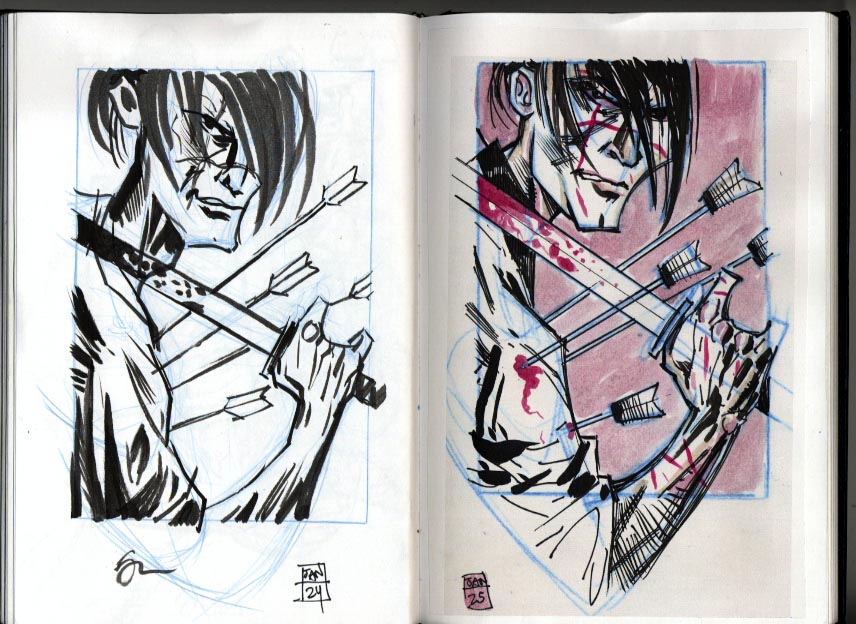
I didn’t mention that the arrows make a connection between Manji and Saint Sebastian because after reading “Blade of the Immortal” I felt there was a lot of suffering and sacrifice that Manji does as penance for his earlier actions.
In any event, these are my quick ink sketches. I have yet to use any reference other that what I did to get the basic pose.
Next I will post the underdrawing which is much more referenced.
Tuesday, January 24, 2006
"Blade of the Immortal" pin-up illustration
My wife thought I’d be drawing scantily clad ladies when I mentioned I was doing a pin-up. Previously, I did this one for “Super Real” a comic book by Jason Martin. 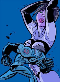
These are my first steps to a pin-up for the manga, “Blade of The Immortal” by Hiroaki Samura and published by Dark Horse. Philip Simone, the editor, said I could do whatever I wanted. Hmmm… After reading a stack of the manga reprints I chose to go with the main character, Manji. Snatched up some samurai and Toshiro Mifune images and was off to the drawing board.
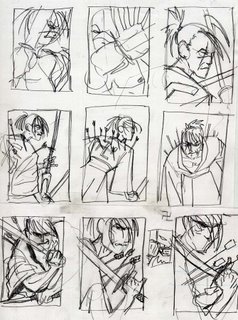
I liked the idea of Manji with arrows sticking out of him, like Saint Sebastian. However my initial roughs lacked the intensity I wanted. So, an angle change, tighter cropping and three roughs later, I had what I wanted.
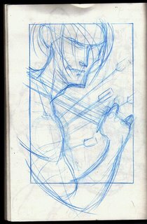 I tried redrawing (always tricky) the rough to scale in my sketchbook but it missed the flow of the rough.
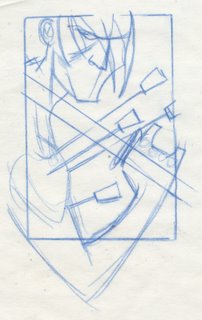 So I used my scale-o-graph to crop the rough to the correct scale and traced over it. From here, I will get needed photo reference and do a tighhter pencil sketch. However as a side step, before I get reference, I’ll pencil and ink the new rough to get a clear idea of where I want this illustration to go. All the while seeing how fast I can do this.

These are my first steps to a pin-up for the manga, “Blade of The Immortal” by Hiroaki Samura and published by Dark Horse. Philip Simone, the editor, said I could do whatever I wanted. Hmmm… After reading a stack of the manga reprints I chose to go with the main character, Manji. Snatched up some samurai and Toshiro Mifune images and was off to the drawing board.

I liked the idea of Manji with arrows sticking out of him, like Saint Sebastian. However my initial roughs lacked the intensity I wanted. So, an angle change, tighter cropping and three roughs later, I had what I wanted.
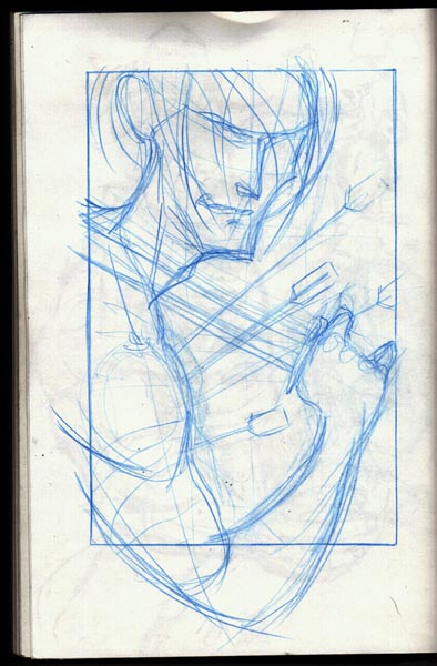 I tried redrawing (always tricky) the rough to scale in my sketchbook but it missed the flow of the rough.
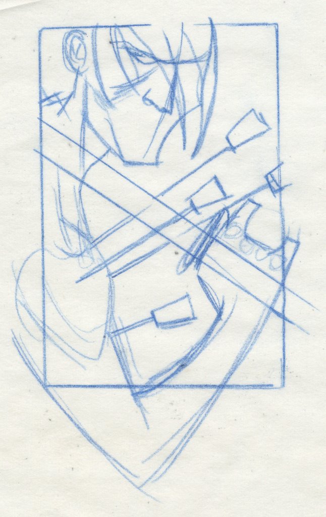 So I used my scale-o-graph to crop the rough to the correct scale and traced over it. From here, I will get needed photo reference and do a tighhter pencil sketch. However as a side step, before I get reference, I’ll pencil and ink the new rough to get a clear idea of where I want this illustration to go. All the while seeing how fast I can do this.
Tuesday, December 27, 2005
My drawing table

Since before the time of Rockwell the camera has been a tentative partner and tool to the illustrator. This Christmas my wife and I bought a digital camera. Not that we have never had a camera before, but film was to involved for us. Ho the digital camera! Shoot it, love it, keep it. Shoot it, hate it, delete it! This is my drawing table top, uncovered and set up for inking. I write most of what I need to do on half size yellow pads, yes I love the Rotring sketch pens and Ticonderoga pencils.
The blue line drawing in the right is a copy of what I was inking. I currently listen to my iPod while drawing since my radio done gone busted.
The batarang is from the Limited Edition Batman Action figure that stands next to it’s Superman counterpart and a Green Lantern action Figure (Hal Jordan) and a Bob’s Big Boy.
This is just a rough description of the area used for conventional art that I call the cockpit.
Illustration roads not taken: Beth Orton
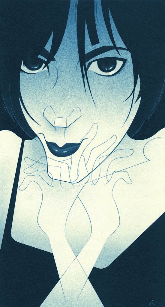
There are a lot of times that, when the illustration is finished, you look at it and think of the things you should have done, could have done and wonder, “Did I do the right thing?” Even when you feel you have, there can be a bit of second guessing. Most artists and illustrators that are, in my opinion, critical of their own work and REALLY take stock of what they are doing, go through these feelings.
This illustration of Beth Orton was for No Depression Magazine. After some research, the concept for the illustration , done in my favorite limited color airbrush style, sprang almost fully formed into my head. The only part I wasn’t sure about was the hands, so I sketched them as a quick overlay on tracing paper. When I saw the hands as outlines over the face, ghostlike, there but not there, I though that was a nice way to show how Orton is somewhat shy, but still opinionated, strong and putting her powerful music in front of a lot of people.
So there it was, the dark dress, the close crop, pale skin with dark eyes. Somewhat mysterious, sexy with wispy ghostlike hands! Cool.
I finished the illustration without a hitch, adding the delicate line work being very careful to not do what I normally do and get heavy.
When I was done, my wife commented that I had lost some ethereal elegant quality that was in the sketch. This is always a a worry in illustration. I That in planning and preparing each stage, some spontaneous, wonderful element will be lost going from one step to the next.
I did some slight reworking to the final after a long bought of soul searching.
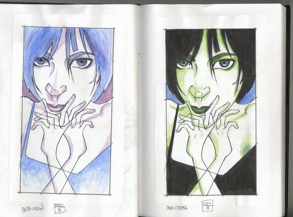 Then on good advice, I made two copies of the sketch and finished each differently, keeping in mind the felling and concept that drove the illustration in the first place. The result? Some not bad work, two pages done in my sketchbook, possible alternatives in style, and a glimpse at illustration alternatives that may come fully to life in another illustration.
Monday, November 07, 2005
Star Sisterz card illustrations


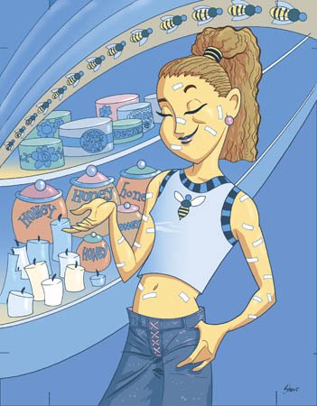

In the LeeAnn Womack post I talked about Star Sisterz so I thought I would show some of them.
Star Sisterz is a collectable charm/card game. Each card describes an activity or task the the player has to complete to receive points or a charm. I’ve worked on three card sets. A total of 54 illustrations targeted for tween-age girls. When I started, the ideal image was Lizzie McGuire.
Illustrators were carefully chosen so their skill set matched up with the card description. I was given some of the more difficult compositions based on the required image. Each card assignment came with a small brief outlining the activity/task to be shown, color scheme, and a general guideline to keep the racial mix balanced, and the clothing not too street. The legal department of Hasbro really did their job on these.
On the first set I did detailed thumbnails, then two increasingly detailed sets of sketches with color notes.
On the second set, after thumbnails, I did one round of sketches and printed them from my computer in a non-repro blue on Bristol board and went right to ink line. The third set was done the same way. All the coloring was done digitally. After getting a nice mix of characters on the first set, I gave all the characters names and reused them for the following two. So all of my card sets feature the same girls. My goal was to have recurring characters that the players would recognize and identify with.
What I enjoyed about this project was that after all the requirements were met for showing the activity , I could concentrate on the details of the characters. Clothes, hair, accessories, posture. I could get into developing the background characters also (mostly boys and adults) to flesh out the scene and ad some real life to the card. All that in a 2inch square space. It doesn’t seem like a big illustrative challenge. But the beauty of being an illustrator is that you can create your own challenge within the assignment. You don’t HAVE to do it, you GET to do it.
Illustration Flavor Mixing: Lee Ann Womack

Most of the time, thematically, assignments alternate from serious to humorous, line to color, caricature to conceptual, back and forth, forth and back.
I had been mired in pink and purple for weeks, doing 22 card illustrations for Star Sisterz, a tween-age girls game. I was ready to switch things up, when No Depression Editor, Grant Alden, called with this assignment, an illustration of Lee Ann Womack. Her music is an easy listening style of almost retro 1970 Country that is light and kind of pop, but very well written and produced. Doing the necessary research, I found her to be friendly, courteous and girlish. Just the kind of traits that I had been putting into the illustrations for Star Sisterz. That’s how the peanut butter hit the chocolate.
Peanut butter flava’.
I did the initial concepts, sketches and airbrushed art just as I like to do, in black and white. I kept me eye on getting the right values and a strong composition with a good use of white space for a lighter feeling overall and a higher key value scale. I had just done a Dolly Parton illustration that was similar in feeling but way darker in value scale.
Chocolaty goodness.
Digitally, I stole the colors from my previous assignment, Star Sisterz, and began to build from there. I added a bit of noise in the background while keeping in mind that this had to have a light frothy bright happy pop, kind of 1970s feeling. By the way, whenever I think of 70’s pop image, I see things surrounded by the Mike Douglas Show set, that explains the flowers, which I did use on the tween-age girl game. It’s not pink and purple. I tried to make Lee Ann more of a butter-honey color, with the bright spot of color being her eyes, which are actually that blue!
Illustrators experiment during down time as a way of bringing new things to their next assignment. That’s is cool, but you don’t have to wait for down time. You can bring what you know or have learned from the previous illustration right along into the next, creating a great new tasty piece of eye candy.
Monday, October 31, 2005
Illustration out of context: Bennifer

I did this while working on the Secret Central website. I was doing still art, animation backgrounds and Flash assets, then got into designing characters that were not part of the line of dolls. After getting the style down, the evil crept in and as a lark I did this piece to send the team.
Always, the style and context of an illustration play a large role in how we read/understand the illustration. Put in another context, a certain style brings a whole new meaning to the illustration.
By the way, the deal with the word balloons was a contest to see who could come up with the best lines for Ben and J-Lo. Feel free to post your own dialog…now that they are splitsville..
Tuesday, October 04, 2005
Illustrating Homage; Ghetto Pulp Fiction

From time to time I have been asked to illustrate certain things, in certain style. Art director's ask because they know I love research, have an extensive library on the history of illustration, and do pretty good impersonations. However there are a few pitfalls with doing this. One, you can loose sense of your art and what you have to offer in the illustration. Two, the possibility of copyright infringement. Three, you may only get work as a "Wrist." Four, you run the risk of recreating mistakes and thus taking on the responsibility for them. And five, you may have big shoes to fill and not measure up.
Taking that all into account, it can still be fun, not to mention educational, to play in the styles of other illustrators from time to time. As part of a feature in Black Issues Book Review, art director Warren Bernard commissioned headline type illustrations for two articles. To start all he wanted was something like the old Blacksploitation movie poster type, our point of reference was "Super Fly", cue the Curtis Mayfield theme. I have a book, or two, in my library on Blacksploitation movies, that reproduce the "Super Fly" poster. After a quick letter count, I wanted to see just how close to the original type I could get.
I began with a lot of sketching on tracing paper, and some correcting of letterforms. I wanted to correct any mistakes that may have been in the original type, and avoid my type looking like it was traced. After I had a sketch I liked, I gave the concept some closer examination. I knew that I thought it was a good idea to use the "Super Fly" type verbatim, but did Warren and, most importantly, would the reader. Was this a strong, valid concept, or an inside joke that no one else would get. Warren loved it. We both thought the homage brought with it a feel for the period and put the reader in a mind set that was right for the article. I'm sure the original type was done by hand, and since I was doing this digitally, and suck at doing type by hand, the accuracy of the computer was a big asset. I was able to check and double check the letterforms, and match the colors exactly. Illustrator made doing the outline strokes and smooth curves a breeze.
The client was happy, and I think this worked out well. The concept was strong enough to support the homage. I was able to use my tools to avoid mistakes. Careful craftsmanship makes the work look fresh and considered, not rushed and traced. The strength of the illustration lies in the concept, something that I would be proud to show and claim “ I did this”, it’s not “Wrist” work. A solid editorial piece that makes it’s own statement, not just a rip-off. Lastly, I learned a little about illustrating type, and a lot about what I love in illustration.
Monday, September 26, 2005
Convetional to digital
When I tell people what I do for a living, after the blank stares, and a brief explanation, they then ask me if I use a computer to do my art. "Is it all on computer?" Well, most everthing starts out on paper for me. I can draw faster, stay on concept and not get caught up in all the nifty things I can do with the computer/Wacom tablet. This is an example of the move from convetional to digital.
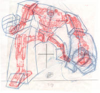
This is the sketch for the TRANSFOMERS skeleton, or chassis, done for the Robot Builder part of the toy's website. After spending a few hours scouring for the right scrap (photos of car chassis, engine bits, wheels struts and shock absorbers), I sat down at my drawing table and got busy! I was free to just kind of throw things down and create a really dynamic drawing with suggestions of things to be. I knew, after I scanned the image, it would be easy to clean up and fine tune, or machine things quite a bit, working from the same scrap photos. The red lines and the blue lines were done on separate sheets of tracing paper then overlayed. Why draw the lines in two colors, 'cause it looks cool! Then it's of to the clean, digital side of the basement.
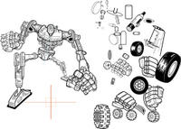
This is the vector art. I used this Chassis as a register mark for all the TRANSFORMERS I created. The bits off to the side are robot parts that were used more than once. I just put them aside to grab when needed. (The most challeging bit to do was the Jeep tire). Somethng like this Chassis is much easier to finish on the computer, but the life and spark of it started on paper. I used a lot of neat tricks digitally to get the lines I wanted, creating brushes and expanding apperances. The Chassis wasn't used as intended, but the concept shows up as the selector icon on the left.
Yeah, super deal, I created 14 TRANSFORMERS from scatch! My art director, was great, backed me up and let me go. The parts are all at the website.click on Robot Builder. The sounds are a lot of fun also.

I normally don't like to draw cars, or machines. However working first loose on paper, playing with the pose, feeling, and concept makes the process fun and energetic. The computer makes keeping things even and machined, doing curves and angles much easier. The whole process can be enjoyable, using the right tool for the right job.
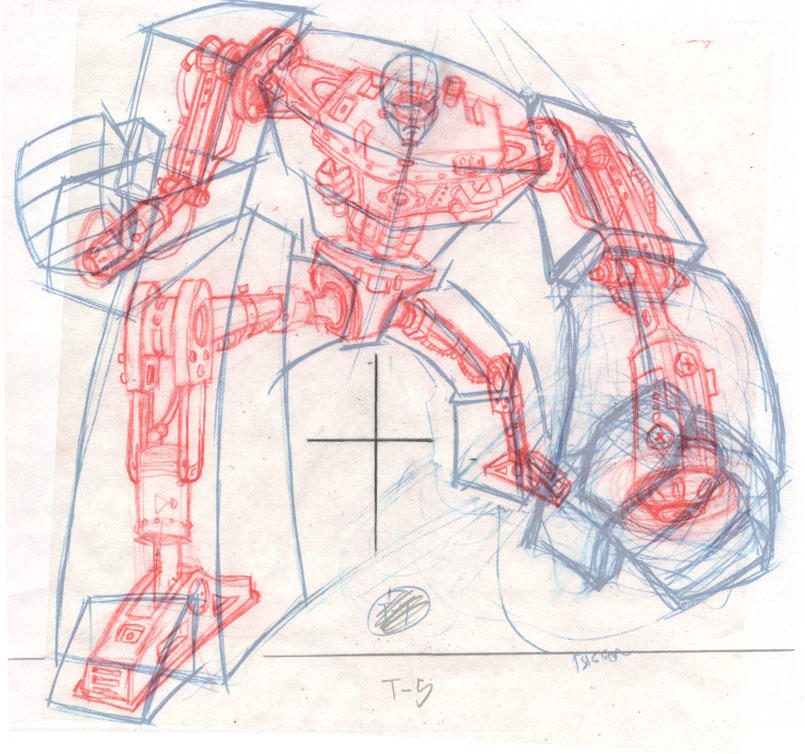
This is the sketch for the TRANSFOMERS skeleton, or chassis, done for the Robot Builder part of the toy's website. After spending a few hours scouring for the right scrap (photos of car chassis, engine bits, wheels struts and shock absorbers), I sat down at my drawing table and got busy! I was free to just kind of throw things down and create a really dynamic drawing with suggestions of things to be. I knew, after I scanned the image, it would be easy to clean up and fine tune, or machine things quite a bit, working from the same scrap photos. The red lines and the blue lines were done on separate sheets of tracing paper then overlayed. Why draw the lines in two colors, 'cause it looks cool! Then it's of to the clean, digital side of the basement.
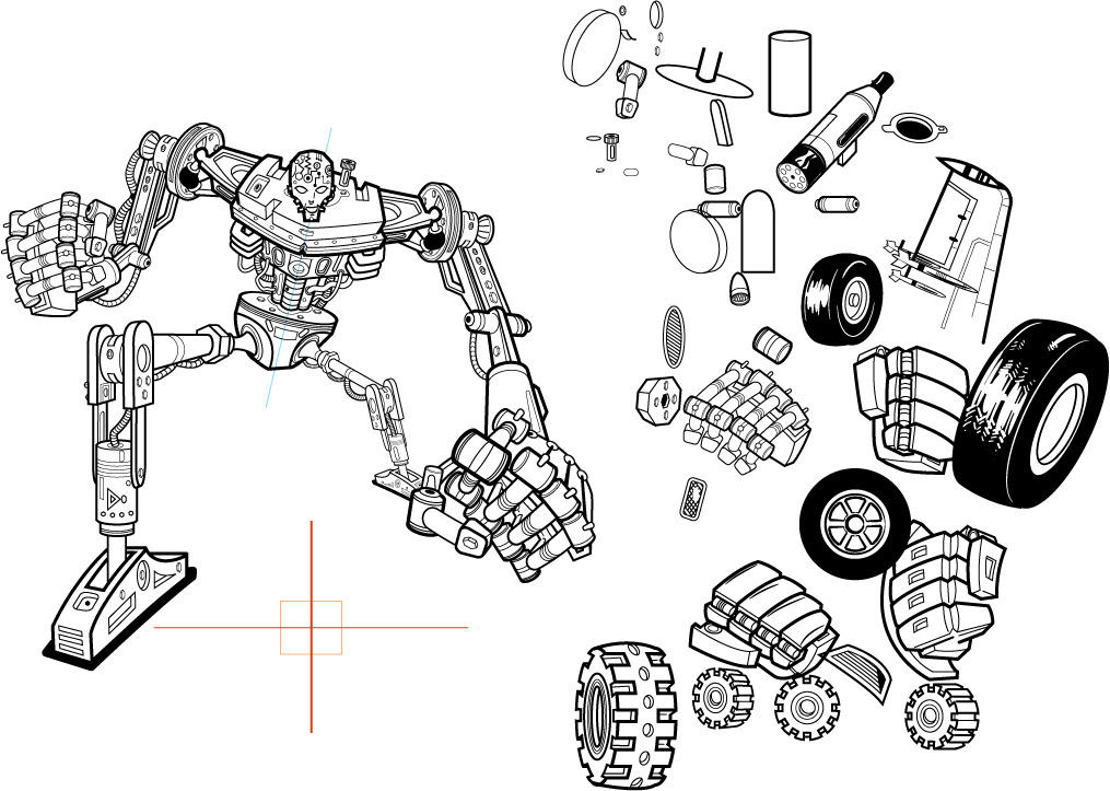
This is the vector art. I used this Chassis as a register mark for all the TRANSFORMERS I created. The bits off to the side are robot parts that were used more than once. I just put them aside to grab when needed. (The most challeging bit to do was the Jeep tire). Somethng like this Chassis is much easier to finish on the computer, but the life and spark of it started on paper. I used a lot of neat tricks digitally to get the lines I wanted, creating brushes and expanding apperances. The Chassis wasn't used as intended, but the concept shows up as the selector icon on the left.
Yeah, super deal, I created 14 TRANSFORMERS from scatch! My art director, was great, backed me up and let me go. The parts are all at the website.click on Robot Builder. The sounds are a lot of fun also.
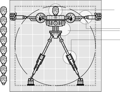
I normally don't like to draw cars, or machines. However working first loose on paper, playing with the pose, feeling, and concept makes the process fun and energetic. The computer makes keeping things even and machined, doing curves and angles much easier. The whole process can be enjoyable, using the right tool for the right job.
Friday, September 23, 2005
Feast of Love illustration
 This is a rough rundown of how I work through an airbrushed illustration. The first step is the rough thumbnail. Here it is with type and side bar pattern put in by Colleen, my designer/art director/wife. No shit, she does all that and garden! Since her type sense is way better that mine, and we work back to back, It's for the best that she does the type at this point. The thumbnail is rough here, in my previous post you can view the sketch. Sketches are done to scale, very tight, so the designer can use them for placement. Saves time for both of us.
 After the sketch is approved I go to the other side of the basement, the convetional art side, (with all my books and scavanged oak drawing table) and airbrush the art. I've been airbrushing for years, but still seem to learn something once and a while, or maybe I just have a really bad memory. In and event, I try to make a nice clean piece of art. This one came out beautifully.
  The last step is to come back over to the computer side of the basement, scan the art, and add color in Photoshop. This one went a bit further. I added the pattern from a shirt I scanned. I removed the side bar from the scan, and brought in more of the shirt pattern. It gaves the illo more depth, things don't look so stuck on.
 Working for Black Issues Book Review is rewarding. I've worked with four art directors. Each one has given me room to really push what I want to do. One day I'll post the "Literary Blackface" project done for BIBR. Lots of sketches and research for a really fun series of illustrations.
More airbrushed illustration like this can be seen at this photo album.
Stan
Wednesday, September 21, 2005
He did what?
This is what I do. This particular illustration is for Black Issues Book Review magazine. This is my final sketch. I'll try to post the next step soon. Right now I have to get back to work lettering a comic story adaptation.


Live fast, draw hard.
I have yet to build a website, but one thing I wanted was some kind of forum, or format, that would allow me to talk about what I do (illustrate, yeah, I'm an illustrator). Several art directors have loved the stories about the illustrations in my portfolio. Others think I'm a walking Illustration encyclopedia, and I'd like to have an place for my students to read my lectures/thoughts/rants about illustration, instead of sitting/sleeping through them. Also, it might be fun, and a way to charge up my creative batteries.
In any event, welcome.
Stan Shaw
In any event, welcome.
Stan Shaw
Subscribe to:
Posts (Atom)

