Showing posts with label vector. Show all posts

Tuesday, November 09, 2010

Treading the boards


For a while now I've been doing a lot of presentation and proprietary storyboard work. Odd stuff, interesting stuff, speculative in nature, and not always finished. These are bits of the second of a two part project. The nature of the assignment called for finished vector work in three distinct styles. This is the one I had the most fun with. It is reminiscent of old Reader's Digest illustrations in it's rough line and single tone color treatment. I created a few special brushes to work with in Illustrator CS4. (I've since moved on to CS5!) I wanted the style to look rough and coarse as if done on oatmeal paper. We all remember paper, right?


The other snippets are from the other set of storyboards. The style was to be more tech, clear line, and cartoony. We wanted a contrast between the rougher line and the cleaner line. Also contrast in how the overall feel, mood and flow of the boards.
They both were fun to do and took advantage of different features in Illustrator. I wish there would have been time to add color to these, in the vein of "Near Art". We had a bit more time at the start, but the schedule got cramped and one of the designers left half way through the project, so in the end we only completed two of the three.
Anyway the dust has settled on these boards, so it safe to tread.

"Live fast, draw hard."

Friday, January 16, 2009

Reinvent Your Commute


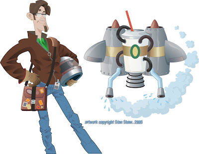
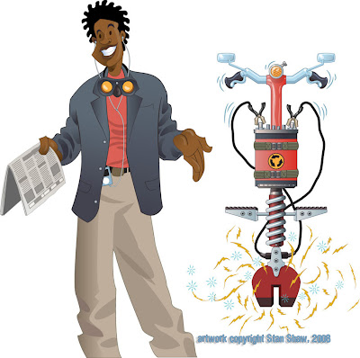
I love illustration, and the research as part of my job. I dig the behind the scenes stuff that sometimes matters more to me than the client or project. I like to think that all the "stuff" adds up to some rich images. Regardless, the entire process is fun-work. This assignmnet is a good example. Scott, an art and marketing director that I have worked with off and on over the years, contacted me with this project. My job was to create visuals for the WSDOT "Reinvent Your Commute" campaign. The illustrations will be used by Pierce Transit and other Washington State transit companies for advertising and promotion, in whatever media, print, transit, billboard, or web, to promote commuting alternatives. The visual concept was open ended. All Scott asked was I work in a style I used for game backgrounds. That was great, the style was vector and if the illustrations were to be as versatile as needed, vector was the way to go. Also, I was to do a type treatment for "Reinvent Your Commute".
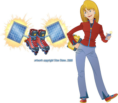
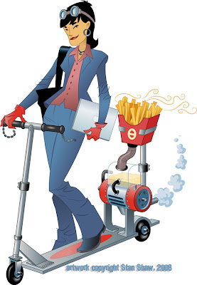
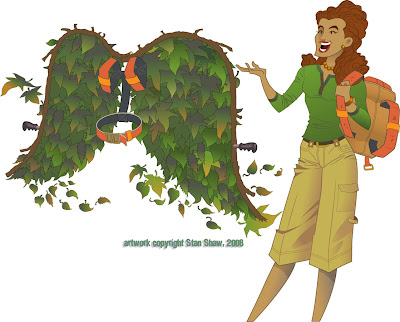
What struck me was how sort of D.I.Y. and "home inventor" the thought of reinventing your commute was. I ran with that idea. My first sketch was of a geeky science type dude standing next to a diagram for a jet pack. Scott liked the idea and we though that each of the illustrations (four that expanded to five) would feature an inventor/commuter and a mode of commuting that would fit their personality. Cool beans! I get to create characters! I always base characters on people I know or know a fair amount about. I helps to get a handle on who I'm drawing (and pinpoint the audience.) It eaier to build a character that rings true with all the little fun touches that make, well, a "Character". How they stand, what they wear, hairstyles, accessories. Even things as small as rings and facial tics, they all ad up. Viewers take it in at a glance and get to "know" the character right away. That's my theory anyway.
So I started with a mode and a general person, then I though of someone I knew who would fit the bill, and fleshed out the character. For instance in the case of the guy with the jet pack, he actually looks like that, he stands that way and used to have a beard like that. Plus, he's the kind of guy that just might build a jet pack. I think he even has a leather Flight Jacket. To my knowledge most character designers will work this way.
Next was the transport modes! They needed to be wild, fun and easy to read. The original jet pack had way to much detail on it. It started out as just about a full blown antique espresso machine! Most of the first attempts suffered from too much detail. The other problem was coming up with outlandish transports. You have no idea what crazy contraptions some people use to get around! I thought, "robot powered rickshaw, that's unusual." Nope, there is one! There are also several kinds of jet packs. Two of the wildest are a full body roller blade suit (you really have to see it in action!) and a Volkswagen Bug with a Jet engine Booster. It's street legal! I was going to do a solid fuel booster unicycle, but, after those two, how far could I go? So we shifted a bit and made them funny visually.
A really big espresso cup, the battery for the pogo stick is a 9 volt battery on steroids. Extra large fries (because they do make bio diesel scooters.) Go figure! The green wings are the only mode that doesn't have an corresponding real life mode of transportation. Maybe Icarus?
So reinventing your commute is much easier in real life than in illustration, but not near as much fun.


Off to work we go!

Tuesday, October 21, 2008

A rose is a rose.


We name everything, from our genitals to our gods. A name helps us deal with the hidden, minor or otherwise hard to explain traits of what we name. Over time I have gotten into the habit of naming illustrations. Particularly any work that requires Character Design. I tend to name them after people I know, have met, or know something about. The name helps me fill in the small bits that flesh out a character, make it fun and give it the undefinable details that, I hope make it a bit special. The characters, once named, seem to me to take on life. Ideas for hairstyles, accessories, poses and colors seem to come faster and make more sense. Oddly, even clients react to the names, responding to them like they were real people. In high school people would just stare at characters I drew without names. Now, with names, clients comment, make requests, the floodgates open up.
Rarely do I pick a person first, then base the character on them. (the exception being when I "cast" a comic book.) However, I do make exceptions, for me very rarely, and sometimes if the client has a special request.
It's always fun to create a character no matter what the use. These characters were for a McSoft project that I think never saw the light of day. Little avatars that you would be able to dress up like paper dolls and take shopping. Cute huh?

The named characters may reflect a part or perceived part of their namesake, but, as far as making a good illustration goes… "What's in a name? That which we call a rose by any other name would smell as sweet."

Monday, August 04, 2008

Top Secret Illustration


Well, this is not a secret illustration, just one of two editorial pieces this week. However this is what it looks like saved as a pdf, with Illy Editing capabilities turned off, out of Illustrator CS3, then selected. Kind cool! Okay back to work.
Live fast, draw hard.

Monday, July 28, 2008

VROOM!!


Today was a good day. I got to sit at my Big Boy drawing table and draw these! Theses are sketches for a web icon, actually more like an animated widget, that I will complete as vector art. Three versions here, with all my little scribbly notes to the designer. Rough work has it's own appeal that the final doesn't.
"live fast, draw hard."

Friday, July 18, 2008

Makin' bank


Things have been busy here. Two houses to work on and one to paint, playing with my new 3000 psi pressure washer!
Meanwhile over at my blog… Right now I'm working on a series of bank illustrations.
Yes me doing illustrations for a financial institution. There are six total. Originally the client wanted to match a painted style with something they would initially use on their new website and possibly later for print/collateral uses. I knew that vector art would work well for web use, and allow for scalability, but how to match, or get close to a painted look/feel for print? Texture and lots of it! I have been slowly building a folder of custom patterns and textures to use in P-shop and Sillly-strator. The one I'm using in this series is something worked up from a scan of one of my airbrush illustrations. I used it like an old stacked screen. (Anyone out there remember those? Buller, Buller…?) the texture is on two layers, one set to normal at about 40 opacity and the other set to multiply at about 20 opacity. And like a stacked screen they're angled to offset. This way the texture builds up a more random look and works over the entire value scale. The shapes are very simple, that's more in keeping with what the client wanted stylistically, but each shape may have the fill and stroke set to different opacities. All in all, the Transparency palette and I are quite friendly now.


The illustrations will be used very small and have the potential to be very big, so I wanted to give the client art that would work at both ends of the scale. Conceptually it's a cake walk, but technically?… there's where the work is.

I also decided to have a common background and cloud motif for all the illustrations. Their previous set did not have much in common at all. I was going to have the background be the same color in all, but the designer thought that might be too repetitive. We'll see how the shape up on the website. Even though I have a Wacom all this was mostly mouse work. Parlor tricks!The"In-House-Art Director" really likes these illustrations and says so whenever she passes by my computer, and the client is happy. Well, and so am I. More so with all the technical stuff I was able to do and how I played with texture and transparency.

Tuesday, March 27, 2007

Draw Fast!


Ha! Here is a boot I designed for a well, boot company as a sample pitch. I was asked o submit samples for their kids boots and I did this. My thinking was, what kind of boot would I want to wear if I was a kid, in the rain, running and splashing, and jumping not quite over big deep puddles. Man, if they ever make this boot I will get a pair. Once the idea was there it took me about 30 minutes to do the vector art. With a neat work-around to get the thick key line, for the extra cool big water repellent look.
I'll post the rest of the samples later today.
Live fast, draw hard.