
Showing posts with label Illustration. Show all posts
Showing posts with label Illustration. Show all posts
Thursday, October 16, 2014
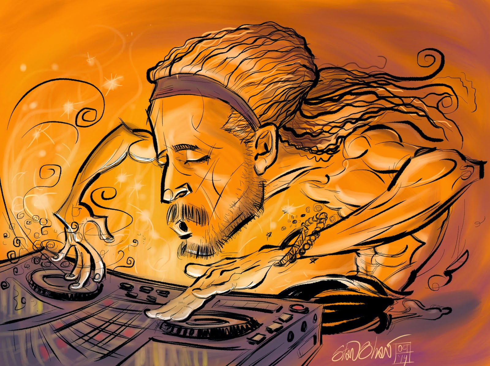
DJ Drez, drop dat beat!


Monday, October 13, 2014
Potential of Us
This is a animated version of the short I did for Verizon Wireless earlier this year. In this video I used the type which was not used in the final piece. Put this together in AfterEffects, but the final is planned to be a digital book with narration and different type added. In the meanwhile there is this to enjoy!
Friday, June 03, 2011
Illustration Robot
Illustration Robot's Arron Petz asked me to do a little show and tell. Sometimes talking about my illustration work is like living a re-run. I like it, remember I liked it the first time around, and so this time I might seem a bit bored, but I'm actually thinking about other things that might be out of the obvious in regards to the illustration. Like a robot with two heads.
Here are seven illustrations I think will show an arc from conventional airbrush to digital airbrush. No matter what I do or what application I work in (Painter, Photoshop, Flash, Illustrator, or Sketchbook Pro) I try to make the concept/idea most important and not the technique.

Nora Jones: This was for No Depression magazine. A lot of my editorial work was black and white airbrush, which I really love doing. Well, monochromatic to be really honest. So this is typical of that. I work at a low pressure setting on cold pressed board so there is a nice organic texture to the work in the sprayed areas and in the line work. While working for The Villiage Voice (printed on not that great newsprint) I learned to keep the work to three values, basically. This prevented the image from becoming muddy when printed. I love the graphic nature of working this way.

Holiday Art: Full page newspaper illustration for a Holiday Arts section. This was sprayed as black and white, then I added the colors digitally in Photoshop. Just basic layers set to multiply, nothing fancy, yet. Still playing with how hue affected values, shifting the compositional focus.

Brandy (w/ Timbaland): Florian Bachleda at Vibe gave me a pretty nice playground for doing my conventional airbrush stuff in color. Interesting subject matter and he gave me a lot of freedom, but also pushed a bit to make sure the concept and execution were spot on. I have a so-so color sense. Airbrush required a lot of planning and sometimes working almost blind because of the frisket. But it was like Christmas when it came time to remove all the frisket and see what I got. This is one of my better color airbrush illustrations. Again, mostly one color and the value/shape range is low. I always set it up by shape/areas. Like, "skin", "dress" and background". Each area basically one value with slight variation within. Timbo's face was sprayed in originally, but Florian and I thought he looked to fat. So I sprayed another face and added it digitally, along with the color.

Beth Orton: Grant Alden at No Depression is another wonderful art director. Plenty of great assignments and room to experiment under a helpful/watchful eye. I'm really pleased with the concept on this, which extends into the execution. Her transparent fingers sort of shy and not quite covering her mouth, suggesting how she veils her meanings in her song lyrics. Again this was sprayed with black ink and colored digitally. I made a few adjustments to the values after scanning so the color would show in the darker areas.

India Arie: Vibe magazine. This is again, sprayed conventionally, but there is an equal amount of digital work done. Tweaking the value areas, adjustments to the face and line work. And a lot of layer manipulation to get the color right and allow the texture to show through. Actually did this illustration over from scratch! Got very comfortable manipulating the texture in photoshop.

Ray LaMontagne: So I loved the Beth Orton piece so much I copied myself for another No Depression illustration. If you look you can tell. The difference is that this one is all digital. If you look close you can see tell tale signs, but this is a big leap for where I was heading!

Tracy Morgan: And we arrive back at the start, sort of. Some of my first black and white editorial airbrush pieces were for The Village Voice, and here is a recent one, but this time digital. I created my own texture, and worked in Illustrator, Photoshop and Painter. My goal was to provide my client with art in the style they wanted, but with the speed that a digital work-flow allowed. Ta-da! Some of my oldest art director friends couldn't tell the difference. "The android had successfully replaced the human!"
On editorial work like this, I try to come up with a strong concept, that doesn't rely on style, but takes advantage of it. Like Norah Jones's body being a piano shape. That concept could work in another style, but I like to think that is shows up well in the style I used. Same goes for the depiction of Brandy as a sort of Egyptian Queen/diva, or the happy, glowy, pop feel to the way India Arie is rendered. Even the Renaissance approach to a simple portrait of Ray LaMontagne. Style is subservient to the concept. Or at least that's what I'm aiming for. I welcome any and all comments from blog readers and other Illustration Robots!
Here are seven illustrations I think will show an arc from conventional airbrush to digital airbrush. No matter what I do or what application I work in (Painter, Photoshop, Flash, Illustrator, or Sketchbook Pro) I try to make the concept/idea most important and not the technique.

Nora Jones: This was for No Depression magazine. A lot of my editorial work was black and white airbrush, which I really love doing. Well, monochromatic to be really honest. So this is typical of that. I work at a low pressure setting on cold pressed board so there is a nice organic texture to the work in the sprayed areas and in the line work. While working for The Villiage Voice (printed on not that great newsprint) I learned to keep the work to three values, basically. This prevented the image from becoming muddy when printed. I love the graphic nature of working this way.

Holiday Art: Full page newspaper illustration for a Holiday Arts section. This was sprayed as black and white, then I added the colors digitally in Photoshop. Just basic layers set to multiply, nothing fancy, yet. Still playing with how hue affected values, shifting the compositional focus.

Brandy (w/ Timbaland): Florian Bachleda at Vibe gave me a pretty nice playground for doing my conventional airbrush stuff in color. Interesting subject matter and he gave me a lot of freedom, but also pushed a bit to make sure the concept and execution were spot on. I have a so-so color sense. Airbrush required a lot of planning and sometimes working almost blind because of the frisket. But it was like Christmas when it came time to remove all the frisket and see what I got. This is one of my better color airbrush illustrations. Again, mostly one color and the value/shape range is low. I always set it up by shape/areas. Like, "skin", "dress" and background". Each area basically one value with slight variation within. Timbo's face was sprayed in originally, but Florian and I thought he looked to fat. So I sprayed another face and added it digitally, along with the color.

Beth Orton: Grant Alden at No Depression is another wonderful art director. Plenty of great assignments and room to experiment under a helpful/watchful eye. I'm really pleased with the concept on this, which extends into the execution. Her transparent fingers sort of shy and not quite covering her mouth, suggesting how she veils her meanings in her song lyrics. Again this was sprayed with black ink and colored digitally. I made a few adjustments to the values after scanning so the color would show in the darker areas.

India Arie: Vibe magazine. This is again, sprayed conventionally, but there is an equal amount of digital work done. Tweaking the value areas, adjustments to the face and line work. And a lot of layer manipulation to get the color right and allow the texture to show through. Actually did this illustration over from scratch! Got very comfortable manipulating the texture in photoshop.

Ray LaMontagne: So I loved the Beth Orton piece so much I copied myself for another No Depression illustration. If you look you can tell. The difference is that this one is all digital. If you look close you can see tell tale signs, but this is a big leap for where I was heading!

Tracy Morgan: And we arrive back at the start, sort of. Some of my first black and white editorial airbrush pieces were for The Village Voice, and here is a recent one, but this time digital. I created my own texture, and worked in Illustrator, Photoshop and Painter. My goal was to provide my client with art in the style they wanted, but with the speed that a digital work-flow allowed. Ta-da! Some of my oldest art director friends couldn't tell the difference. "The android had successfully replaced the human!"
On editorial work like this, I try to come up with a strong concept, that doesn't rely on style, but takes advantage of it. Like Norah Jones's body being a piano shape. That concept could work in another style, but I like to think that is shows up well in the style I used. Same goes for the depiction of Brandy as a sort of Egyptian Queen/diva, or the happy, glowy, pop feel to the way India Arie is rendered. Even the Renaissance approach to a simple portrait of Ray LaMontagne. Style is subservient to the concept. Or at least that's what I'm aiming for. I welcome any and all comments from blog readers and other Illustration Robots!
Tuesday, November 09, 2010
Treading the boards


For a while now I've been doing a lot of presentation and proprietary storyboard work. Odd stuff, interesting stuff, speculative in nature, and not always finished. These are bits of the second of a two part project. The nature of the assignment called for finished vector work in three distinct styles. This is the one I had the most fun with. It is reminiscent of old Reader's Digest illustrations in it's rough line and single tone color treatment. I created a few special brushes to work with in Illustrator CS4. (I've since moved on to CS5!) I wanted the style to look rough and coarse as if done on oatmeal paper. We all remember paper, right?

The other snippets are from the other set of storyboards. The style was to be more tech, clear line, and cartoony. We wanted a contrast between the rougher line and the cleaner line. Also contrast in how the overall feel, mood and flow of the boards.
They both were fun to do and took advantage of different features in Illustrator. I wish there would have been time to add color to these, in the vein of "Near Art". We had a bit more time at the start, but the schedule got cramped and one of the designers left half way through the project, so in the end we only completed two of the three.
Anyway the dust has settled on these boards, so it safe to tread.
"Live fast, draw hard."
Thursday, July 22, 2010
All in a day's work.


Tuesday, March 30, 2010
Tracy Morgan for the Village Voice, Liz Lemon!

This is a different conventional/digital mix than normal for me. Being that the conventional part was done digitally and the digital part was done conventionally.
Jesus Diaz of the Village Voice asked me to do a straight illustration of Tracy Morgan for the Choices section. Specifically he wanted my airbrush style, which I perfected (or whatever) years ago working for The Voice, and went on to use it for a lot of other clients (Pierce Transit, Vibe, No Depression, BIBR, Dark Horse Comics,)
Originally I was doing this airbrush style in black and white, later I added color by spraying with Rortring Inks (Arguably the best inks that were on the market. Rumor is, they closed a plant rather than change the formula.)
When I started using a computer, I developed a way to color the black and white airbrush so I had the best of both. Nice B&W art for me, and controlled color art for my clients!
I like this style best in black and white, it just looks cool to me. My last sprayed color piece was an illustration of author Zadie Smith for Black Issues Book Review. After that I only did B&W, mostly for No Depression.
Then recently Jesus Diaz asked for that ol' airbrush magic. Time was tight, as usual, and I had only done one successful digital airbrush piece, (my jazz Blue Note Santa!) The sketch was drawn conventionally by hand (as opposed to by foot?) on paper over my light table. I scanned the drawing and completed the illustration in Photoshop CS4, making paths the same way I would cut frisket, okay maybe a bit more anally 'cause I'm like that! The new rotate feature is very handy. The texture is my own special recipe, actually sprayed by hand! Layers were sandwiched and the illo was sent off. In the rush, I forgot to add color but Jesus did that and it looks great.
Thursday, August 13, 2009
Storyboards End

The illustrator and teacher Cherry Brown, who along with her husband Dick Brown founded The School of Visual Concepts, once told me to draw something every day.
Storyboards are the wind sprints of illustration. Short, quick, you do a lot and they can be very tiring. However at the end you definitely on. Even though they might not be the best drawing you'll ever do, a little bit of careful attention to each one can have great results for your skills in the end.
Sunday, May 31, 2009
Hey Kids, Comics: The Flitcraft Parable!
 Well it's comic book time kids! We'll start with a project I was incredibly happy to do and proud to say it's not too shabby. There are things I'd do differently, but that's hindsight for ya! "The Flitcraft Parable" starts on the cover. I always consider the cover part of the story. It works to set a mood and generate the first spark of storytelling magic for the reader.
The cover portrait illustration of Hammett was done twice. Like any good Op, Hammett had more than one face. The first likeness I did had much more personal influence on it. I was calling heavily on the fact that Hammett was a private detective. It was a moody, stern-jawed likeness, that evoked him, but didn't look like him. Since the lead article was about Hammett, and more revealing, I thought it would work better to see him how he was. His face had a softness to it that was hidden amongst smooth flat planes that denied detail. The classic photo of him getting of a train shows that, his face is a group of stark black and white planes beneath a wide hat brim. The map came late from the article's writer, Michael Sullivan. It's a map of Tacoma, made during the time that Hammett lived here, showing some of his favorite places. I think it was drawn by Hammett. My initial likeness lived on as the face of Flitcraft himself in my adaption, adding another subtext.
A bit about the layout. I may go into this more with the other posts. But, for Flitcraft I kept it simple. My reason being the audience was not made up of comic book fans, but of non comic book readers. I think the difference is that regular readers have a small set of expectations about comics that they are willing to have broken and expanded upon. Most often it's because a regular reader doesn't expect much from a comic book, the bar is set pretty low. Interestingly enough they seem quite open to different styles of art. Comic Book readers are more sophisticated about comics and what they can do. They expect more, but also seem to hold the comic book to, at times, a more rigid standard of what constitutes a "comic book". I remember a quote from an illustration text book ("Illustration Today" by Robert Ross) that goes something like, " A successful illustrator is one who thinks his way into the minds of individuals." Blah, blah blah. So to illustrate for the regular reader, think like the regular reader. I used an old paper texture to evoke the period. The same with the coloring, which springs from old Readers Digest illustrations. They were often black line work with a couple of process colors roughly cut or drawn. Not quite the same time period, but cheap printing plus cheap paper equals 100% Pulp!

Page one, and right from the start I get to draw Spade and Brigid! Even though there's not a lot of movement, I spent a lot of time on the characters, poses and type to set the mood quickly since I didn't have very many pages. Brigid is based on a photo of a secretary that Hammett was supposed to have had an affair with, and may have based the novel version of Brigid on. The clothes are authentic, from a vintage Sear's catalog. In the first panel I had a lot to establish quickly. I did a few passes at this page, but it was the wonderfully freeing advice of the editor to change things if I had to, that put me on the right path! In the novel Spade and Brigid are not staged this way. I made the leap to position them in a sexually playful way, that's a bit antagonistic. It also made a nice pyramid structure that helped the type. The type is a modern font that echos an older style, the way I hope the art does. I had the help of a wonderful designer Colleen Gray (the "In House Art Director") and the input of my good friend designer Jesse Reyes.
I gave the word balloons a squared off tail to make them different from American comics and something a bit special. The tails are like some of my favorite European comics. I figured the audience would be open to that. The last two panels immediately take us into the first level of flashback.

More authenticity on the second page with housewife style dress and the Davenport Hotel in Spokane. The hotel had been remodeled recently and their website is full of great images of the lobby and front desk. Here I used my original take on Hammett as the character design for Flitcraft. The second panel shot of Flitcraft is based on a photo of Hammett. The visual theme of the "beam" starts in the last two panels. First, I used the beam shape to focus light on Flitcraft's eyes, like in old films. Then I used it to set the light and shadow in the background of the same panel. Again, the beam appears in the last panel as a silhouette, like Flitcraft himself. I was hoping the silhouetting would tie the two together, like fate had. Get the hip waders 'cause it's gettin' deep!

Page three goes into the flashback within a flashback! I took the liberty of having Flitcraft tell his own story. That's the reason for the wonky structure. I stepped into a different color scheme and the art is a much more symbolic and illustrative. Panel one is a bank building (The Washington Building) that was being constructed around the time Hammett was living in Tacoma. If memory serves me, it had the dubious distinction of being part of some big swindle that halted construction and caused a national scandal. It was in the right place at the right time to drop a beam near Flitcraft. Panel two, I thought the beam acted like a bolt of lightning (from God?) so my beam hits the ground bending and crumpling, transforming to a lightning bolt like shape. I gave the bolt and Flit the "jitters" like Horror type. Panels four to eight we see as well as read how his life and thought begin to crowd him, forcing a new direction. Relief come in the expanded ninth panel, his face a clear, blank slate.
Panel ten, all the other possible lives, chances and changes represented by beams. The scar is prominent on this page as a marker for the character, like Johnny Quests hair, a good strong visual cue.

Page four ends the flashback and works to get us back to the story proper. In panel one I wanted to show how Flitcraft was shaken and separate from his fellows on the street. I showed this with a thick rough key line around his figure. Somewhat like the blank slate he think he could become, his face is basic and stripped bare. In panel two he talks about ordering his life. Somehow that made me think that all he had done and accomplished was by the hard work of his hands, in a metaphorical way. So I separated him (his face) from his hands. The narrative box also is the middle in the three panel descent, so that in panel three, when things are calmer, the narrative box is at the bottom of the panel, creating a nice progression that really connects all three. Panels 4 and 5 work to bring us back to the first level by a shift in color, and the change of Flitcraft and the identifying scar. Panel 6 we see Flitcraft/Hammett talking to Spade. The angle is on Spade so as to make a smooth transition to…

Page five, panel one. A close up of Spade similar to Page one panel three that took us into the flashback. The "photo" of Flitcraft is again taken from the photo of Hammett same as page two, panel two was. About Spade, he is described as looking "rather like a pleasant blonde Satan". I work to get the characters set and stay on model but this last page is the better Spade.
The bottom panel is a nice half page that mirrors the start of the adaptation.
I try to make (at least for now) circular stories, where the beginning and the end echo each other. Here we have Spade and Brigid in a pyramidal composition similar to the first panel of page one. The body language is less aggressive, and adversarial but more playful and cozy. He did tell her a nice story after all.
I like the adaptation. I think of it as "Noir", and as such, I felt for a while I should have used more black shapes and areas to create a darker feel. But now I'm happier with tone that comes across emotionally without the trope of a lot of inky blackness.
NEXT WEEK in Hey Kids, Comics!…911 single page comic for Dark Horse Comics!
Monday, May 04, 2009
Hey kids Comics! Intro

Like a ton of other comic book artists, I put a lot into my work. Some noticed, some not so much. Seldom do I, or any other comic book artist, get to explain in detail what they do. So, over the next three weeks I'll be posting three comic book projects explaining what and why I did things, panel by panel. That is what this blog is about after all, the what and the why.
The projects are;
A five page adaptation of the famous parable of the falling beam from Dashiell Hammett's The Maltese Falcon, "The Flitcraft Parable" for City Arts magazine,
A four page visual liner note for Camper Van Beethoven reunion album, "That Gum You Like" done for No Depression magazine,
A 9-11 page done for Dark Horse Comics. I haven't looked at this in years myself!
An advertising five pager,"BTS Master" for Pullen Advertising, the client was Anritsu.
And a special surprise, the job I got because Mike Richardson, me and my editor at Dark Horse got mixed up, my eight page Western Fairy Tale, "Out in the West"!
Tell all your friends (and a few enemies)
I have been fortunate enough to be able to experiment on just about every comic book project I've done. Maybe posting about these dissimilar experiments will help me better understand what I'm doing and point to some creative experiments for my next comic book work.
Live fast, draw hard.
Friday, January 16, 2009
Reinvent Your Commute

I love illustration, and the research as part of my job. I dig the behind the scenes stuff that sometimes matters more to me than the client or project. I like to think that all the "stuff" adds up to some rich images. Regardless, the entire process is fun-work. This assignmnet is a good example. Scott, an art and marketing director that I have worked with off and on over the years, contacted me with this project. My job was to create visuals for the WSDOT "Reinvent Your Commute" campaign. The illustrations will be used by Pierce Transit and other Washington State transit companies for advertising and promotion, in whatever media, print, transit, billboard, or web, to promote commuting alternatives. The visual concept was open ended. All Scott asked was I work in a style I used for game backgrounds. That was great, the style was vector and if the illustrations were to be as versatile as needed, vector was the way to go. Also, I was to do a type treatment for "Reinvent Your Commute".
What struck me was how sort of D.I.Y. and "home inventor" the thought of reinventing your commute was. I ran with that idea. My first sketch was of a geeky science type dude standing next to a diagram for a jet pack. Scott liked the idea and we though that each of the illustrations (four that expanded to five) would feature an inventor/commuter and a mode of commuting that would fit their personality. Cool beans! I get to create characters! I always base characters on people I know or know a fair amount about. I helps to get a handle on who I'm drawing (and pinpoint the audience.) It eaier to build a character that rings true with all the little fun touches that make, well, a "Character". How they stand, what they wear, hairstyles, accessories. Even things as small as rings and facial tics, they all ad up. Viewers take it in at a glance and get to "know" the character right away. That's my theory anyway.
So I started with a mode and a general person, then I though of someone I knew who would fit the bill, and fleshed out the character. For instance in the case of the guy with the jet pack, he actually looks like that, he stands that way and used to have a beard like that. Plus, he's the kind of guy that just might build a jet pack. I think he even has a leather Flight Jacket. To my knowledge most character designers will work this way.
Next was the transport modes! They needed to be wild, fun and easy to read. The original jet pack had way to much detail on it. It started out as just about a full blown antique espresso machine! Most of the first attempts suffered from too much detail. The other problem was coming up with outlandish transports. You have no idea what crazy contraptions some people use to get around! I thought, "robot powered rickshaw, that's unusual." Nope, there is one! There are also several kinds of jet packs. Two of the wildest are a full body roller blade suit (you really have to see it in action!) and a Volkswagen Bug with a Jet engine Booster. It's street legal! I was going to do a solid fuel booster unicycle, but, after those two, how far could I go? So we shifted a bit and made them funny visually.
A really big espresso cup, the battery for the pogo stick is a 9 volt battery on steroids. Extra large fries (because they do make bio diesel scooters.) Go figure! The green wings are the only mode that doesn't have an corresponding real life mode of transportation. Maybe Icarus?
So reinventing your commute is much easier in real life than in illustration, but not near as much fun.


Off to work we go!
Wednesday, December 03, 2008
The Badlands Covers

 I have forgotten most of the story around the top illustration with the vultures, something about Nike. I do remember it being somewhat of a big deal with Willamette Week (or was that just me?). The art director, Katherine Topaz, threw all her trust in me for an illustration that would be both cover and a two page interior illustration. Later, this was the piece that High Country News saw and liked enough to have Kat get me to do a cover for them. One of the few times my work has been a reference for itself. Kind of fun though, sister illustrations.
With the cover for High Country News I again worked with with Katherine Topaz. She's one of my very favorite art directors and a swell designer. I was fortunate enough to work with her through-out most of her art directorial tenure at Willamette Week. Kat is a blast to work with, lots of fun and a risk taker willing to experiment. She also allows illustrators to have input into the overall design and end use of the illustration, taking advantage of the interplay between AD and Illustrator to great effect. This cover was a last attempt Hail Mary Pass for a tough, dry concept (tax revenue from oil drilling used for government services). The client had seen and liked the vulture cover I'd done for Willamette Week. After doing a butt load of thumbnails with way different concepts, in the end we went with something really close, to the vultures cover, that shared style and composition.
Tuesday, December 02, 2008
Near Art 3 to 6: End of the run
What was planned to be a 12 strip run made it to 6. Enjoy 3 thru 6 here and 1 and 2 in a previous post, then read below for details.


City Arts recently changed editors. When they did, the decision was made to make changes to my strip, Near Art. They cut the pay by two thirds, cut the size by at least half, and let me know that they were not to confident that the continuity was enough for a monthly audience who may, or may not have been, regular readers. But they did like the art! I'm trying to make the best of it. I will continue with the name Near Art (which I did not come up with) doing something else, for less money that takes less time and is not a continuity.
What saddens me most is that the strip was a 12 part romance, a little valentine for my wife, and we only got to part 6. I had thought I was going to rant here about editors making visual decisions and in-decisions, magazines dumbing down, and the devaluation of visual content, but that all reads like whining. (Oddly, a fitting tie to NA #6.) The best thing to do is to complete the strip myself, on my own.
And then sell it!
Live fast, draw hard.


City Arts recently changed editors. When they did, the decision was made to make changes to my strip, Near Art. They cut the pay by two thirds, cut the size by at least half, and let me know that they were not to confident that the continuity was enough for a monthly audience who may, or may not have been, regular readers. But they did like the art! I'm trying to make the best of it. I will continue with the name Near Art (which I did not come up with) doing something else, for less money that takes less time and is not a continuity.
What saddens me most is that the strip was a 12 part romance, a little valentine for my wife, and we only got to part 6. I had thought I was going to rant here about editors making visual decisions and in-decisions, magazines dumbing down, and the devaluation of visual content, but that all reads like whining. (Oddly, a fitting tie to NA #6.) The best thing to do is to complete the strip myself, on my own.
And then sell it!
Live fast, draw hard.
Monday, December 01, 2008
Cool World covers
 I like this cover the best. It was fun to draw the characters in my own style.
  No she's not holding up a building. I think I put something in the street names but I don't remember.
  After hounding my contacts at DC comics, I finally wound up with some work from them. If I remember correctly I had been doing a strip in the DC Comics employee newsletter and had sent off the obligatory second round of inking samples. The Ralph Bakshi film "Cool World" was being released and DC was doing the film adaptation. Film adaptations get a bad rap and rightly so. They are kin to license work and come with a ton of restrictions that are piled on by committee and client, at times making no sense. In this case I was told that I had to avoid likenesses of the actors (Brad Pitt, Gabriel Byrne, Kim Bassinger). I was tasked with inking the film adaptation and doing covers 2 thru 4 of the mini series. Bakshi was doing the first cover. I dutifully inked the adaptation. I was really happy and excited when the editor kicked back my initial cover sketches as not being wild enough. They wanted me to really cut loose and have fun with the covers. So I did. Looking back, I think I went a little too wild but I did do just what I wanted on three covers for a major comic publisher. Weeks later I got my share of the inked pages, finished art is divided between the creative team. All the faces that I inked so the did not look like the actors (as we had been told) had been carefully pasted over and redrawn to look like the actors. It's funny that the method used to patch the art involved cutting a slit in the page art at the throat of each character and sliding in a new piece of paper on which the new head was drawn. They had all been be-headed.
I don't think I have any of the pages I inked but I do have the pre digital covers stashed away somewhere. Every once in a while I come across the covers on line. Small, cool world huh?
Monday, November 03, 2008
Sign of the Times
 This illustration received a nice post on the blog of Jürgen Mantzke, the art director of Lore magazine. This illustration was not used. Rarely do I have an illustration "killed". Of those killed only one other have I liked as much as the second go 'round. More often the two attempts are extremely close in concept. This time however I liked the second attempt which was way different from the first. As you can see.
 Both concepts were sound, the second coming on recommendation from the publisher. It created some interesting creative hurdles. Both illustrations were done in black and white airbrush with color added digitally. It's wild to think that both illustrations were based on the same article, about the same man. That says something about the power and life of an illustration despite the words that it's tied to. A good lesson about something we sometimes think of as conversely subservient or self serving. That, or they could just be pretty pictures.
Tuesday, October 21, 2008
A rose is a rose.

We name everything, from our genitals to our gods. A name helps us deal with the hidden, minor or otherwise hard to explain traits of what we name. Over time I have gotten into the habit of naming illustrations. Particularly any work that requires Character Design. I tend to name them after people I know, have met, or know something about. The name helps me fill in the small bits that flesh out a character, make it fun and give it the undefinable details that, I hope make it a bit special.
 The characters, once named, seem to me to take on life. Ideas for hairstyles, accessories, poses and colors seem to come faster and make more sense. Oddly, even clients react to the names, responding to them like they were real people. In high school people would just stare at characters I drew without names. Now, with names, clients comment, make requests, the floodgates open up.
  Rarely do I pick a person first, then base the character on them. (the exception being when I "cast" a comic book.) However, I do make exceptions, for me very rarely, and sometimes if the client has a special request.
 It's always fun to create a character no matter what the use. These characters were for a McSoft project that I think never saw the light of day. Little avatars that you would be able to dress up like paper dolls and take shopping. Cute huh?
The named characters may reflect a part or perceived part of their namesake, but, as far as making a good illustration goes… "What's in a name? That which we call a rose by any other name would smell as sweet."
Thursday, September 11, 2008
Big Boy Drawing!


I should be here…as in the above pictures, of my relatively new drawing table. It's the Alvin:Ensign or Workcenter, I can't remember which. If you need to know email me. It's a really good table, and thanks to all the illustrators I asked about what table they had. Alvin has been a nice company to deal with. There is one bolt on the left leg/foot that won't thread completely, but DIZZAMN, the table is so heavy that it doesn't matter! The top moves with a hydraulic assist (suh-weeet!). It came to me all the way from Italy. I get romantic about that because I spent three weeks there hanging out in a castle in central Italy, driving an Alfa Romeo. These shots are of my cockpit after we remodeled earlier this Spring. I still get sentimental about my old oka table, sniff. But now I have a big boy drawing table!
By the way, one of my current crushing deadline is another story for Graphic Classics. A 30 page story and I'm turning around three pages per day. That sloshing sound is ME MIGHTY INKING BRUSH!!! Actually, I'm inking it in Painter. Another story I did the same way received a favorable mention from sequart.org
And I proudly quote,
"Moxon's Master", about a robotics experiment gone wrong, is one of the best-looking stories in the book. Stan Shaw's scribbly-yet-elegant line serves the darkness of this story well, but it's not difficult to predict what's coming
Yeah! scribbly yet elegant! That's how me roll! Now it's back to work.
Wednesday, August 06, 2008

Monday, August 04, 2008
Top Secret Illustration

Well, this is not a secret illustration, just one of two editorial pieces this week. However this is what it looks like saved as a pdf, with Illy Editing capabilities turned off, out of Illustrator CS3, then selected. Kind cool! Okay back to work.
Live fast, draw hard.
Monday, July 28, 2008
VROOM!!

Today was a good day. I got to sit at my Big Boy drawing table and draw these! Theses are sketches for a web icon, actually more like an animated widget, that I will complete as vector art. Three versions here, with all my little scribbly notes to the designer. Rough work has it's own appeal that the final doesn't.
"live fast, draw hard."
Subscribe to:
Posts (Atom)


