Sunday, October 21, 2007

The Flitcraft Prable!


Lets start at the beginning, sort of. The Flicraft Parable is the tale that Sam Spade tells Brigid O'Shaugnessey in "The Maltese falcon" written By Dashiell Hammett. The parable appears in the first part of the Chapter "G on the air" just before Joel Ciaro, Brigid and Spade all meet in Spade's apartment. It's an interesting little tale that appears to have nothing to do with anything, that involves a Charles Fltcraft from Tacoma WA, who vanishes one day on his way to lunch. I won't go into too much about the story other than the more you know about it, Spade and Hammett, the more layers it seems to have. Although the simplest answer is most likely the best.
So, flash forward to a few weeks ago, I was contacted by City Arts magazine to illustrate the parable! Okay, I'll cop (no pun intended) to being a huge Hammett fan, and the fact that we both live/lived in Tacoma is another huge plus. The editor, Jefferey, was more than kind to pay my normal rate and let me expand the tale from 4 pages to 5, plus a cover illustration of Hammett.
So we were of to the races, kind of. My first instinct was to do a slavish adaptation, word for word taking every detail that Hammett put down and drawing that and only that.
Jeffrey, calmly let me know that I may want to really adapt the story. After three wimpy attempts at layouts for the pages, I finally took his advice. Some of the best adaptations are just that, adaptations, taking advantage of what the new medium has to offer and working the story so that you get the basics, the and best. Now I was free! Narration became dialog, Flitcraft became a speaking character, and the sexual…tension between Spade and Brigid became a visual, physical thing. Also the art moved from my wanting it to look old to being new, and having the same tough, noir feel that the book and film have.
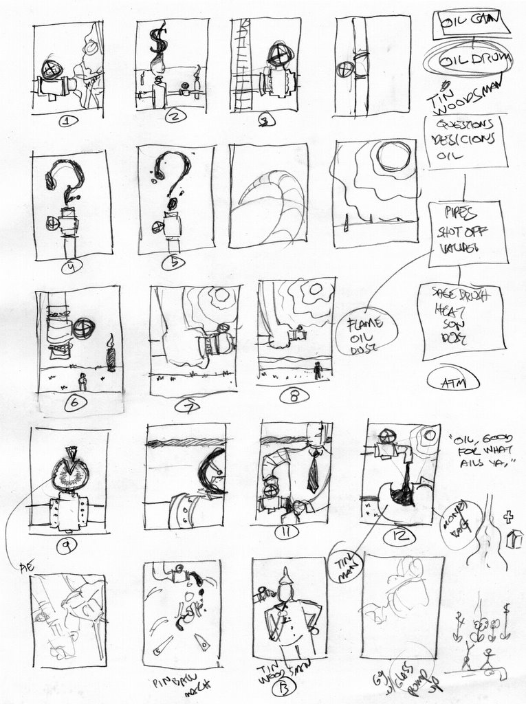
My initial layouts sucked!. They gave me a good feel for how the story should break down, but they struck me as uninspired, dull and less than worthy of the story. By un-tethering myself from slavish adaptation, I found ways to express (in the layouts) the tension between the characters and the somewhat surreal nature of a story within a story within a story!
the images above are my tests for art style, inks adjusted and colored in Painter and Photoshop,and my first sucky attempt layouts. Right now I'm changing more narration to dialog and doing more layouts.It's happening fast, I'll do my best to keep the posts coming.

Thursday, October 18, 2007

Three Months at McSoft with images!


Finally I can show what I did while at Microsoft. I consider these "Image design" and not so much illustration because there were things to consider and, approaches to, the visual that were outside the normal realm of illustration and somewhat in the realm of design. There was even a little consideration to user interface.

The first two are images for Prom. One shows the main art stripped and the other with most of the type and modules in place. We also worked the modules, some more elaborate than others, active and inactive, selected and various states of the links and type. Yee ha!

Next is Superbowl Party. I like the theme, but anyone that knows me, knows I am not a sports fan.

Moving along to Valentine theme. This stripped main art was a fun trick. My starting point was the title graphic for "I love Lucy", which I think was a heart on satin. I created a satin background. This is not a photo. All the work we did had to be free of all rights restrictions. No stock art or illustration. (also no words or language, international market you know.) And I never did anything in my own style(s).
The velvet was total CGI. So for all you lovers out there if you need that satin feeling, give me a call. I'll post more themes later. You can go to Windows Live Events create an event, and see all the themes.

Monday, August 06, 2007

"Out in the West"


These are four pages from a comic book short,"Out in the West" I did for Dark Horse Comics. The art is all black and white airbrush. I wanted it to have a Howard Hawks/John Houston feel to it. There are references to a lot of Western stories, some fiction and some fact in it, which prompted one critic to refer to it as a "Western fairy tale". However the title is a tip of the Stetson to "ElPaso" by Marty Robbins. The other four pages include a page that mirrors the one here of the Sherrif that features a outlaw who is more in the spaghetti western mode. If anyone would like to see the entire story, I'll scan the other four pages and post them. When he saw the rough sketches I was doing for this Chris Warner wanted to title it, "Slap leather!"

Saturday, June 16, 2007

Flaming Summer Nights!


I did this illustration a while ago for Seattle Magazine. The story was about a writers memories of summer camp in the islands of Puget Sound. In the good ol' days you could do whatever you wanted in an editorial piece. In this one I have kid running with flaming sugar torches! More commomnly reffered to as roasted marshmallows. Is it just me or does anyone else kind of see the similarity between a marshmallow on fire and napalm? Both kinda sticky and hard to put out. Great thingfor kids to have while running around I thought. I hope this sort of captured that fun(?) Lord of the Flies vibe.
Live fast, draw hard.

Thursday, June 14, 2007

Playing the hand delt.


Needed to post and needed to sketch, something! Came up with this idea while doing yoga. It's for the words "Suit" and "Pencil" as part of my first posts to Illustration Friday, and Sugar Frosted Goodness.

Thursday, May 17, 2007

Gene Autry finish


Okay, I'm posting this even though I'm not completely happy with it. I think it turned out fine, just not what I had in mind. Sometimes, if I don't have a clear vision of what I want to see, the illustration gets away from me. In this case it looked best as a piece of line art, it's first incarnation. I was thinking of finishing it in airbrush then adding color digitally, but second guessed myself into trying to complete it all digitally. Top it off with some unseen drawing boo- boos and there you have it. A lot of hustle on the back end to make it work. It does get across the message/felling I wanted, that of a more wolfish Autry, but what I see is all the correcting I had to do and the illustration it could have been.
I think any creative goes through this. We see not what we have created, but what we didn't create. A wonderful illustrator by the name of Fred Pfiffer went through this at the end of his life. Not to worry, I plan to be around to make many more boo boos like this.
Live Fast, draw hard.

Thursday, May 03, 2007

Flash up

This is my first Animation.

Friday, March 30, 2007

Das Boot Illustrations


These are the rest of the samples that I did for a boot company. Not a real gig, but I liked them enough to want to show them. Not quite portfolio ready, but in this informal blogosphere they fit.

I looked at a lot of different boot designs to get an idea of what was being done, and then let myself play. Most of these ideas started out as visual puns. Water, fire, running and flying… I tried to be playful and have fun. I know I had fun, so I wanted to share.

Mavis Staples: The Gospel Finish


Here it is, the finished Mavis Staples Illustration. I had some problems wit the values, I'm a bit rusty with the airbrush. So by way of practice, I will be doing the Gene Autry illo with airbrush. I think this is close to the feel I wanted, the power seeming to both come from and to the figure. The faint glow around the figure ads a touch of the Divine in an old poster sort of way. The glow, colors and texture, I hope, have somewhat of an old Southern feel. Not too old I think but, I hope it takes you back to the 60s, and the A men corner.

Wednesday, March 28, 2007

Mavis Staples: Cutting frisket


At this point, cutting frisket, I try to keep in mind not to clutter things up with cutting a lot of shapes that will need to be sprayed. Keeping it simple and value areas few so the piece holds together instead of looking like a jumble of cut outs. Also it really focuses the concept. I want the illustration to be strong, simple and poster-like. Also I think about texture while I'm cutting, should I use pressure or spray-thrus, and what that will add or distract.
Live fast, draw hard.

Tuesday, March 27, 2007

Draw Fast!


Ha! Here is a boot I designed for a well, boot company as a sample pitch. I was asked o submit samples for their kids boots and I did this. My thinking was, what kind of boot would I want to wear if I was a kid, in the rain, running and splashing, and jumping not quite over big deep puddles. Man, if they ever make this boot I will get a pair. Once the idea was there it took me about 30 minutes to do the vector art. With a neat work-around to get the thick key line, for the extra cool big water repellent look.
I'll post the rest of the samples later today.
Live fast, draw hard.

Gene Autry Editorial Illustration: Back in the saddle again.


A few years ago, as part of teaching by example, I kept every rough thumbnail and every sketch I did for every assignment for an entire year. It's bound into a nice 2 inch book that was a great teaching tool, and part of an exhibit of my work. Keeping my roughs made me more aware of what I was putting down and what I did at that early stage. Not to mention, force me into coming up with more than one good, usable idea. The notion that I would be keeping them lead me to take more time and care in drawing them, so they even look nicer.
I'm keeping this in mi ind with Gene Autry. I have heard two schools of thought on the number of concepts. A) After years of experience, you usually get it right the first time, so one is enough and you refine that along way.
B) The more the better. Anyone can come up with one good idea, a true pro can come up with more.
Well, sad me, I always get a bit rusty if I haven't done an editorial piece in a while and it's been a while. Seems like I have one idea. I like it, but it's only one. A tight close up of bad boy Autry in a dramatic composition that throws attention to his face. His face that has a cock-eyed grin. The article talks about the early, rougher, bluer side of Autry, different from the singing cowboy we all know and love. I had hoped to come up with more concepts. I have some flexible time coming up this weekend, so I may sit down again and give it a whirl.

Mavis Staples: The Gospel Illustration


Much time has been spent, lately, doing illustrations that I can't show because of NDA or corporate stuff. What I can show is this, an in progress of Mavis Staples for No Depression Magazine. This is fun, after many months I'm back to the black and white airbrush. Simple and clean, well okay not clean.
The big thing about this piece is that I have given in to the impulse to not do a close up of a singer. The idea I had was more about Mavis in context of what she's singing on her new cd (Gospel and Civil Rights era songs), and how she sings, with much power and emotion. So my idea shows her as a singer and as a conduit of a higher power. A bolt of lightin' from the Lord, or is she exploding with power herself? That's what I wanted to get to. Power, but from which direction, or both? Also, I'm still working through my love of Aaron Douglas.
At this stage (sketched, scanned, and value study done, I'm about to cut frisket today!)the illustration is free of cluttering detail, I'd like to keep it that way. My temptation is to ad bits of line swirling through describing stuff that may be clear enough anyway.

Also today will be concept work on an illustration of Gene Autry. After reading the article there is good reason to not show/refer to him in the Gentleman Cowboy manner.

Monday, February 26, 2007

A blog is a dog


Most of the work I've done lately has been for big companies, Microsoft, Hasbro, Wizards… not that I'm complaining! The work has been been fun, financially rewarding and in various ways a creative or artistic challenge. The down side is that I have to wait for approval or until the project is "live" before I can post anything on my blog.
So what can I post? How about this. This is a small spot illustration done for Washington law and Politics for an article about a bill that would allow pets into bars. I inadvertently made this screen shot. The concept owes a lot to cartoons of the 50s and 60s and the fact that I was wanting to play in Illustrator for a bit. The concept isn't very strong but it's a bit of an exercises for me as far as color goes. (see my previous post about using every
color!)

Friday, February 16, 2007

Three months at McSoft Part One

So, where did I go for those few months late last year? It's all a bit TOP SECRET. After a dreadfully slow period that followed my annual Spring teaching stint, I wound up with a contract position at Microsoft. What I was working on should be released soon, so I think I can talk a bit about my experience, which was pretty good. This post hopefully will reappear once the project is launched and I can show the art completed.

HOME AWAY FROM HOME
The first thing I encountered at Microsoft was that the department I worked in wasn't set up the same as my home studio. Go figure. At home I have my iMac, Wacom, scanner, printer, and second monitor, a drawing table, light table, big ol’ work table. Plenty of sloppy conventional art/illustration materials. Things such as ink, paint, pencils pens and brushes. Not too mention my library. (I have way too many books to just say "books".) No such thing there in the Customer Design Center, CDC for short (or Center for Disease Control as my wife called it). They had a scanner, (in another area) and they sprung for Wacom tablets for myself and the other Illustrator/designer working on the project. As one would guess I had to work on a PC. So, most of the day I sat at my desk with just a couple of sketch books, the Wacom and “Dell the Funky PC" (my pet name for the Dell computer).

DRAWING IN THIN AIR
I was aware that some illustrators sketch directly with the tablet. I had never done that because I thought it would be much more difficult to actually start art on the tablet. There's a big difference between sketching on paper and on a tablet. I quickly had to overcome that, or face lugging the scanner across the department every time I wanted to scan something. I made a special Photoshop brush with eraser settings that looked and acted like a nice soft pencil. WOW, it’s fun. Forced to use the Graphire tablet exclusively, I came to really love, and appreciate it. I realised that I had yet to touch on all the things I could do with the Graphire more so even with my Intuos at home. I used layers like tracing paper. Revising a sketch, making alterations and such until I was happy. You can’t really turn the tablet like paper (Okay not in P-Shop, but you can in Painter and that makes inking, say a "Daredevil" comic page, a blast! But that's another post!) but you get over that once you get into what you’re drawing and focus on making a picture. The hypnotic lure of drawing!

PEOPLE WHO NEED PEOPLE
Freelancers work alone, very alone. At Microsoft, I worked with a lot of people. Oddly enough, because of where my desk was, my back was to most of them. After years of not interacting with people I felt like an oddity. It was hard for me to start talking and just as hard to stop once I got started! I tend to put my head down and work like a hamster in a ball, pushing through to the deadline, which was 4PM, when my vanpool came to get me for the hour long commute home. (Tacoma to Redmond and back again). I confess to not being the most socially adept person and I have long thought it a failing of mine not to be a sparkling conversationalist. I admit to erring on the side of "stoic worker bee" mentality. But being in that context, talking with people, listening to people and making idle chit chat around the "water cooler" and trying to take lunch it was a very good thing for me as a person.
When I first entered the CDC, I noticed it was very quite, and a lot of people had headphones. I thought they were listening to something having to do with work. Silly me, they were playing music. I quickly logged on to Pandora and set up my SnoopDogg, Propellerheads Big Audio Dynamite, Prez Prado and Louis Prima stations.

GO TEAM
There were two other illustrators on the project. One was moved onto another assignment and the other illustrator, Karen Kirchhoff, and I finished the bulk of the themes. We had weekly meetings with the UI designer, Cinthya, (who is Japanese but has a heavy Spanish accent, 'cause she's from Peru. It threw me a bit, but in my case most people don't expect to see a "pro basketball player" when they look for an illustrator, or one that sounds like Kermit the Frog for that matter. Whatever…)
Karen has a different approach than I do and it was eye opening to see her solutions to some of the same assignments I was doing. I learned a lot about my work and what I needed to do, from the meetings with Karen and Cinthya. For one thing I didn't need to use every color! Karen's work is more thoughtful and, gulp, more "artistic" than mine, which tends to be like a hammer on china. There was one person I had known previously who was in the department, Marty. He's great and was invaluable in making me feel like part of the department and answering technical questions and questions about "campus life" at McSoft. Others around me were Greg; who is uncannily like my good friend Jesse Reyes, Jennifer; who has a keen eye for illustration and some really cool ideas about UI, Francie; the only other person as quite as me, Chris; who is a sarcastic hoot and half and got there almost as early as me, 7AM! And lastly, the guy who showed me how to refill the coffee maker. Ah the coffee machine, it was an old Farmer's Brother machine that was later replaced by a spankin' new Starbuck's one-touch-instant-robo-brew-by-the-cup-thing, that made all manner of hot drinks. All the drinks were free, and one day there was an ice cream truck, well more like a motorcycle with a side car, that came around with free ice cream. Another day when I arrived at 7AM, they had placed a espresso stand in the lobby and all the espressos were free, all morning! After years running upstairs at home to reheat my coffee, I felt I had died and gone to double mocha heaven!

I SENSE A THEME HERE…
When they hired me they wanted an illustrator to make pictures. What I actually did bordered more on design. We (Karen, J.D. and myself) built themes. For a lot of reasons we had to be original but not obtuse, not create all the art in any one style. Since I was working for the MAN, I certainly didn't want to use/give away my own style. Not everything was strictly illustration. I did a lot of illustration but also a lot of design and iconography. None of it with type. All of the work is unrecognizable as mine even the illustrations I did complete. As I learned more about patterns and the technical limits we had for cutting assets, I began to experiment more and had a great time pushing the boundaries of what we could do. Also got deep into working with both Photoshop and Illustrator side by side, back and forth.

I would start my day with about two or three themes that I wanted to get done to stay on schedule. In my sketchbook I would do a few very rough thumbnail ideas and make notes as to what I wanted to see and any stylistic riffing I could do. Then it was onto the web to find reference.

We kept in our minds that anything we did had to be very clear of any sort of copyright infringement. I would even go with something I though wasn't as good if it was at least original. After that, about 8AM, I would start sketching with the Wacom for the main image or pattern tile to be used in the background or header bar (go to spaces.com to see what I'm talking about.) By the time Greg got in I'd normally have the image about half done, or at least looking good. Once the main image was done I could use that to set my color palette. Before lunch I would start sketching for the second theme of the day, being warmed up, full of coffee and all. After Lunch I would begin the modules and create any tillable images or single image if needed. Most of these were better in the idea stage than in reality. We had severe size limits and that with resolution made small images almost a waste. Near the end of the day I would be developing color ways for the type, selected and unselected, apply those and double check for legibility. Legibility was a big issue for me since my color sense was so, um…freakin' aggressive! Sometimes they were too harsh and other times all a bucket of mud. Karen's work was a beacon of tastefulness and Cinthya was good at pointing out what needed to be changed, nice art direction. At the end of the day I would save the file and pick two more for the next day. Given time, both Karen and I got into the habit of creating several different versions of each theme for client approval. Sometimes we had four versions for a single theme. Once I had two solutions with a couple of versions on each! Got to be kind of fun. Most often they picked the first versions anyway, such is life…

DO WHATCH LIKE
Creatively we were left alone. At first we were given a list, with some partially completed by the previous illustrator, J.D. Then Karen added to the list and the I added to the list! Shortly after I arrived J.D. was pulled of the themes and onto something else. For a week I worked just to streamline the template we had and get a handle on the technical constraints since the process had not been fully tested. Once I had the template file cleaned up and stripped down, it was time to get busy. Being the illustration fool that I am and given that they didn't want any particular style it was a blessing to go romping through the history of design and illustration. I love to do research and so I allowed myself the luxury of going deep. It might not be readily apparent to the casual viewer, but I like to think good research is what makes the image rich and appealing and supports all the creative decisions along the way to a successful graphic.

Recently I looked back over my 13 sketchbooks that cover more that 13 years. I was struck by the swing from style to style, medium to medium that is there, and not in my paid/published/commissioned work. Each page was a small experiment, a small adventure that lasts anywhere from a few minute to s few days depending on how long it takes to complete the page. In a way, each theme was the same. My range is something that few art directors have seen or expect from me.

For three months I didn't have the usual freelancer concerns of looking for work! That and free coffee!
Before I end this I'll answer the one question I get asked most. Yes, I did see Bill Gates, up close! I was getting into the Vanpool van there was a car next to it. Two guys got out of the front and walked past me, a third got out of the back and started to put his jacket on. I was about 10 feet away from him. I was going to say hi because I thought," He looks familiar, I think I know him." It was Bill. We nodded and I got into the van. As we were leaving, the traffic was bad, and one of the other riders, Beth, said it was all Bill's fault (Bill was also the name of the van driver) I said ," Yeah I just passed him."
"Bill's driving." she replied, "what do you mean?"
"No, Bill Gates." I said.
"Where?"
"He was going into the building."
And I was on my way home.


Well, that's about all I can say for now, the rest is TOP SECRET, so you'll have to wait until Part Two. Next post will be about something I can show!

Live fast, draw hard.

Thursday, February 01, 2007

Three months at McSoft Part Zero

Sorry to say that I have been informed that since the work I did at McSoft has not yet gone "live" I can't post any of it. After some review I may post the written portion again.
Thanks.

Monday, June 12, 2006

"Blade of the Immortal Pin Up", Part whatever!


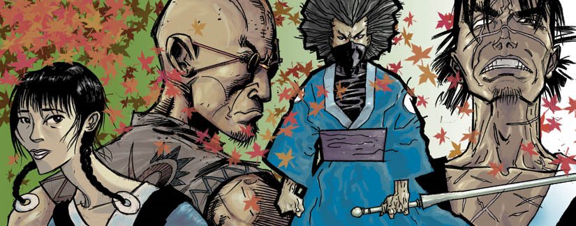
Finally, the "Blade of the Immortal" pin up is done. This is a prime example of what I like to call being an Illustration hog. The back cover art of four consecutive issues of the Dark Horse manga this Summer starting with issue #117!

I had several goals with this piece, most of which were met. The leaves are close to what I wanted and each section has a slightly different feel to the coloring. My original intent was to stay loose and, if I had the chance, to work in Painter. Alas, I had to finish this in P-Shop. Looking at it now I wish the leaves had morphed into snowflakes so as to emphasize the seasonal part of the concept.

Thursday, April 27, 2006

Illustration Class Final Assignment

Portrait of someone famous or yourself, no fictional characters. The size is 9 by 12 inches, horizontal or vertical. The illustration is full color, which as most of my students know means any color, in any combination or limitation.

So, to the meat of the matter …
I challenge you to create a portrait of this person without using a likeness. Can you show me who this person is without a likeness? So, you may or may not use their face. In any event the viewer, me, should learn something about the subject that is not common knowledge, or learn something new about the person more than the obvious. No singers with microphones! I further challenge you to use symbols and objects to create or suggest an essence of the subject and add to the understanding of the illustration.
The final presentation must include, the name of the subject, pertinent and relevant facts.
Along with the final art include your roughs and sketches. There is no deadline for roughs or sketches this time, but I encourage you to submit them for critique, as you would for an art director to review.
Finished art is due by the last day of class during finals week, or anytime before.
Live fast, draw hard.

Thursday, April 06, 2006

Petite experiments.

I've been looking back over a lot of my work lately. Sometimes depressing sometimes invigorating.

Looking over work, you notice the little changes that mark tuning points in your illustration. Sometimes visible only to the artist or a tuned in art director. These petite experiments can appear small but may have large repercussions.

My experiments have been with collage. An effect that I have incorporated, using what I have learned in Photoshop. Also not being a bull headed neo-Luddite. Just kidding.

My in-house Art Director has been after me to experiment with collage for a while now, and recently suggested that I do so to bring in more texture. I admit I was reluctant, since to MY eyes, the airbrush work had plenty of nice texture as it was. But I thought better, and decided to experiment.


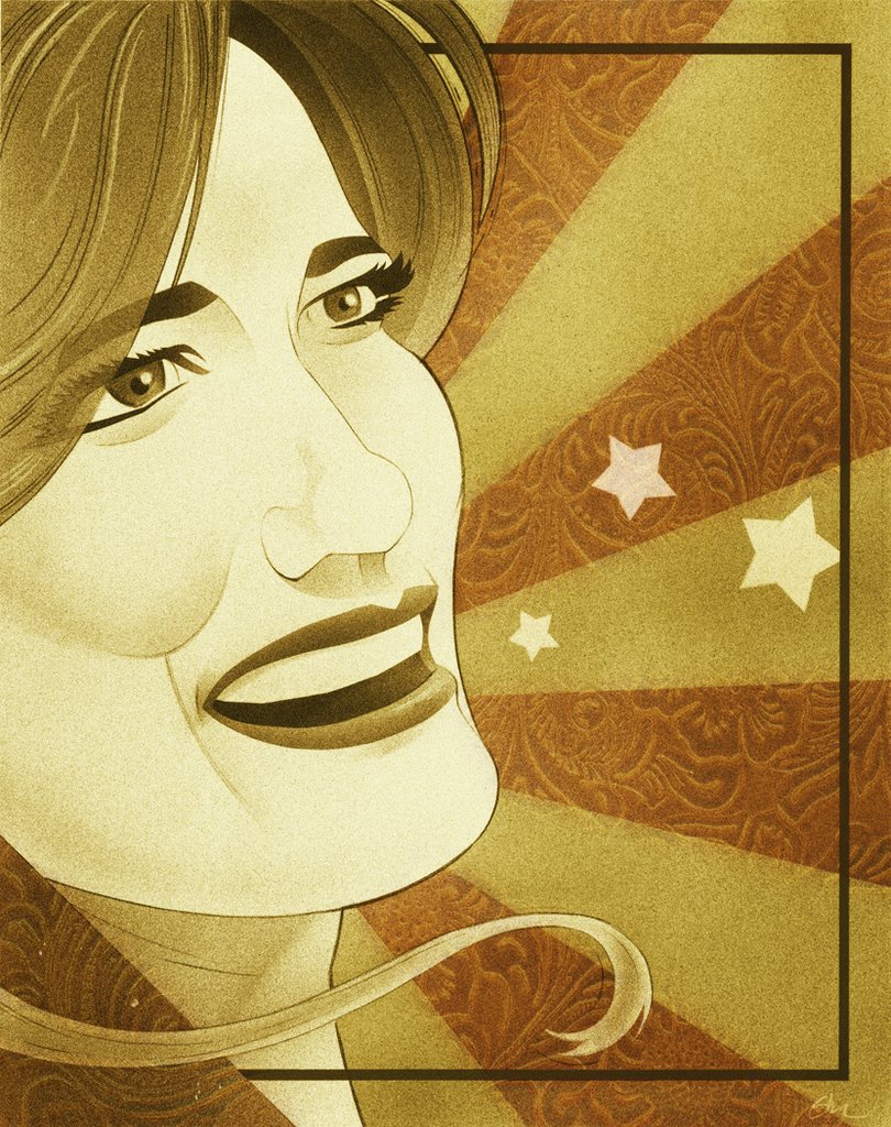
The first experiment was in the illustration of Bluegrass singer, Alicia Nugent. I brought in a texture, the embossed leather pattern, that was added specifically to focus and enhance the concept. The color was a "happy accident".

In the illustration of singer Cassandra Wilson I wanted storm clouds and had planned to airbrush them. But I HATE my clouds, I'm never happy with them. So I decided to get good photo reference. The reference looked so good I thought, why not just place it over the tonal area. So I did. I had to actually use two masked layers to get the look I wanted.

Both uses of collage in each illustration were relatively small and insignificant…to most everyone but me, and my In-house Art Director. The petite experiments worked, I liked the results and the journey along the way. Definitely invigorating and fun.
I'm sure I'll do more petite experiments.

Live fast, draw hard.

Friday, February 10, 2006

The Rules of Art Direction


A while ago, when I started teaching Illustration, I realized that while some of my students wanted to become illustrators, others were planning on going into design. I also realized how at times younger art directors, and a few older, seemed at a loss as to how to direct art and work with illustrators. In school you’re taught to be an illustrator or designer, but not how to work with one another. So, I asked a few art directors I knew, who worked well with Illustrators, if they had any rules for art direction. What follows are their answers.

I plan to expand on this and collect as many rules as I can from other art directors and illustrators. If you have any comments about this post, or rules of your own, feel free to chime in.

The relationship between the art director and illustrator can make or break both the design and the illustration. It’s a living thing that holds the potential to create great work. It’s a part of the business that seems to get little attention in schools and in real life. I think we can change that.

Live fast, draw hard.

-----------------------------------------------------------

Florian Bachleda
Vibe Magazine

Well, a lot of it depends on who the illustrator is. In many ways I’ve always considered the AD/Illustrator relationship to be like that of the film director and actor. If you’re a good director, you tailor how you deal with the illustrator, depending on their talent, temperament and strengths. Overall the director should point where he or she wants to go and what solution needs to be solved, then leave the rest to the illustrator. Here’s point A and point B, take me there. If you don’t trust your Illustrator, you shouldn’t have picked them. This is assuming there is not an overbearing editor somewhere who can ruin the process entirely—no matter how good the AD and Illustrator are.

Half the battle is choosing the right Illustrator- and not always the most obvious- for the assignment. At New York Magazine, Bob always had us choose an illustrator that didn’t automatically come to mind. For example, we would have Steve Brodner do concept illos, and Sue Coe do likenesses. Again, The editor is the most important factor here—if they’re brave enough and trust their AD to work like this.

An illustrator should never, ever call up an art director and ask him or her for information such as the address of the magazine, the spelling of the art director’s name, who else is in the department, etc. Basically, any information the illustrator can get on their own from some basic research (picking up the magazine and looking at the masthead, address, etc,) It may sound snooty, but to me it says this illustrator is unprepared.

----------------------------------------
Katherine Topaz
Topaz Design

1. Don’t assume anything. Be clear. Use specific language, i.e. don’t say "Okay, you want it to look 'hip', " say, “Okay, when you say hip you mean like…”

2. Sometimes art directors have no clue what they want and they want you the illustrator to come up with something, but art directors usually have something in mind. Make sure you understand which is the case. If the art director wants you to come up with the concept, make sure that is clear what they are asking for, because obviously you are more vulnerable for the amount of alterations needed. If the art director knows what he wants, then, listen, ask questions, be clear and specific.

3. Art directors want to give criticism. Make them feel comfortable by not being defensive. The more the art director feels comfortable, the more the art director will give—which is good, because the more they talk, the more specific and clear they are, and the happier you are with the end result. The easier the process is, and the more comfortable the art directors are with the process the more they want to use you again—or recommend you.

4. Don’t assume art directors know all of your styles if you have multiple styles. Send samples. When art directors talk about “your style” make sure sure you know which “style” they are talking about. Many art directors think of illustrators as having one style, the one the art director is familiar with. Thusly they expect that style when they assign work. The art director might not assign other projects because he doesn't know the illustrator can do that style. On the other hand, the art director won’t assign a project because he knows the illustrator will try to “talk them into” their other style which the art director may not like.

5. Remember the art director is more aware than you of internal politics. For example: if the editor likes or hates illustrations. Sometimes this means the art director knows what types of illustrations can be used in order to get more in the future. Or what styles/elements/ colors set the owner/client off. See #1.

6. Don’t assume they don’t like your work because they haven’t used you. It might be a situation where they’re waiting and hoping, months (and yes, years) might go by. Make sure you continue to send samples and keep your contact number, email and address information current.

7. Do not bother them. Again, you have no clue what’s going on at their end. So contact them in non-threatening ways. E-mail is good. You can call, but be aware of their deadlines, press days, etc.

-------------------------------
Bob Newman,
Fortune

It’s funny, because my only philosophy is to call the right people, people I like and like working with, and give them as much freedom as possible. If there’s anything I can say that works best from my end is that an art director be as clear as possible about what’s wanted stylistically and content-wise. I try to give some direction in terms of the illustrator’s style, especially if they have multiple approaches (which many do). I also try to suggest they send a few sketches…I usually say, “Do your thing, send whatever you want for sketches, but also do something relatively straight-forward for the editor.” It’s great for me to get a few options, let the illustrator stretch out, but also have something safe. The other thing I try to do is let them know when the illustration really needs to fit the design of the page: it needs a background, it should be a silhouette, the size and shape really matters. And on the flip side, when the page is more free-form, I like to tell them, let me know what shape works best for you. I always try to think out trouble spots ahead of time, and really work hard to find an illustrator who is just perfect for the assignment.

I think it’s important to let illustrators know that they should be realistic about their talents and skills and who they approach for work. I see a lot of illustrator books that are sent to a magazine that would never publish work in their style. Also, a lot of illustrators rush out and show their book to people way too early, before they have skills and experience necessary to work for that magazine. The problem with this is that you may only get one chance to show or drop off your book somewhere, and it doesn’t help you if it’s not together. You’re better off hustling at smaller, less prestigious places where you might actually get work that can build up your book and your experience. Some tear sheets from The Village Voice or Guitar World are better than a rejection from Rolling Stone.

Art directors like to see illustrations with ideas, or style, or great caricatures. But most of all style. The most important thing for a young illustrator to work on are style, technique and ideas. The interesting thing is that all art directors have different approaches…some would rather see more style, others more ideas.

Nothing beats professionalism. Anyone who wants to get work as an illustrator needs the basics: email, message machine, fast reply to phone calls, fax, etc. From a practical point of view, it really helps to get gigs if you work digitally or can transmit your work digitally.

---------------------------------------
Jesse Marinoff Reyes,
Penguin USA

1) What can I say? First off, I don’t mean to state the obvious (but I will anyway), is that art directors (ADs) and future ADs should always be clear with their illustrators. Too often, there is a lack of clarity which generally implies that the illustrator should “do their thing” but this lack of clarity may not mean this. It may merely mean that the AD is not a good communicator (despite egotistical leanings to the contrary). It could also mean that the AD is unsure of what’s expected by his superiors (and editor, or a publisher—or in my case—an author and the author’s agent). Because time is finite, clarity in instruction can prevent unnecessary delays and prevent misunderstanding.

ANECDOTE: I know this because I have been put in a position a number of times in the past to second-guess another AD when an illustrator pal gets confused at the 11th hour, when they can't contact their art director.

2) ADs need to have an air of authority in their presentation to the illustrator. If the illustrator doesn’t believe this, the deadline can become jeopardized by a careless illustrator and an AD who is too distracted to notice until it is too late. The criteria in #1 is helpful in this, but I would also add that the AD knows how much finite time exists between the submittal of art and the time it takes to design around it in time to make the press deadline. Sometimes illustrators have some leeway (as in formatted magazine pages) to turn in work closer to the printing deadline, but again, this discretion is up to the art director and no one else. The illustrator has to understand that part of their being contracted to work has to do with their ability to get the job done on time.

ANECDOTE: An illustrator I knew of became too comfortable with the amount of time allotted for revision, and came to believe that art directors gave “fake” deadlines. The deadlines were certainly not “fake,” but the illustrator made the mistake of arrogantly taking the time for himself without permission (turning in the artwork later than scheduled). The illustrator’s livelihood depends upon the level of trust that the AD has in him. Without that trust, there is no relationship—and no work.

3) The AD needs to know “what’s going on” in the art and design and illustration world. If an AD wants to work with certain illustrators, he needs to learn about them (if possible). Their style, their body of work, their reputation. The annuals are a good place to start, but only as a point of departure. Sometimes the best illustrators are not the folks you find in award books. Does the AD’s body of work mean that to execute his particular vision at a particular workplace at a particular time mean that the AD needs to suss out his own brand of illustrator? Maybe he only wants to work with underground cartoonists, or classically-trained illustrator-painters. Maybe the one category was great for that AD's philosophy for the first 5–8 years
of his career, but the next job demanded a different vision and he had to become familiar with the latter style and it’s adherents. Maybe it’s good to be AWARE period. Knowing what other art directors are doing is also helpful, but it can lead to “Flavor of the Month” syndrome—where everyone seems to be working with a particular guy all at the same time. Is this because that illustrator is “hot” ( I really hate that) or really because “everyone else is using him.” But does any of that mean the illustrator is any good or not? Gee whatever became of “so-and-so…”

ANECDOTE: This is especially useful in determining which illustrators are suited to a particular job. Or how illustrator “A” should be handled versus illustrator “B” on the same kind of job. For example, some illustrators are great conceptually. Some have superb design skills within an illustration context. Others have great style and technique, yet don’t want to have to think beyond a certain point whereas others thrive on the “stretching. Glenn Hilario is a good “stretcher.” He can place himself into a design context. Scott McDougall prefers to be told what he needs to do and what he’s being fit into. It’s not that the one is superior to the other (sometimes you want somebody who just wants to take direction; sometimes you need all the help you can get), it’s just that knowing these differences can help in a particular context, solving a particular problem or set of problems.

4) It’s helped in my case that I’d spent time as an illustrator during my career. This is not an absolute requirement to be a good art director, but it helped in my case. I kinda knew if someone was begging for more time because he really needed it—or because he’d blown off the deadline until it was too late. At times former-sometime-illustrators can tend to impose their personal style preferences on an illustrator (I’ve seen this), in other words, use the illustrator as a “wrist.” I’d caution any future ADs with illustration backgrounds to have more respect for the actual talent doing the actual work. Let that background help the AD/illustrator relationship—not hinder it.

5) Be AWARE. Not as in criteria #3 per se with illustrators and their work, but culturally, socially, politically, historically. Read. Know about things. Being a cypher is fine, but it can only take you so far in problem solving.

Let the illustrator BE who they are. What does this mean? part of the AD process is picking certain talent to solve certain problems. For example, if a collage artist is selected, it should be because of that artist’s ability to create an arresting image through collage—but some bad AD’s or “others” in the food chain will use that as an excuse to force the collagist to find
every element of the story and cram it into the image (I’ve been in this unfortunate situation as an illustrator). Understanding that certain illustrators and/or certain styles are desired to solve a problem, it’s in the best interests of everyone concerned that the AD be sure about this approach—and then let the talent thrive in the situation. Knowing that Steve Cerio is great with counterculture imagery helps in just turning over those kinds of assignments to him, and letting him “do his thing.” This, of course, has a lot to do with criteria #1 above (clarity), but when you are sure of this then the process can become sublime. Contrarily, if you hire a Gary Panter to render an assignment better suited to Bernie Fuchs, then the result (and the political fallout) will not be pleasant for anyone concerned—and because the AD should’ve known better (and didn’t act or think), the relationship is soured. Sometimes this is because the AD is too embarrassed to contact the illustrator again after a bad experience, even if it’s not the “fault” of the illustrator.