
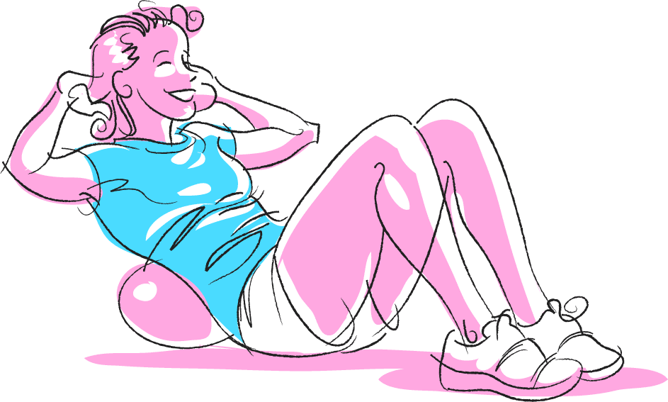
I'm working on a casual game UI piece. I've posted it here temporarily for feedback. Let me know what you think. My usual notes and notes about animation in Flash, with movements done in blue.


 This didn't start out to look like Sean Connery, but hey, none the worse. I stopped here because I accidentally screwed up the Sketchbook Pro file.
 This is a sort of live test, but I will be posting all my 2009 Stantas!
 There are/were three major players in the scandal, but they only wanted to focus on two, and I HAD to draw the pose "Link" (Link, Pete and Julie! get up on your Mod Squad!) was in! So…
 After the rough I move to Painter, where I "ink" the art. I still do love inking conventionally, but I have a thing for what I call "The Impossible Brush." The ink never runs out and you get to Command Z any messed up strokes.
 Then, over to Photoshop for the colors. I could color them in Painter, but Photoshop is better and faster at total image manipulation, and I'm used to the interface.
 Colors and textures are added and for this an additional mod background and type.
 For the NYC Tugboat Strike the concept was more metaphorical. My original idea was to use a version of Tommy the Tugboat, or more like his New York cousin, who's on strike. The AD didn't think there was anything funny in the article so we were going to go with a straight shot of a tug with a strike banner. I though the banner would be too small to read and then had the Eisner-esque idea of putting it in the water.
 Whompped it up in Painter with "The Impossible Brush"…
 …and then colorfied in Photoshop.
 One of my first real gigs I got excited about was illustrating for the Village Voice. I was just little ol' me in Tacoma, doing section covers, spots and feature illustration for one of the hippest, toughest, newsweeklies in the country. I learned to work on New York time. It helped that I was fast and worked well in the morning. I did a lot of stuff, airbrush, line art, all really nice black and white. People moved on, design regimes came and went. I stopped illustrating for them but kept in contact. I like to think I got better and faster (and stronger, like the Six Million Dollar Man) Three weeks ago one of the Voice art directors contacted me. It was Thursday afternoon, they had a column (written by long time political reporter Tom Robbins) that needed an illustration. Sketch by Friday, finish by Monday, end of day… New York time. Well, yeah, I did it!
 Next illustration was of New York Congressman Nadler, a big, big fella. He was to look friendly, but imposing, not cartoonish or caricatured. There's not much about ACORN in the illustration but they are an important part of the article. We thought subtlety was best.
 Finished yet another storyboard project. Similar to the last, all top secret. I did make good use of Sketchbook Pro. All the line art and roughs were don in Sketchbook Pro, the color was done in Photoshop. I could have done the color in SBP, but the look I wanted was easier to do in P-Shop. At least as far as I know. Sketchbook Pro has some cool features, including a rotate feature that you can do thru the interface or in set increments with a key command. The brushes have been expanded and are customizable. This may all be held over from the previous version but it's all new to me. It's not as fast with straight cutting and pasting and I have yet to find a way to really transform objects. But for basic drawing, it's faster and more responsive (at a speed) than P-Shop or Painter. Now Autodesk can send me a check.

 Well now, where I…
 The cover art was essentially done (see my roughs above, done for the ad illustration). I added title lettering under the helpful eye of The In House Art Director. Then I began the pages.
 In page one, top panel we see the monster, Irk, because he's irksome, chomping on a cell tower. I did my research on cell towers believe me! In drawing Irk I kept thinking of the monster in "Nightmare at 20,000 Feet", part monster and part gremlin. A corner-of-the-eye thing, well not so much in the end! He has cooling rods in his back (ouch!) a hammer, which shows he does damage, and feet that allow him to grip and scamper up towers. At the bottom we see Vicki, the female lead. I wanted to have a character that would interest the readers (mostly male, tech, engineer types) and act as a counter to the main hero. I based Vicki on Tina Fey, Geek sex symbol. In the bottom panels she observes Irk and calmly calls in our heroes. A color note; the action starts at night and ends at sunrise. As we all know, monsters and gremlins (and freaks) come out at night. The change in light sets a definite time period and pace for the action. Also, this allowed me to do some subtle color stuff.
 Page two introduces our heroes, Doc and his sidekick Volt, and sets up their characters. This would not have been possible without the extra pages/space. This page is a complete luxury. The only essential panel is panel one, which shows the heroes flying in. About the dialog; I read up a bit on the actual technical jargon and from there created super-jargon and tech-speak for Doc and Volt. So, somehow, what they are saying should really make sense. Vicki's dialog reflects the real problems the product is designed to test and solve. In panel two I show Doc as being the cool thoughtful hero while Volt, my favorite, is the hot head, giving off electricity. His dialog is more aggressive. Their costumes riff on the difference between Silver Age heroes and Image era heroes. Doc echos Space Ghost if you look hard. Panel four has more reality than it appears. Volts dialog, the machines in his hands and the rack unit behind him were heavily referenced, and reflect what may really be done and used in a similar situation. Well I mean not if you had a monster on a a tower but just a problem with the tower. The color palette is pretty limited and I feel I did a decent job of restraining myself to a tasteful level. I tried to create a sense of light from a definite source and color.
 Page three starts with an unusual beauty shot of the product and our heroes, and goes into a harder ad pitch. All this followed by Volt blasting off to take care of things the old fashioned way! Which is what the product offers a streamlined alternative to. Panels three and four are just a little humor that I thought alleviated the hard sell of the piece and added a bit to the characterization while keeping the story moving right along. Doc is drawn an bit more cartoonish and breaks the panel border to add to the effect. It also lets the reader in by breaking the Fourth Wall.
 Page Four takes two panels to develop Irk. He's just a simple, hungry monster with a desire to be his best. Even though Volt took off first in Page Three, Doc is first up and everyone takes note of how well Doc handles the situation using the product. I'm not all that happy with the color on this page. I think the light coming from Irk being zapped should have been the main/stronger light source for everything on the page. I remember struggling with the colors in Irk. In hindsight it seems pretty clear what to do. The grass and concrete texture are made from using a scan of one of my airbrushed illustrations.
 Page Five has Doc take a little credit, basking in his superior intellect and promoting the BTS Master even more. You can tell now the sun is rising by the colors in the background. Irk is now more of a cute lil' gremlin. pointing to the happy light-hearted ending. The last panel has dialog the explains what would actually happen, the limits of the product, after it's use. Vicki's dialog shows her relationship with Doc, and Volt's is a double entendré. Both of which I thought would get cut, but didn't.
 I just found out today that in addition to winning the SPJ First Place award for Cartoons/Illustration in a magazine, Washington Law and Politics to be exact…
 that I also won third place in the same category! I think the above illustration won Third and the one below was First. I'm not sure because I often give the illustrations different names than the article for various reasons, the chief being the articles don't always have names or titles when I get the assignments.
 This doesn't explain why I have not posted the reminding parts of "Hey Kids Comics". I have been working for McSoft doing a bazillion presentation storyboards. All top secrety and hush hush stuff! I also completed a Flash animation test for a local game studio. All this has left me wanting to do something different. Single image illos or comics. However I have a gazillion more storyboards to do. So it's back to the drawing board. After July 4th, I'll have a better handle on getting back to "Hey Kids Comics"!
 In 2004 Camper Van Beethoven reformed and released "New Roman Times", a key track was "That Gum You Like is Back in Style." One of my first editorial illustrations was for an article in The Rocket, on Camper Van Beethoven. I was assigned that illustration by Grant Alden. Years later, in 2004 to be exact, Grant asked me to do this extended editorial illustration in No Depression for the new CVB release. How could I resist! Grant is one of my favorite, and best art directors working. The trick to this comic piece is how little I wrote! As I recall, I used the CD track titles and notes only, in order! A tribute to how well CVB did in creating a story. We wanted to to do a comic that had a bit of flavor from the old men's magazines of the 40s and 50s. You know, the ones where badgers are ripping the flesh of a guy.
 PAGE THREE
 However, PAGE FOUR starts with a good panel! Another spread, (Mmmm, gotta love those) Plenty of fun stuff to draw. Crazy old men, a craggy ex-spy and an Invaders type flying saucer! Topped of with better clouds than in panel three on the previous page. I think I obviously had a clear vision of what I was aiming for on this page. It seems to skip the herky jerky creative mess of page three and pick up where the double truck left off. I mean look, I even pick up the hippie theme and gradually disintegrate the figure over the remaining four panels. The lines going dead, images overlapping, breaking panel borders. Going from Captain America to a suicide bomber, all the while keeping it light and happy.

