Portrait of someone famous or yourself, no fictional characters. The size is 9 by 12 inches, horizontal or vertical. The illustration is full color, which as most of my students know means any color, in any combination or limitation.
So, to the meat of the matter …
I challenge you to create a portrait of this person without using a likeness. Can you show me who this person is without a likeness? So, you may or may not use their face. In any event the viewer, me, should learn something about the subject that is not common knowledge, or learn something new about the person more than the obvious. No singers with microphones! I further challenge you to use symbols and objects to create or suggest an essence of the subject and add to the understanding of the illustration.
The final presentation must include, the name of the subject, pertinent and relevant facts.
Along with the final art include your roughs and sketches. There is no deadline for roughs or sketches this time, but I encourage you to submit them for critique, as you would for an art director to review.
Finished art is due by the last day of class during finals week, or anytime before.
Live fast, draw hard.
Thursday, April 27, 2006
Thursday, April 06, 2006
Petite experiments.
I've been looking back over a lot of my work lately. Sometimes depressing sometimes invigorating.
Looking over work, you notice the little changes that mark tuning points in your illustration. Sometimes visible only to the artist or a tuned in art director. These petite experiments can appear small but may have large repercussions.
My experiments have been with collage. An effect that I have incorporated, using what I have learned in Photoshop. Also not being a bull headed neo-Luddite. Just kidding.
My in-house Art Director has been after me to experiment with collage for a while now, and recently suggested that I do so to bring in more texture. I admit I was reluctant, since to MY eyes, the airbrush work had plenty of nice texture as it was. But I thought better, and decided to experiment.

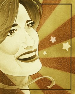
The first experiment was in the illustration of Bluegrass singer, Alicia Nugent. I brought in a texture, the embossed leather pattern, that was added specifically to focus and enhance the concept. The color was a "happy accident".
 In the illustration of singer Cassandra Wilson I wanted storm clouds and had planned to airbrush them. But I HATE my clouds, I'm never happy with them. So I decided to get good photo reference. The reference looked so good I thought, why not just place it over the tonal area. So I did. I had to actually use two masked layers to get the look I wanted.
Both uses of collage in each illustration were relatively small and insignificant…to most everyone but me, and my In-house Art Director. The petite experiments worked, I liked the results and the journey along the way. Definitely invigorating and fun.
I'm sure I'll do more petite experiments.
Live fast, draw hard.
Looking over work, you notice the little changes that mark tuning points in your illustration. Sometimes visible only to the artist or a tuned in art director. These petite experiments can appear small but may have large repercussions.
My experiments have been with collage. An effect that I have incorporated, using what I have learned in Photoshop. Also not being a bull headed neo-Luddite. Just kidding.
My in-house Art Director has been after me to experiment with collage for a while now, and recently suggested that I do so to bring in more texture. I admit I was reluctant, since to MY eyes, the airbrush work had plenty of nice texture as it was. But I thought better, and decided to experiment.

The first experiment was in the illustration of Bluegrass singer, Alicia Nugent. I brought in a texture, the embossed leather pattern, that was added specifically to focus and enhance the concept. The color was a "happy accident".
 In the illustration of singer Cassandra Wilson I wanted storm clouds and had planned to airbrush them. But I HATE my clouds, I'm never happy with them. So I decided to get good photo reference. The reference looked so good I thought, why not just place it over the tonal area. So I did. I had to actually use two masked layers to get the look I wanted.
Both uses of collage in each illustration were relatively small and insignificant…to most everyone but me, and my In-house Art Director. The petite experiments worked, I liked the results and the journey along the way. Definitely invigorating and fun.
I'm sure I'll do more petite experiments.
Live fast, draw hard.
Subscribe to:
Comments (Atom)


