From time to time I have been asked to illustrate certain things, in certain style. Art director's ask because they know I love research, have an extensive library on the history of illustration, and do pretty good impersonations. However there are a few pitfalls with doing this. One, you can loose sense of your art and what you have to offer in the illustration. Two, the possibility of copyright infringement. Three, you may only get work as a "Wrist." Four, you run the risk of recreating mistakes and thus taking on the responsibility for them. And five, you may have big shoes to fill and not measure up.
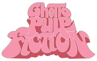
Taking that all into account, it can still be fun, not to mention educational, to play in the styles of other illustrators from time to time. As part of a feature in Black Issues Book Review, art director Warren Bernard commissioned headline type illustrations for two articles. To start all he wanted was something like the old Blacksploitation movie poster type, our point of reference was "Super Fly", cue the Curtis Mayfield theme. I have a book, or two, in my library on Blacksploitation movies, that reproduce the "Super Fly" poster. After a quick letter count, I wanted to see just how close to the original type I could get.
I began with a lot of sketching on tracing paper, and some correcting of letterforms. I wanted to correct any mistakes that may have been in the original type, and avoid my type looking like it was traced. After I had a sketch I liked, I gave the concept some closer examination. I knew that I thought it was a good idea to use the "Super Fly" type verbatim, but did Warren and, most importantly, would the reader. Was this a strong, valid concept, or an inside joke that no one else would get. Warren loved it. We both thought the homage brought with it a feel for the period and put the reader in a mind set that was right for the article. I'm sure the original type was done by hand, and since I was doing this digitally, and suck at doing type by hand, the accuracy of the computer was a big asset. I was able to check and double check the letterforms, and match the colors exactly. Illustrator made doing the outline strokes and smooth curves a breeze.
The client was happy, and I think this worked out well. The concept was strong enough to support the homage. I was able to use my tools to avoid mistakes. Careful craftsmanship makes the work look fresh and considered, not rushed and traced. The strength of the illustration lies in the concept, something that I would be proud to show and claim “ I did this”, it’s not “Wrist” work. A solid editorial piece that makes it’s own statement, not just a rip-off. Lastly, I learned a little about illustrating type, and a lot about what I love in illustration.


