Tuesday, November 09, 2010

Treading the boards


For a while now I've been doing a lot of presentation and proprietary storyboard work. Odd stuff, interesting stuff, speculative in nature, and not always finished. These are bits of the second of a two part project. The nature of the assignment called for finished vector work in three distinct styles. This is the one I had the most fun with. It is reminiscent of old Reader's Digest illustrations in it's rough line and single tone color treatment. I created a few special brushes to work with in Illustrator CS4. (I've since moved on to CS5!) I wanted the style to look rough and coarse as if done on oatmeal paper. We all remember paper, right?


The other snippets are from the other set of storyboards. The style was to be more tech, clear line, and cartoony. We wanted a contrast between the rougher line and the cleaner line. Also contrast in how the overall feel, mood and flow of the boards.
They both were fun to do and took advantage of different features in Illustrator. I wish there would have been time to add color to these, in the vein of "Near Art". We had a bit more time at the start, but the schedule got cramped and one of the designers left half way through the project, so in the end we only completed two of the three.
Anyway the dust has settled on these boards, so it safe to tread.

"Live fast, draw hard."

Tuesday, August 10, 2010

Sunglasses After Dark cover

Gettin' funky with the warp mesh.
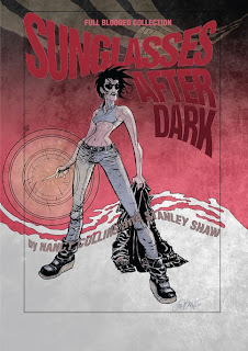
 Hey kids comics! Or at least the cover for one.

Vampires never die. The adaptation of "Sunglasses After Dark" that Nancy Collins (the original author) and I did about 15 years ago will finally be collected and reprinted by IDW in 2011. An exact date has not been set, but the cover is done!

The wheels are in motion, the page art has to be scanned, lettered and colored. I didn't do any of the original series covers, but I did the collection cover.

 Not only has it been 15 years since I drew the character, but for most comic book characters, I'm used to playing off existing art. This time I only had myself to riff on.
My first take on the cover was much more designy, book cover-ish, and minimalist. I wasn't happy with the lack of excitement or interest this cover had.
like some ol' make-up ad!


After that, I went back over my original drawings of Sonja Blue, seeing why I drew her the way I did. I figured I would make some changes, sort of update her a bit, and did a lot of sketches along that line. But the more I drew, the more I realized that over the course of the original mini series Sonja had become fully developed. I didn't need to rethink the character at all. At one point I was even going to change her sunglasses and drew several different pair, but  I wound up using the original (soldering) glasses she had.
"When will you make and end!?!"


"Sunglasses After Dark" has a strong pulp noir feel so I wanted that to come across in the cover.
Once I got on track I did several roughs with a sort of pulp noir paperback look using the exaggerated figure, and low angle, and classic femme fatale stance. As with a lot of my stuff lately it was a complete digital work flow. The pencils were done in Sketchbook Pro, inks in Painter and colors were completed in Photoshop. I added a basic texture background and did my local color over that. My goal was to have an image that was dark but not murky and hard to see. While at the same time had some eye-candy appeal. In the original series Nancy and I wanted Sonja to have Engineer's Boots, this time I made them high-heeled Engineer's boots.
only a few of the roughs done for the illustration!


When the art was finished IDW wanted my input on type treatment, which I was happy to give. I have always had a fondness for the Doc Savage logo type done by Len Leone, which is a classic paperback type treatment that is echoed in tons of covers. So I went with that. I had to restrain myself and keep the warping to a minimum. In the image here colors are roughly chosen, subject to change, but I'm mostly happy with the way it looks. However it still has to pass  few eyeballs before being final. Not sure when that will be, but stay tuned.

Monday, July 26, 2010

Casual Game User Interface


I'm working on a casual game UI piece. I've posted it here temporarily for feedback. Let me know what you think. My usual notes and notes about animation in Flash, with movements done in blue.

Thursday, July 22, 2010

All in a day's work.


So, the top image is some of what I'm doing currently. Pretty normal, but along the way I get to experiment in Painter and I've made a nice "felt tip marker" that could yield some nice results, given more time. As it is I'm cranking on these with more of an eye to showing off the product/setting (basic information) than anything else, plus I have lot more to do by tomorrow. It's interesting, I know some illustrators have an aversion to working digitally and I definitely can see their point. But there are some pluses. One un-obvious thing, I put a piece of Bristol board over my Wacom so it feels like I'm drawing on paper rather than a piece of plastic. It even sounds like drawing on paper, which I love, "scritch, scritch, scritch." Any drawing is good practice. Doing this sort of stuff allows me to turn around things like the Sunglasses cover in short time (about three hours for inks and colors, more on the creation of that cover in my next post ). I don't always want to work at that pace, but it's all in a day's work, and sometimes it's like driving a really nice, fast car.

Thursday, April 15, 2010

Bob Harper Fitness Illustrations on MSN

Earlier this year I worked on a project  doing fitness/exercise illustrations, 21 episodes with at least three images per episode,  for, "Help Yourself in 5 with Bob Harper, sponsored by Planters Nutrition", a site Bob Harper (The Biggest Loser) has on MSN. I was called in at the start of the development phase because of my visual problem solving skills. This was exciting because both my wife and I are gym rats so I would have no problem understanding any of the exercises or finding models! Well that and I was getting paid!

Microsoft's Branded Entertainment Experience Team had sent me a lot of art with the flavor they wanted. They had a rough look for the site and wanted to add illustrations  that were subtle, tasteful with a little flair. In the beginning we were thinking of bright colors and textures. We wanted an almost retro, 50's look to it. Think Jack Lalanne!

I started in on stye tests, working in Illustrator CS because vector art was needed since this was to be used online and on mobile applications.  The first style tests were too light in line weight and to detailed to really work online and definitely on mobile apps. So, we went to a thicker line with simpler filled areas.  See, I have this thing for actually naming illustrations so we had Betty, Veronica, Kate and Lucy to chose from. In the third real style test (I did a ton before sending any to BEET) we felt "Veronica" was the best. However to use color in the arrow and spot that shows what area is benefitting, (sometime overlapping the figure and working in 3-D,)  I made the figure only black and white. Real old school! The spot and arrow colors would be equally old school, faded colors. I felt that an arrow that moved in and around the figure would better show the movement called for in the exercise.
The art director, project manager and head writer felt we had nailed the style so I got the scripts and started on the final illustrations.

I created a brush and set up a format in Illustrator so that all the line weights and scaling would be the same for all roughly 63 drawings. I pulled together my reference, took photos and made changes. Somethings were not safe and some postures weren't straight so I corrected them, just like yer old gym teacher! My sketches were done in Sketchbook Pro and fired off to BEET for approval. From there I finished each one "inking" them in Illustrator, saving out two versions for web and mobile.

"Ironing Man" (using a clothes iron to do bicep curls) made sneaky appearances before the project went live.
I don't spend ALL of my life in front of a computer and I just got word that the site is live on MSN a couple of days ago. Stop by take a look at all the workouts, and let me know what you think. Do an exercise or two and waste five minutes getting fit, and remember it was drawn by some guys sitting on his butt.

Tuesday, March 30, 2010

Tracy Morgan for the Village Voice, Liz Lemon!


This is a different conventional/digital mix than normal for me. Being  that the conventional part was done digitally and the digital part was done conventionally.

Jesus Diaz of the Village Voice asked me to do a straight illustration of Tracy Morgan for the Choices section. Specifically he wanted my airbrush style,  which I perfected (or whatever) years ago working for The Voice, and went on to use it for a lot of other clients (Pierce Transit, Vibe, No Depression, BIBR, Dark Horse Comics,)

Originally I was doing this airbrush style in black and white, later I added color by spraying with Rortring Inks (Arguably the best inks that were on the market. Rumor is, they closed a plant rather than change the formula.)

When I started using a computer, I developed a way to color the black and white airbrush so I had the best of both. Nice B&W art for me, and controlled color art for my clients!

I like this style best in black and white, it just looks cool to me.  My last sprayed color piece was an illustration of author Zadie Smith for Black Issues Book Review. After that I only did B&W, mostly  for No Depression.

Then recently Jesus Diaz asked for that ol' airbrush magic. Time was tight, as usual, and I had only done one successful digital airbrush piece, (my jazz Blue Note Santa!) The sketch was drawn conventionally by hand (as opposed to by foot?) on paper over my light table. I scanned the drawing and completed the illustration in Photoshop CS4, making paths the same way I would cut frisket, okay maybe a bit more anally 'cause I'm like that!  The new rotate feature is very handy. The texture is my own special recipe, actually sprayed by hand! Layers were sandwiched and the illo was sent off. In the rush, I forgot to add color but Jesus did that and it looks great.

Thursday, February 04, 2010

And now for something completely different…Batman Action Figures

I used to do a monthly or twice monthly single panel comic for the DC Comics employee newsletter. That's pretty fun stuff when I think about it. It was my second chance to work with the talented Dean Motter. I got to poke fun at whatever hero from the DC pantheon was in the spotlight at the time. I remember doing Superman, Shade (the Changing Man!) Aquaman, and Martian Manhunter gags. They're all somewhere in a pile of bristol board.  Recently I heard  (yet to be confirmed) that this Batman strip is in  the "Batman Vault: Museum in a Box"!
So, I thought I'd drag it out for show and tell to kick of a few posts that present a completely different side of what I do.

Wednesday, January 06, 2010

Alpha Stanta


From the depths of my hard drive, the original Stanta.