
Showing posts with label concept. Show all posts
Showing posts with label concept. Show all posts
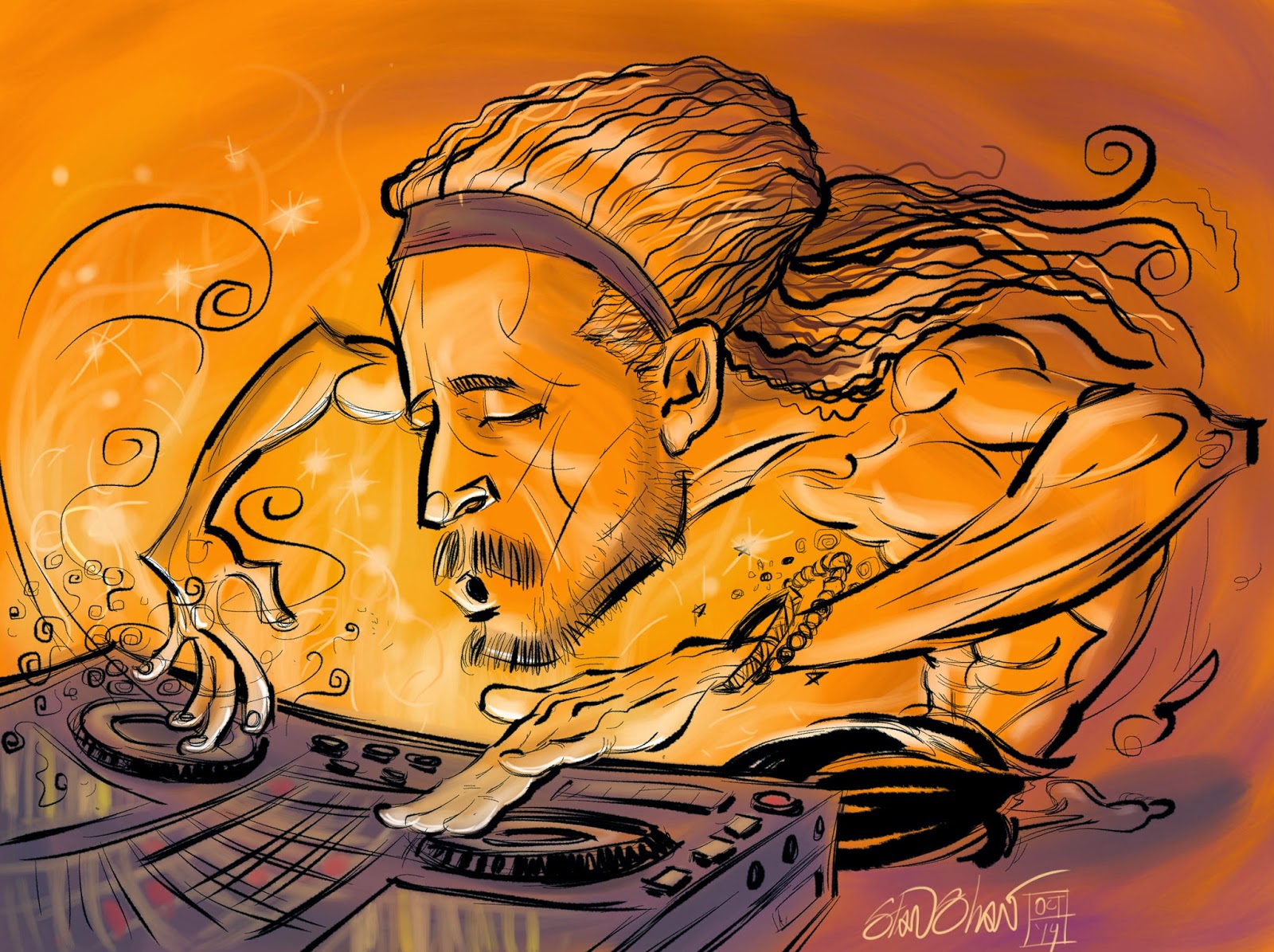
Thursday, October 16, 2014
DJ Drez, drop dat beat!
Tuesday, August 27, 2013
Two Projects
I do not have multiple personalities. But, I do have a wide range of illustration, and each project gets a completely different style and treatment.


In one hand is the re-coloring of Sunglasses After Dark, the vampire mini series I did with Nancy Collins. It will be collected and republished by IDW…as soon as I get done with the colors. I have been coloring (and at times touching up or fixing) the art for a while now. The last issue/part is being done. Lots of moody, mature themed images. Very stylized and sharp. Not to mention it is a vampire story for growed-ass adults. The original series was published, probably, over 15 years ago by Verotic Comics. Now I get to color it since we do not have the colored art. It's kind of something to work with your younger self. I look at the line art and try to remember/understand what I was thinking or trying to do at the time.


In the other hand I completed 10 background illustrations (and character sketches, icon design/creative direction and pre production drawings) for Avistakids. This is a site devoted to helping kids understand how to be energy wise.
The project was to refresh the site and characters while adding learning activities for kids. From the estimate phase on, we were under a rush deadline. In addition to the clients schedule, I was going on a much needed three week vacation to Bali! Avista wanted a somewhat cinematic approach, so we settled on a widescreen format. A really wide screen format, about 5 by 42 inches! It also needed to be fun and bright. There was a set color palette from the existing site and graphics. All of which I was to use as I did the new backgrounds and redesigned the characters, (Wattson, a Scooby-like dog, and Edison,
his human companion).
I went with a sketchy style that would be fun and look fun while allowing for speedier finish. Used a pencil brush that had some texture to it to keep the sketchy vibe. The client really wanted to veer away from too clean of a look, so, I created and added an organic texture to each piece. The backgrounds are layers so they can be animated in a parallax/multiplane fashion as you scroll through them. Which is really cool! This was a key point in the process, the functionality of the backgrounds. I got excited by the process and added more layers to show views through windows and doors that moved, TV and monitors with stuff going on, and objects in the room that could change and move. On one I even aded a rainbow that could be faded in! To strengthen the depth of field, objects were added as a foreground and blurred. Those objects also served as transitions between views when needed. Textures and effects were saved as layers so they would be consistent and easy to add, remove or modify. To lighten the mood and create some magic I added sun rays (or God rays!). I even went as far as creating these or separate layers and different positions so they could be animated as well. It got to be kind of fun to making all the parts. Not all of them are used in the first iteration of the site due to the timeframe the coders were working under. To speed the work sketches and roughs were done in the same file and emailed via Adobe Emailer. It's a plug in that allows you to email directly out of Photoshop. What a time saver, I can send of views of the image as I'm working without any extra hassle of saving, stopping or quitting. The sketch could sometimes be cleaned up and used as finished line art. The same brushes used for Sunglasses After Dark were used to color the backgrounds. Once approved the psd file was uploaded to the agency FTP and downloaded by the coder. The art was then optimized for use. This iso something I wish I had done, since some detail was lost. I think I may have been able to save detail or redraw the art so as to minimize any loss. The results look good though! The goal of making them fun to go through was achieved and the client was happy. Just before I left on vacation, they ordered another background, the basement. That background includes a few Easter Eggs that may be in additional backgrounds! Two of them!

Tuesday, February 07, 2012
2012 February
Isn't it nice when blogs have recent updates?
So, what have I been working on lately (or since June!) well…
Top Secrety Storyboard Stuff: Shhh…trust me it looks cool!
Mogo Charms: Two waves, (a wave being a group of charms.) The charms are for pre-teen/tween-age girls and boys. I did about 12 sets of three. Including a commemorative set for the Royal Wedding. It's the smallest art I've ever done, one quarter inch in diameter! Most people would not know I've done quite a bit of work for the tween-age girl market!


Morty G. Filtercat for Filter Talent: I was brought in to do ideation, character design and assets for Filter's Holiday website, I wound up doing the animations as well. There were nine animations each about 12 seconds long, one for each cat life, and a resurrection animation as well. Plus the cool cat skullz icon. This is the kind of stuff people think I do. Blowin' up cats, tons o'fun!!

Friendly Neighborhood DrawVatar: Worked two events drawing live for Filter! Geekwire Launch Party and the Seattle Interactive Conference. I designed and illustrated the DrawVatar logo, which got me a free lab coat! "Don't forget to tip your illustrator."

Masque of the Red Death: Added color to the black and white version of the story I adapted for Graphic Classics. Also illustrated the back cover. This adaptation was originally in black and white, so I made the black work as red and all the compositions are based on positive and negative space. It was quite a challenge to come back to it and add color, without screwing it up.


The Negro: Two page adaptation of the famous Langston Hughes poem for African American Classics. This was and experiment in completing the art as vector, textures and all. Developed this as an in-class demonstration while I was teaching Design at Pierce College. The challenge was in using this to show off various tools in Illustrator and not have it look all "vectory". I wanted to show my students how to make subtle use of some of the more overlooked and powerful vector tools. I created patterns, imported textures, and adjusted attributes to give the pages a natural African art look and feel.

Fart Proudly: Another adaptation/experiment (!) this time of Benjamin Franklins letter to the Royal Academy of Brussels. Taking into account Franklins wit and sarcasm, this was done as if he had his own daily political comedy show. Again, I was making use of some under appreciated tools in Illustrator. Also showing how carefully setting up a file at the start can make working quick and give the art a cohesive and distinct look. This is to be published in "The Graphic Canon" from Seven Stories Press.


Also started and completed (yeah!) a little experiment, "Trapdoors and Whores" on my Facebook page. It was quite a fun experiment using the methods from my storyboard work. Many thanks to the people who liked it. More on TDAW soon in my next post…really!
Monday, July 26, 2010
Casual Game User Interface

I'm working on a casual game UI piece. I've posted it here temporarily for feedback. Let me know what you think. My usual notes and notes about animation in Flash, with movements done in blue.
Subscribe to:
Posts (Atom)
