Tuesday, October 29, 2013

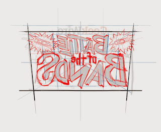
GeekWire Battle of the Bands Graphic


Ready, steady GO!…
One: Up down and straight. Order from chaos.
Two: Trying to remember what I learned from watching Ward Payne and Art Chantry work things out with lettering, while at the same time keeping it loose, with an Silver Age Marvel vibe.

Three: Now we see some things to move around…

Four: Pushing thru, being quick and fast. Hopefully fast enough to keep some of the energy and not fast enough to make a ton of mistakes.

Five: Ooops, Battle is spelled with two Ts!

Six: Vector pieces building the letters.

Seven: Add a few fun things at the request of the Marketing Director…

Eight: A few more fun elements for the designer to play around with and…done!


Thursday, October 10, 2013

Ruston Tunnel Playing Card: The Card went beep beep.

I picked The Ruston Tunnel because it was a fun place in Tacoma, a place you could sound your horn like crazy, because you were supposed too! Driving thru a tiny dark tunnel! What could be more fun? I wanted to make sure the card illustrations worked like playing card illustrations, that you could view/read them  from both sides. No top no bottom.  The Tunnel having two identical ends really lent itself to that. …"beep, beep"

My driving idea was a car, back lit, coming into the dark tunnel sounding it's horn. The light being the center and the words/sounds, "beep, beep",  readable both ways.  I tried adding oncoming headlights. A close runner up was to show both ends of  the tunnel with the road curving  from the dark into the light opening. I thought that was an intriguing idea but a little to gimmicky, forced, "beep, beep".

I went for simplicity in my next rough. Working digitally upsized. I had a lit tunnel entrance with the words readable both ways, "beep, beep(… the car went , beep, beep")
I felt this was on the right track, but somehow lacked the kind of mystery and fun of the tunnel.

I continued on, playing with the tunnel, the light and the words, "beep, beep". Maybe more of a straight ahead signage feel? Naaah. "beep, beep"
This last rough had some of the feel I wanted, the car, backlit with headlights on coming into the dark.

In the end I decided to strip everything away, giving up what I thought would be fun stuff to draw. I think it was Alex Toth that said something about reducing elements to just what is needed to tell the story, then drawing the hell out what is left.

Originally the words were set as type, but they didn't fit with the drawn headlights. So the set type was drawn, then flipped and rotated to make the card work like a card. Both ways, coming and going thru the tunnel…"beep, beep".

Full Color Storyboards: Built for Speed


It's been a few years since this project was completed. A chunk of the frames were lost,  the team has all moved on. Now's a good time to let these surface into the light.

Working fast can have it's advantages. It's great practice and a good way to get familiar with streamlining work-flow and working methods. It frees you from getting bogged down with application tricks and techniques, forcing you to rely solely on basic illustration skills.


These images are part of a project I worked on in December. All secret and copyright protected, so forgive the lack of details, but, there were over 30 images total. Backgrounds and characters were done separately. I was able to devote attention to each. Most anyone who's done backgrounds will tell you its best to think of them as characters. What you put into the backgrounds, how you light, draw and color them, defines their personality. I've found that a well considered background helps define the other characters in the scene. Sort of like saying where they come from.


When it gets to the characters you can really go, they have a rich setting to react to, crammed, stinky cabin, hot dry desert, calm blue stratosphere. And if you've developed the characters fully from the start it's that much easier and fun.


 Technically speaking there were all done this-a-way…
I did a rough breakdown for all 30 plus images in InDesign. Set up a page format containing the frame outline and written notes/script. Then drew the rough concept with the pencil tool. This way I could easily rearrange the frames and add or remove frames and notes. Once that document was approved, each frame pasted into Sketchbook Pro and did a detailed rough for client approval. Finished line art was done in Sketch book Pro and I spit me out a psd file to color in Photoshop.


In P-Shop I set up two brushes, with opacity overrides in the toolbar, and one eraser. I worked with as few layers as possible for speed.  I remember a friend saying, " layers are for pussies." I had a separate layer acting as a palette, so I could use  the eye dropper (accessible by quick key) to swiftly change color. It also allowed me to see how the colors would look in the composition which was useful.


I had a plug-in I installed that allowed me to email directly from P-Shop. So I did that for quickly sending art to client for approval. This again was all part of my putting in place every step of  the way things that smoothed out the work-flow without compromising the quality…too much…hopefully.  In the end the client was happy and I was happy with the look of the art.

Tuesday, August 27, 2013

Two Projects


I do not have multiple personalities. But, I do have a wide range of illustration, and each project gets a completely different style and treatment. 

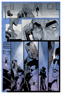
In one hand is the re-coloring of Sunglasses After Dark, the vampire mini series I did with Nancy Collins. It will be collected and republished by IDW…as soon as I get done with the colors. I have been coloring (and at times touching up or fixing) the art for a while now. The last issue/part is being done. Lots of moody, mature themed images. Very stylized and sharp. Not to mention it is a vampire story for growed-ass adults. The original series was published, probably, over 15 years ago by Verotic Comics. Now I get to color it since we do not have the colored art. It's kind of something to work with your younger self. I look at the line art and try to remember/understand what I was thinking or trying to do at the time.


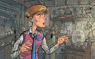
In the other hand I completed 10 background illustrations (and character sketches, icon design/creative direction and pre production drawings) for Avistakids. This is a site devoted to helping kids understand how to be energy wise. 


The project was to refresh the site and characters while adding learning activities for kids. From the estimate phase on, we were under a rush deadline. In addition to the clients schedule, I was going on a much needed three week vacation to Bali! Avista wanted a somewhat cinematic approach, so we settled on a widescreen format. A really wide screen format, about 5 by 42 inches! It also needed to be fun and bright. There was a set color palette from the existing site and graphics. All of which I was to use as I did the new backgrounds and redesigned the characters, (Wattson, a Scooby-like dog, and Edison, 
his human companion). 


I went with a sketchy style that would be fun and look fun while allowing for speedier finish. Used a pencil brush that had some texture to it to keep the sketchy vibe. The client really wanted to veer away from too clean of a look, so, I created and added an organic texture to each piece. The backgrounds are layers so they can be animated in a parallax/multiplane fashion as you scroll through them. Which is really cool! This was a key point in the process, the functionality of the backgrounds. I got excited by the process and added more layers to show views through windows and doors that moved, TV and monitors with stuff going on, and objects in the room that could change and move. On one I even aded a rainbow that could be faded in! To strengthen the depth of field, objects were added as a foreground and blurred. Those objects also served as transitions between views when needed. Textures and effects were saved as layers so they would be consistent and easy to add, remove or modify. To lighten the mood and create some magic I added sun rays (or God rays!). I even went as far as creating these or separate layers and different positions so they could be animated as well. It got to be kind of fun to making all the parts. Not all of them are used in the first iteration of the site due to the timeframe the coders were working under.  To speed the work sketches and roughs were done in the same file and emailed via Adobe Emailer. It's a plug in that allows you to email directly out of Photoshop. What a time saver, I can send of views of the image as I'm working without any extra hassle of saving, stopping or quitting. The sketch could sometimes be cleaned up and used as finished line art. The same brushes used for Sunglasses After Dark were used to color the backgrounds. Once approved the psd file was uploaded to the agency FTP and downloaded by the coder. The art was then optimized for use. This iso something I wish I had done, since some detail was lost. I think I may have been able to save detail or redraw the art so as to minimize any loss. The results look good though! The goal of making them fun to go through was achieved and the client was happy. Just before I left on vacation, they ordered another background, the basement. That background includes a few Easter Eggs that may be in additional backgrounds! Two of them!