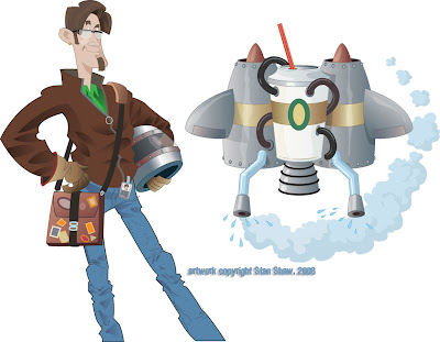
I love illustration, and the research as part of my job. I dig the behind the scenes stuff that sometimes matters more to me than the client or project. I like to think that all the "stuff" adds up to some rich images. Regardless, the entire process is fun-work. This assignmnet is a good example. Scott, an art and marketing director that I have worked with off and on over the years, contacted me with this project. My job was to create visuals for the WSDOT "Reinvent Your Commute" campaign. The illustrations will be used by Pierce Transit and other Washington State transit companies for advertising and promotion, in whatever media, print, transit, billboard, or web, to promote commuting alternatives. The visual concept was open ended. All Scott asked was I work in a style I used for game backgrounds. That was great, the style was vector and if the illustrations were to be as versatile as needed, vector was the way to go. Also, I was to do a type treatment for "Reinvent Your Commute".
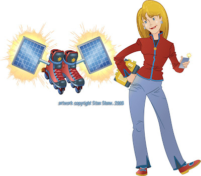
What struck me was how sort of D.I.Y. and "home inventor" the thought of reinventing your commute was. I ran with that idea. My first sketch was of a geeky science type dude standing next to a diagram for a jet pack. Scott liked the idea and we though that each of the illustrations (four that expanded to five) would feature an inventor/commuter and a mode of commuting that would fit their personality. Cool beans! I get to create characters! I always base characters on people I know or know a fair amount about. I helps to get a handle on who I'm drawing (and pinpoint the audience.) It eaier to build a character that rings true with all the little fun touches that make, well, a "Character". How they stand, what they wear, hairstyles, accessories. Even things as small as rings and facial tics, they all ad up. Viewers take it in at a glance and get to "know" the character right away. That's my theory anyway.
So I started with a mode and a general person, then I though of someone I knew who would fit the bill, and fleshed out the character. For instance in the case of the guy with the jet pack, he actually looks like that, he stands that way and used to have a beard like that. Plus, he's the kind of guy that just might build a jet pack. I think he even has a leather Flight Jacket. To my knowledge most character designers will work this way.
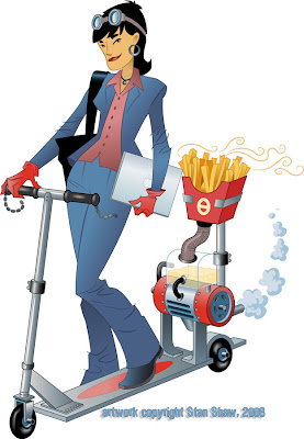
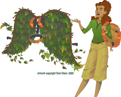
Next was the transport modes! They needed to be wild, fun and easy to read. The original jet pack had way to much detail on it. It started out as just about a full blown antique espresso machine! Most of the first attempts suffered from too much detail. The other problem was coming up with outlandish transports. You have no idea what crazy contraptions some people use to get around! I thought, "robot powered rickshaw, that's unusual." Nope, there is one! There are also several kinds of jet packs. Two of the wildest are a full body roller blade suit (you really have to see it in action!) and a Volkswagen Bug with a Jet engine Booster. It's street legal! I was going to do a solid fuel booster unicycle, but, after those two, how far could I go? So we shifted a bit and made them funny visually.
A really big espresso cup, the battery for the pogo stick is a 9 volt battery on steroids. Extra large fries (because they do make bio diesel scooters.) Go figure! The green wings are the only mode that doesn't have an corresponding real life mode of transportation. Maybe Icarus?
So reinventing your commute is much easier in real life than in illustration, but not near as much fun.
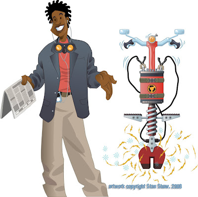

Off to work we go!


1 comment:
Hi Stanley,
I loved reading the back story on your process for these fantastic characters. I had the pleasure of creating more animation for the electronic billboards on I-5 using some of the inventions. They will start running April 1st, so keep your eyes peeled!
Erica (from WSDOT)
Post a Comment