

Showing posts with label Cartooning. Show all posts
Showing posts with label Cartooning. Show all posts
Monday, November 17, 2014
Camper Van Beethoven Reissue Comic
Thursday, October 16, 2014
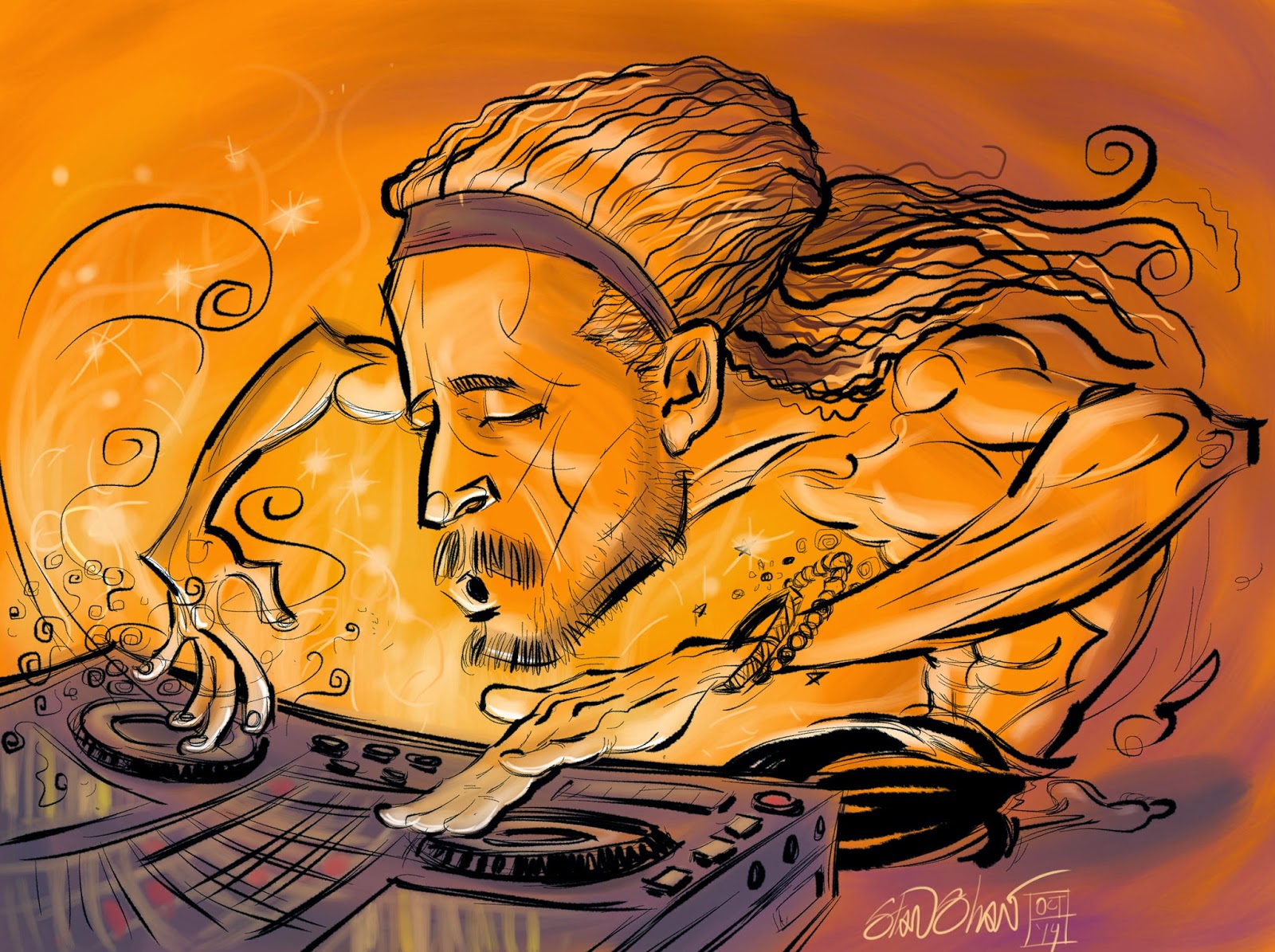
DJ Drez, drop dat beat!
Wednesday, June 29, 2011
On-Model, a philosophy of line
I had a good start for this post but, well… Anyway there are few challenges more exacting for a cartoonist than staying on-model. Sure it's one thing to draw your own character consistently. That's more like getting your own signature right. But staying on-model, whole different thing. It's more than just imitating a style. Often you are tasked with creating art with the character in a new pose or setting, that doesn't yet exist.
I've had the great fortune to work on at least there cool on-model projects. (These illustrations being one.) Cartoony characters are the toughest. You can't hide differences in a field of lines (or "hay" as the old times used to call "hatching".) like you can with comic book characters like Batman, Superman or Hay-Bale Man. There are fewer lines so each misstep is apparently out of line.

There is lots of information on breaking down characters to their basic shapes so you can get a better understanding of them and how they work in 3 dimensional space. But, I think it also helps to understand where the character comes from, it's ancestors, what the original cartoonists were trying to do, and how they worked.

Some things that help keep you on-model are mistakes made early on, short-cuts taken by previous cartoonists and just plain effects from they way they are drawn. Like the character said, "I'm not bad, I'm just drawn that way."

For me staying on model is more about getting into the head of who (years of other cartoonists, a current cartoonist, or a model sheet) and trying to let it flow from there. Like a cartoonist profiler! This goes beyond shapes and form because you want the art to have some life.
 When the drawing is done, it's fun to look at and see a favorite cartoon character, in a new pose or setting that you created and realize you made it from scratch. And it looks like the real thing. At least that's my philosophy.
I've had the great fortune to work on at least there cool on-model projects. (These illustrations being one.) Cartoony characters are the toughest. You can't hide differences in a field of lines (or "hay" as the old times used to call "hatching".) like you can with comic book characters like Batman, Superman or Hay-Bale Man. There are fewer lines so each misstep is apparently out of line.

There is lots of information on breaking down characters to their basic shapes so you can get a better understanding of them and how they work in 3 dimensional space. But, I think it also helps to understand where the character comes from, it's ancestors, what the original cartoonists were trying to do, and how they worked.

Some things that help keep you on-model are mistakes made early on, short-cuts taken by previous cartoonists and just plain effects from they way they are drawn. Like the character said, "I'm not bad, I'm just drawn that way."

For me staying on model is more about getting into the head of who (years of other cartoonists, a current cartoonist, or a model sheet) and trying to let it flow from there. Like a cartoonist profiler! This goes beyond shapes and form because you want the art to have some life.

Friday, January 16, 2009
Reinvent Your Commute

I love illustration, and the research as part of my job. I dig the behind the scenes stuff that sometimes matters more to me than the client or project. I like to think that all the "stuff" adds up to some rich images. Regardless, the entire process is fun-work. This assignmnet is a good example. Scott, an art and marketing director that I have worked with off and on over the years, contacted me with this project. My job was to create visuals for the WSDOT "Reinvent Your Commute" campaign. The illustrations will be used by Pierce Transit and other Washington State transit companies for advertising and promotion, in whatever media, print, transit, billboard, or web, to promote commuting alternatives. The visual concept was open ended. All Scott asked was I work in a style I used for game backgrounds. That was great, the style was vector and if the illustrations were to be as versatile as needed, vector was the way to go. Also, I was to do a type treatment for "Reinvent Your Commute".
What struck me was how sort of D.I.Y. and "home inventor" the thought of reinventing your commute was. I ran with that idea. My first sketch was of a geeky science type dude standing next to a diagram for a jet pack. Scott liked the idea and we though that each of the illustrations (four that expanded to five) would feature an inventor/commuter and a mode of commuting that would fit their personality. Cool beans! I get to create characters! I always base characters on people I know or know a fair amount about. I helps to get a handle on who I'm drawing (and pinpoint the audience.) It eaier to build a character that rings true with all the little fun touches that make, well, a "Character". How they stand, what they wear, hairstyles, accessories. Even things as small as rings and facial tics, they all ad up. Viewers take it in at a glance and get to "know" the character right away. That's my theory anyway.
So I started with a mode and a general person, then I though of someone I knew who would fit the bill, and fleshed out the character. For instance in the case of the guy with the jet pack, he actually looks like that, he stands that way and used to have a beard like that. Plus, he's the kind of guy that just might build a jet pack. I think he even has a leather Flight Jacket. To my knowledge most character designers will work this way.
Next was the transport modes! They needed to be wild, fun and easy to read. The original jet pack had way to much detail on it. It started out as just about a full blown antique espresso machine! Most of the first attempts suffered from too much detail. The other problem was coming up with outlandish transports. You have no idea what crazy contraptions some people use to get around! I thought, "robot powered rickshaw, that's unusual." Nope, there is one! There are also several kinds of jet packs. Two of the wildest are a full body roller blade suit (you really have to see it in action!) and a Volkswagen Bug with a Jet engine Booster. It's street legal! I was going to do a solid fuel booster unicycle, but, after those two, how far could I go? So we shifted a bit and made them funny visually.
A really big espresso cup, the battery for the pogo stick is a 9 volt battery on steroids. Extra large fries (because they do make bio diesel scooters.) Go figure! The green wings are the only mode that doesn't have an corresponding real life mode of transportation. Maybe Icarus?
So reinventing your commute is much easier in real life than in illustration, but not near as much fun.


Off to work we go!
Tuesday, December 02, 2008
Near Art 3 to 6: End of the run
What was planned to be a 12 strip run made it to 6. Enjoy 3 thru 6 here and 1 and 2 in a previous post, then read below for details.


City Arts recently changed editors. When they did, the decision was made to make changes to my strip, Near Art. They cut the pay by two thirds, cut the size by at least half, and let me know that they were not to confident that the continuity was enough for a monthly audience who may, or may not have been, regular readers. But they did like the art! I'm trying to make the best of it. I will continue with the name Near Art (which I did not come up with) doing something else, for less money that takes less time and is not a continuity.
What saddens me most is that the strip was a 12 part romance, a little valentine for my wife, and we only got to part 6. I had thought I was going to rant here about editors making visual decisions and in-decisions, magazines dumbing down, and the devaluation of visual content, but that all reads like whining. (Oddly, a fitting tie to NA #6.) The best thing to do is to complete the strip myself, on my own.
And then sell it!
Live fast, draw hard.
Monday, December 01, 2008
Cool World covers
 I like this cover the best. It was fun to draw the characters in my own style.
  No she's not holding up a building. I think I put something in the street names but I don't remember.
  After hounding my contacts at DC comics, I finally wound up with some work from them. If I remember correctly I had been doing a strip in the DC Comics employee newsletter and had sent off the obligatory second round of inking samples. The Ralph Bakshi film "Cool World" was being released and DC was doing the film adaptation. Film adaptations get a bad rap and rightly so. They are kin to license work and come with a ton of restrictions that are piled on by committee and client, at times making no sense. In this case I was told that I had to avoid likenesses of the actors (Brad Pitt, Gabriel Byrne, Kim Bassinger). I was tasked with inking the film adaptation and doing covers 2 thru 4 of the mini series. Bakshi was doing the first cover. I dutifully inked the adaptation. I was really happy and excited when the editor kicked back my initial cover sketches as not being wild enough. They wanted me to really cut loose and have fun with the covers. So I did. Looking back, I think I went a little too wild but I did do just what I wanted on three covers for a major comic publisher. Weeks later I got my share of the inked pages, finished art is divided between the creative team. All the faces that I inked so the did not look like the actors (as we had been told) had been carefully pasted over and redrawn to look like the actors. It's funny that the method used to patch the art involved cutting a slit in the page art at the throat of each character and sliding in a new piece of paper on which the new head was drawn. They had all been be-headed.
I don't think I have any of the pages I inked but I do have the pre digital covers stashed away somewhere. Every once in a while I come across the covers on line. Small, cool world huh?
Monday, October 27, 2008
Near Art Part 1

I have decided to post the Near Art comics on my blog. If anyone feels like commenting on then please do. I will also be annotating them a bit. I will however refrain from posting the most current strip until after it has run in City Arts magazine. So this will be sort of like the directors cut! So, "Shall we play a game?"
In NA 1 we meet the main players all three in fact. Amanda, Stan and our Protagonist.
Some of the events in the strip are real, no lie. I do remember a panel discussion hosted by Fantagraphics that featured Robert Crumb, Burne Hogarth, and Jamie Hernandez and possibly Gilbert also. There was a party afterword somewhere. Crumb and Hogarth had very opposing views on dealing with editors and what goes into a comic. It was a lively night.
When I use the term Pop Comic, I use it in the same sense as Pop Music. Light frothy, nothing serious. Clean and well produced. I have a lot of influences in this strip but most obvious may be the Rock Hudson/Doris Day kind of romantic comedies I used to watch on afternoon TV. Man, I hope this strip is funny! Another is Serge Clerc. The colors are at this point very clean and bright, but as I get into the strip I find I want to push the limits I have set for myself in service of the story.
I felt the first strip went by to fast, to condensed. So in the next strip I expanded somewhat, to good effect I hope.
Anyway, read, enjoy and let me know what you think.
Tuesday, October 21, 2008
A rose is a rose.

We name everything, from our genitals to our gods. A name helps us deal with the hidden, minor or otherwise hard to explain traits of what we name. Over time I have gotten into the habit of naming illustrations. Particularly any work that requires Character Design. I tend to name them after people I know, have met, or know something about. The name helps me fill in the small bits that flesh out a character, make it fun and give it the undefinable details that, I hope make it a bit special.
 The characters, once named, seem to me to take on life. Ideas for hairstyles, accessories, poses and colors seem to come faster and make more sense. Oddly, even clients react to the names, responding to them like they were real people. In high school people would just stare at characters I drew without names. Now, with names, clients comment, make requests, the floodgates open up.
  Rarely do I pick a person first, then base the character on them. (the exception being when I "cast" a comic book.) However, I do make exceptions, for me very rarely, and sometimes if the client has a special request.
 It's always fun to create a character no matter what the use. These characters were for a McSoft project that I think never saw the light of day. Little avatars that you would be able to dress up like paper dolls and take shopping. Cute huh?
The named characters may reflect a part or perceived part of their namesake, but, as far as making a good illustration goes… "What's in a name? That which we call a rose by any other name would smell as sweet."
Thursday, September 11, 2008
Big Boy Drawing!


I should be here…as in the above pictures, of my relatively new drawing table. It's the Alvin:Ensign or Workcenter, I can't remember which. If you need to know email me. It's a really good table, and thanks to all the illustrators I asked about what table they had. Alvin has been a nice company to deal with. There is one bolt on the left leg/foot that won't thread completely, but DIZZAMN, the table is so heavy that it doesn't matter! The top moves with a hydraulic assist (suh-weeet!). It came to me all the way from Italy. I get romantic about that because I spent three weeks there hanging out in a castle in central Italy, driving an Alfa Romeo. These shots are of my cockpit after we remodeled earlier this Spring. I still get sentimental about my old oka table, sniff. But now I have a big boy drawing table!
By the way, one of my current crushing deadline is another story for Graphic Classics. A 30 page story and I'm turning around three pages per day. That sloshing sound is ME MIGHTY INKING BRUSH!!! Actually, I'm inking it in Painter. Another story I did the same way received a favorable mention from sequart.org
And I proudly quote,
"Moxon's Master", about a robotics experiment gone wrong, is one of the best-looking stories in the book. Stan Shaw's scribbly-yet-elegant line serves the darkness of this story well, but it's not difficult to predict what's coming
Yeah! scribbly yet elegant! That's how me roll! Now it's back to work.
Wednesday, August 06, 2008

Wednesday, May 21, 2008
Near Art Part One
 Whew, the first part of my comic novella is out the door! What a long process it's been. A lot of tweaking, fine tuning, editing, course changing and grumbling from me as I had to be smart and give up on some inside jokes and plot elements that would only make any kind of sense to me. What remains is a better story with a clear plot that gets up and running in no time at all! Twelve pages is not that much to tell a long form story and to keep interest over a month between each is a lot to ask. I've done short comic stories ranging from 5 to 11 pages, and read at once it's a good read.
 Page count and time aside my goal from the start was to do something different, hence a pop love story, confection, eye candy.

Of course I can never leave thing alone so I had to keep dumping in a lot of stuff and the whole thing took on a love story ala Philip K. Dick tone. Which would be nice if, again, I had the space and pages to set things up. We, the editor and I, had hoped to do a strip within a strip, a twist on reality, a mobius strip. See, it even takes a while to set up a bad pun about it!

I started by coming up with my (half baked) idea, then doing thumbnails. Visually driven, I wound up falling in love (no, no pun intended) with some ideas.
Bad cartoonist, no credit line!

Since this is the launch, I don't want to spoil it by giving too much away. The magazine described it as semi-autobiographical. I like to think of what the writer Denny Eichorn once told me. I had been illustration a few of his auto-bio comic stories and I asked him if they were true, he replied, "Well, they're true enough."
Sunday, October 21, 2007
The Flitcraft Prable!


Lets start at the beginning, sort of. The Flicraft Parable is the tale that Sam Spade tells Brigid O'Shaugnessey in "The Maltese falcon" written By Dashiell Hammett. The parable appears in the first part of the Chapter "G on the air" just before Joel Ciaro, Brigid and Spade all meet in Spade's apartment. It's an interesting little tale that appears to have nothing to do with anything, that involves a Charles Fltcraft from Tacoma WA, who vanishes one day on his way to lunch. I won't go into too much about the story other than the more you know about it, Spade and Hammett, the more layers it seems to have. Although the simplest answer is most likely the best.
So, flash forward to a few weeks ago, I was contacted by City Arts magazine to illustrate the parable! Okay, I'll cop (no pun intended) to being a huge Hammett fan, and the fact that we both live/lived in Tacoma is another huge plus. The editor, Jefferey, was more than kind to pay my normal rate and let me expand the tale from 4 pages to 5, plus a cover illustration of Hammett.
So we were of to the races, kind of. My first instinct was to do a slavish adaptation, word for word taking every detail that Hammett put down and drawing that and only that.
Jeffrey, calmly let me know that I may want to really adapt the story. After three wimpy attempts at layouts for the pages, I finally took his advice. Some of the best adaptations are just that, adaptations, taking advantage of what the new medium has to offer and working the story so that you get the basics, the and best. Now I was free! Narration became dialog, Flitcraft became a speaking character, and the sexual…tension between Spade and Brigid became a visual, physical thing. Also the art moved from my wanting it to look old to being new, and having the same tough, noir feel that the book and film have.
My initial layouts sucked!. They gave me a good feel for how the story should break down, but they struck me as uninspired, dull and less than worthy of the story. By un-tethering myself from slavish adaptation, I found ways to express (in the layouts) the tension between the characters and the somewhat surreal nature of a story within a story within a story!
the images above are my tests for art style, inks adjusted and colored in Painter and Photoshop,and my first sucky attempt layouts. Right now I'm changing more narration to dialog and doing more layouts.It's happening fast, I'll do my best to keep the posts coming.
Monday, August 06, 2007
"Out in the West"


These are four pages from a comic book short,"Out in the West" I did for Dark Horse Comics. The art is all black and white airbrush. I wanted it to have a Howard Hawks/John Houston feel to it. There are references to a lot of Western stories, some fiction and some fact in it, which prompted one critic to refer to it as a "Western fairy tale". However the title is a tip of the Stetson to "ElPaso" by Marty Robbins. The other four pages include a page that mirrors the one here of the Sherrif that features a outlaw who is more in the spaghetti western mode. If anyone would like to see the entire story, I'll scan the other four pages and post them. When he saw the rough sketches I was doing for this Chris Warner wanted to title it, "Slap leather!"
Subscribe to:
Posts (Atom)
