

Showing posts with label Art. Show all posts
Showing posts with label Art. Show all posts
Monday, November 17, 2014
Camper Van Beethoven Reissue Comic
Thursday, October 16, 2014
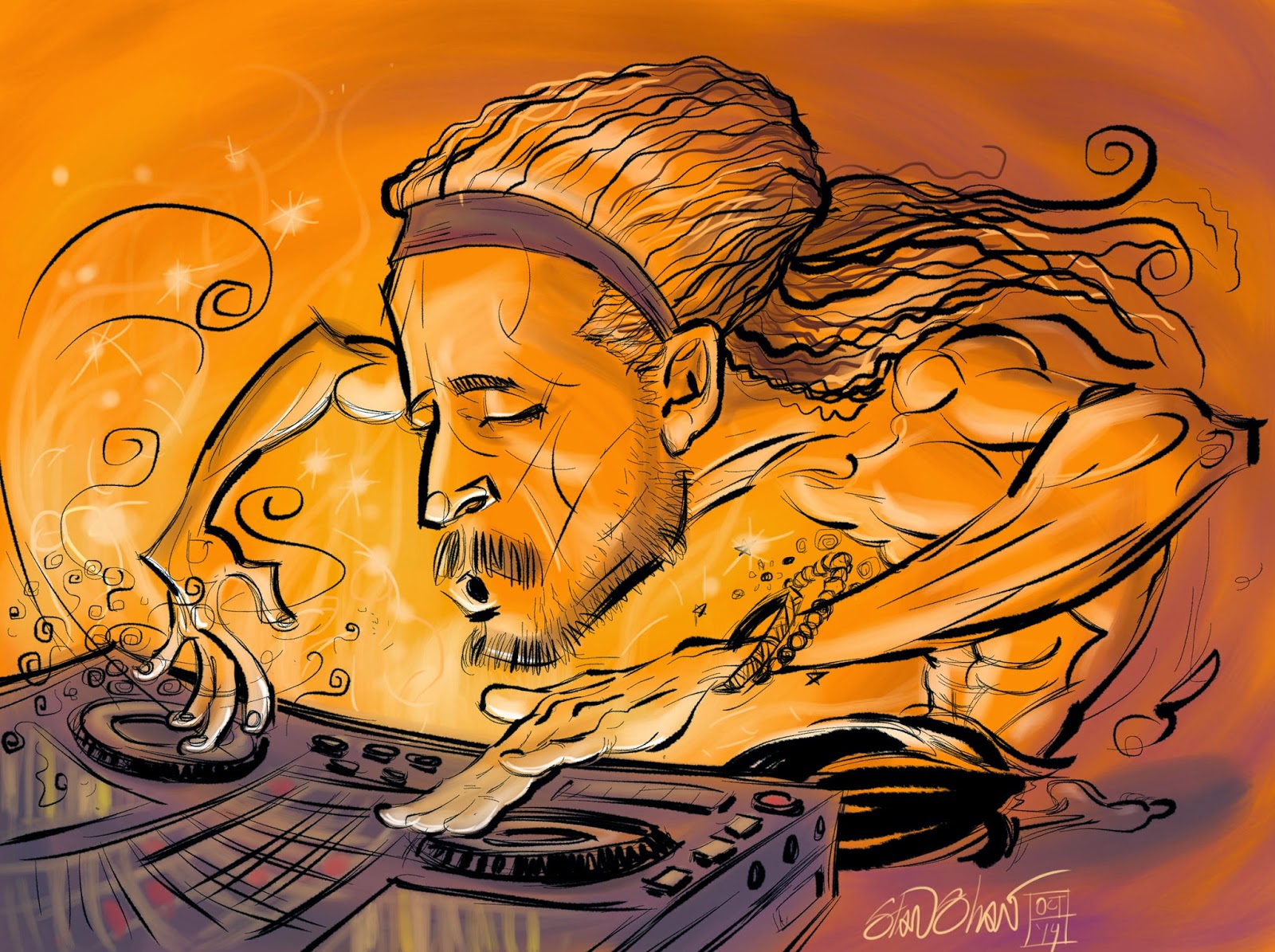
DJ Drez, drop dat beat!
Monday, May 04, 2009
Hey kids Comics! Intro

Like a ton of other comic book artists, I put a lot into my work. Some noticed, some not so much. Seldom do I, or any other comic book artist, get to explain in detail what they do. So, over the next three weeks I'll be posting three comic book projects explaining what and why I did things, panel by panel. That is what this blog is about after all, the what and the why.
The projects are;
A five page adaptation of the famous parable of the falling beam from Dashiell Hammett's The Maltese Falcon, "The Flitcraft Parable" for City Arts magazine,
A four page visual liner note for Camper Van Beethoven reunion album, "That Gum You Like" done for No Depression magazine,
A 9-11 page done for Dark Horse Comics. I haven't looked at this in years myself!
An advertising five pager,"BTS Master" for Pullen Advertising, the client was Anritsu.
And a special surprise, the job I got because Mike Richardson, me and my editor at Dark Horse got mixed up, my eight page Western Fairy Tale, "Out in the West"!
Tell all your friends (and a few enemies)
I have been fortunate enough to be able to experiment on just about every comic book project I've done. Maybe posting about these dissimilar experiments will help me better understand what I'm doing and point to some creative experiments for my next comic book work.
Live fast, draw hard.
Wednesday, December 03, 2008
The Badlands Covers

 I have forgotten most of the story around the top illustration with the vultures, something about Nike. I do remember it being somewhat of a big deal with Willamette Week (or was that just me?). The art director, Katherine Topaz, threw all her trust in me for an illustration that would be both cover and a two page interior illustration. Later, this was the piece that High Country News saw and liked enough to have Kat get me to do a cover for them. One of the few times my work has been a reference for itself. Kind of fun though, sister illustrations.
With the cover for High Country News I again worked with with Katherine Topaz. She's one of my very favorite art directors and a swell designer. I was fortunate enough to work with her through-out most of her art directorial tenure at Willamette Week. Kat is a blast to work with, lots of fun and a risk taker willing to experiment. She also allows illustrators to have input into the overall design and end use of the illustration, taking advantage of the interplay between AD and Illustrator to great effect. This cover was a last attempt Hail Mary Pass for a tough, dry concept (tax revenue from oil drilling used for government services). The client had seen and liked the vulture cover I'd done for Willamette Week. After doing a butt load of thumbnails with way different concepts, in the end we went with something really close, to the vultures cover, that shared style and composition.
Tuesday, December 02, 2008
Near Art 3 to 6: End of the run
What was planned to be a 12 strip run made it to 6. Enjoy 3 thru 6 here and 1 and 2 in a previous post, then read below for details.


City Arts recently changed editors. When they did, the decision was made to make changes to my strip, Near Art. They cut the pay by two thirds, cut the size by at least half, and let me know that they were not to confident that the continuity was enough for a monthly audience who may, or may not have been, regular readers. But they did like the art! I'm trying to make the best of it. I will continue with the name Near Art (which I did not come up with) doing something else, for less money that takes less time and is not a continuity.
What saddens me most is that the strip was a 12 part romance, a little valentine for my wife, and we only got to part 6. I had thought I was going to rant here about editors making visual decisions and in-decisions, magazines dumbing down, and the devaluation of visual content, but that all reads like whining. (Oddly, a fitting tie to NA #6.) The best thing to do is to complete the strip myself, on my own.
And then sell it!
Live fast, draw hard.
Monday, November 03, 2008
Sign of the Times
 This illustration received a nice post on the blog of Jürgen Mantzke, the art director of Lore magazine. This illustration was not used. Rarely do I have an illustration "killed". Of those killed only one other have I liked as much as the second go 'round. More often the two attempts are extremely close in concept. This time however I liked the second attempt which was way different from the first. As you can see.
 Both concepts were sound, the second coming on recommendation from the publisher. It created some interesting creative hurdles. Both illustrations were done in black and white airbrush with color added digitally. It's wild to think that both illustrations were based on the same article, about the same man. That says something about the power and life of an illustration despite the words that it's tied to. A good lesson about something we sometimes think of as conversely subservient or self serving. That, or they could just be pretty pictures.
Monday, October 27, 2008
Near Art Part 1

I have decided to post the Near Art comics on my blog. If anyone feels like commenting on then please do. I will also be annotating them a bit. I will however refrain from posting the most current strip until after it has run in City Arts magazine. So this will be sort of like the directors cut! So, "Shall we play a game?"
In NA 1 we meet the main players all three in fact. Amanda, Stan and our Protagonist.
Some of the events in the strip are real, no lie. I do remember a panel discussion hosted by Fantagraphics that featured Robert Crumb, Burne Hogarth, and Jamie Hernandez and possibly Gilbert also. There was a party afterword somewhere. Crumb and Hogarth had very opposing views on dealing with editors and what goes into a comic. It was a lively night.
When I use the term Pop Comic, I use it in the same sense as Pop Music. Light frothy, nothing serious. Clean and well produced. I have a lot of influences in this strip but most obvious may be the Rock Hudson/Doris Day kind of romantic comedies I used to watch on afternoon TV. Man, I hope this strip is funny! Another is Serge Clerc. The colors are at this point very clean and bright, but as I get into the strip I find I want to push the limits I have set for myself in service of the story.
I felt the first strip went by to fast, to condensed. So in the next strip I expanded somewhat, to good effect I hope.
Anyway, read, enjoy and let me know what you think.
Tuesday, October 21, 2008
A rose is a rose.

We name everything, from our genitals to our gods. A name helps us deal with the hidden, minor or otherwise hard to explain traits of what we name. Over time I have gotten into the habit of naming illustrations. Particularly any work that requires Character Design. I tend to name them after people I know, have met, or know something about. The name helps me fill in the small bits that flesh out a character, make it fun and give it the undefinable details that, I hope make it a bit special.
 The characters, once named, seem to me to take on life. Ideas for hairstyles, accessories, poses and colors seem to come faster and make more sense. Oddly, even clients react to the names, responding to them like they were real people. In high school people would just stare at characters I drew without names. Now, with names, clients comment, make requests, the floodgates open up.
  Rarely do I pick a person first, then base the character on them. (the exception being when I "cast" a comic book.) However, I do make exceptions, for me very rarely, and sometimes if the client has a special request.
 It's always fun to create a character no matter what the use. These characters were for a McSoft project that I think never saw the light of day. Little avatars that you would be able to dress up like paper dolls and take shopping. Cute huh?
The named characters may reflect a part or perceived part of their namesake, but, as far as making a good illustration goes… "What's in a name? That which we call a rose by any other name would smell as sweet."
Thursday, September 11, 2008
Big Boy Drawing!


I should be here…as in the above pictures, of my relatively new drawing table. It's the Alvin:Ensign or Workcenter, I can't remember which. If you need to know email me. It's a really good table, and thanks to all the illustrators I asked about what table they had. Alvin has been a nice company to deal with. There is one bolt on the left leg/foot that won't thread completely, but DIZZAMN, the table is so heavy that it doesn't matter! The top moves with a hydraulic assist (suh-weeet!). It came to me all the way from Italy. I get romantic about that because I spent three weeks there hanging out in a castle in central Italy, driving an Alfa Romeo. These shots are of my cockpit after we remodeled earlier this Spring. I still get sentimental about my old oka table, sniff. But now I have a big boy drawing table!
By the way, one of my current crushing deadline is another story for Graphic Classics. A 30 page story and I'm turning around three pages per day. That sloshing sound is ME MIGHTY INKING BRUSH!!! Actually, I'm inking it in Painter. Another story I did the same way received a favorable mention from sequart.org
And I proudly quote,
"Moxon's Master", about a robotics experiment gone wrong, is one of the best-looking stories in the book. Stan Shaw's scribbly-yet-elegant line serves the darkness of this story well, but it's not difficult to predict what's coming
Yeah! scribbly yet elegant! That's how me roll! Now it's back to work.
Wednesday, August 06, 2008

Monday, August 04, 2008
Top Secret Illustration

Well, this is not a secret illustration, just one of two editorial pieces this week. However this is what it looks like saved as a pdf, with Illy Editing capabilities turned off, out of Illustrator CS3, then selected. Kind cool! Okay back to work.
Live fast, draw hard.
Monday, July 28, 2008
VROOM!!

Today was a good day. I got to sit at my Big Boy drawing table and draw these! Theses are sketches for a web icon, actually more like an animated widget, that I will complete as vector art. Three versions here, with all my little scribbly notes to the designer. Rough work has it's own appeal that the final doesn't.
"live fast, draw hard."
Friday, July 18, 2008
Makin' bank


Things have been busy here. Two houses to work on and one to paint, playing with my new 3000 psi pressure washer!
Meanwhile over at my blog… Right now I'm working on a series of bank illustrations.
Yes me doing illustrations for a financial institution. There are six total. Originally the client wanted to match a painted style with something they would initially use on their new website and possibly later for print/collateral uses. I knew that vector art would work well for web use, and allow for scalability, but how to match, or get close to a painted look/feel for print? Texture and lots of it! I have been slowly building a folder of custom patterns and textures to use in P-shop and Sillly-strator. The one I'm using in this series is something worked up from a scan of one of my airbrush illustrations. I used it like an old stacked screen. (Anyone out there remember those? Buller, Buller…?) the texture is on two layers, one set to normal at about 40 opacity and the other set to multiply at about 20 opacity. And like a stacked screen they're angled to offset. This way the texture builds up a more random look and works over the entire value scale. The shapes are very simple, that's more in keeping with what the client wanted stylistically, but each shape may have the fill and stroke set to different opacities. All in all, the Transparency palette and I are quite friendly now.

The illustrations will be used very small and have the potential to be very big, so I wanted to give the client art that would work at both ends of the scale. Conceptually it's a cake walk, but technically?… there's where the work is.

I also decided to have a common background and cloud motif for all the illustrations. Their previous set did not have much in common at all. I was going to have the background be the same color in all, but the designer thought that might be too repetitive. We'll see how the shape up on the website. Even though I have a Wacom all this was mostly mouse work. Parlor tricks!
 The"In-House-Art Director" really likes these illustrations and says so whenever she passes by my computer, and the client is happy. Well, and so am I. More so with all the technical stuff I was able to do and how I played with texture and transparency.
Thursday, February 01, 2007
Three months at McSoft Part Zero
Thanks.
Subscribe to:
Posts (Atom)
