Tuesday, November 09, 2010

Treading the boards


For a while now I've been doing a lot of presentation and proprietary storyboard work. Odd stuff, interesting stuff, speculative in nature, and not always finished. These are bits of the second of a two part project. The nature of the assignment called for finished vector work in three distinct styles. This is the one I had the most fun with. It is reminiscent of old Reader's Digest illustrations in it's rough line and single tone color treatment. I created a few special brushes to work with in Illustrator CS4. (I've since moved on to CS5!) I wanted the style to look rough and coarse as if done on oatmeal paper. We all remember paper, right?


The other snippets are from the other set of storyboards. The style was to be more tech, clear line, and cartoony. We wanted a contrast between the rougher line and the cleaner line. Also contrast in how the overall feel, mood and flow of the boards.
They both were fun to do and took advantage of different features in Illustrator. I wish there would have been time to add color to these, in the vein of "Near Art". We had a bit more time at the start, but the schedule got cramped and one of the designers left half way through the project, so in the end we only completed two of the three.
Anyway the dust has settled on these boards, so it safe to tread.

"Live fast, draw hard."

Tuesday, August 10, 2010

Sunglasses After Dark cover

Gettin' funky with the warp mesh.
 Hey kids comics! Or at least the cover for one.

Vampires never die. The adaptation of "Sunglasses After Dark" that Nancy Collins (the original author) and I did about 15 years ago will finally be collected and reprinted by IDW in 2011. An exact date has not been set, but the cover is done!

The wheels are in motion, the page art has to be scanned, lettered and colored. I didn't do any of the original series covers, but I did the collection cover.

 Not only has it been 15 years since I drew the character, but for most comic book characters, I'm used to playing off existing art. This time I only had myself to riff on.
My first take on the cover was much more designy, book cover-ish, and minimalist. I wasn't happy with the lack of excitement or interest this cover had.
like some ol' make-up ad!


After that, I went back over my original drawings of Sonja Blue, seeing why I drew her the way I did. I figured I would make some changes, sort of update her a bit, and did a lot of sketches along that line. But the more I drew, the more I realized that over the course of the original mini series Sonja had become fully developed. I didn't need to rethink the character at all. At one point I was even going to change her sunglasses and drew several different pair, but  I wound up using the original (soldering) glasses she had.
"When will you make and end!?!"


"Sunglasses After Dark" has a strong pulp noir feel so I wanted that to come across in the cover.
Once I got on track I did several roughs with a sort of pulp noir paperback look using the exaggerated figure, and low angle, and classic femme fatale stance. As with a lot of my stuff lately it was a complete digital work flow. The pencils were done in Sketchbook Pro, inks in Painter and colors were completed in Photoshop. I added a basic texture background and did my local color over that. My goal was to have an image that was dark but not murky and hard to see. While at the same time had some eye-candy appeal. In the original series Nancy and I wanted Sonja to have Engineer's Boots, this time I made them high-heeled Engineer's boots.
only a few of the roughs done for the illustration!


When the art was finished IDW wanted my input on type treatment, which I was happy to give. I have always had a fondness for the Doc Savage logo type done by Len Leone, which is a classic paperback type treatment that is echoed in tons of covers. So I went with that. I had to restrain myself and keep the warping to a minimum. In the image here colors are roughly chosen, subject to change, but I'm mostly happy with the way it looks. However it still has to pass  few eyeballs before being final. Not sure when that will be, but stay tuned.

Monday, July 26, 2010

Casual Game User Interface


I'm working on a casual game UI piece. I've posted it here temporarily for feedback. Let me know what you think. My usual notes and notes about animation in Flash, with movements done in blue.

Thursday, July 22, 2010

All in a day's work.


So, the top image is some of what I'm doing currently. Pretty normal, but along the way I get to experiment in Painter and I've made a nice "felt tip marker" that could yield some nice results, given more time. As it is I'm cranking on these with more of an eye to showing off the product/setting (basic information) than anything else, plus I have lot more to do by tomorrow. It's interesting, I know some illustrators have an aversion to working digitally and I definitely can see their point. But there are some pluses. One un-obvious thing, I put a piece of Bristol board over my Wacom so it feels like I'm drawing on paper rather than a piece of plastic. It even sounds like drawing on paper, which I love, "scritch, scritch, scritch." Any drawing is good practice. Doing this sort of stuff allows me to turn around things like the Sunglasses cover in short time (about three hours for inks and colors, more on the creation of that cover in my next post ). I don't always want to work at that pace, but it's all in a day's work, and sometimes it's like driving a really nice, fast car.

Thursday, April 15, 2010

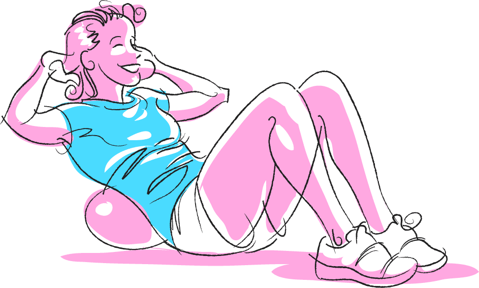
Bob Harper Fitness Illustrations on MSN

Earlier this year I worked on a project  doing fitness/exercise illustrations, 21 episodes with at least three images per episode,  for, "Help Yourself in 5 with Bob Harper, sponsored by Planters Nutrition", a site Bob Harper (The Biggest Loser) has on MSN. I was called in at the start of the development phase because of my visual problem solving skills. This was exciting because both my wife and I are gym rats so I would have no problem understanding any of the exercises or finding models! Well that and I was getting paid!

Microsoft's Branded Entertainment Experience Team had sent me a lot of art with the flavor they wanted. They had a rough look for the site and wanted to add illustrations  that were subtle, tasteful with a little flair. In the beginning we were thinking of bright colors and textures. We wanted an almost retro, 50's look to it. Think Jack Lalanne!

I started in on stye tests, working in Illustrator CS because vector art was needed since this was to be used online and on mobile applications.  The first style tests were too light in line weight and to detailed to really work online and definitely on mobile apps. So, we went to a thicker line with simpler filled areas.  See, I have this thing for actually naming illustrations so we had Betty, Veronica, Kate and Lucy to chose from. In the third real style test (I did a ton before sending any to BEET) we felt "Veronica" was the best. However to use color in the arrow and spot that shows what area is benefitting, (sometime overlapping the figure and working in 3-D,)  I made the figure only black and white. Real old school! The spot and arrow colors would be equally old school, faded colors. I felt that an arrow that moved in and around the figure would better show the movement called for in the exercise.
The art director, project manager and head writer felt we had nailed the style so I got the scripts and started on the final illustrations.

I created a brush and set up a format in Illustrator so that all the line weights and scaling would be the same for all roughly 63 drawings. I pulled together my reference, took photos and made changes. Somethings were not safe and some postures weren't straight so I corrected them, just like yer old gym teacher! My sketches were done in Sketchbook Pro and fired off to BEET for approval. From there I finished each one "inking" them in Illustrator, saving out two versions for web and mobile.

"Ironing Man" (using a clothes iron to do bicep curls) made sneaky appearances before the project went live.
I don't spend ALL of my life in front of a computer and I just got word that the site is live on MSN a couple of days ago. Stop by take a look at all the workouts, and let me know what you think. Do an exercise or two and waste five minutes getting fit, and remember it was drawn by some guys sitting on his butt.

Tuesday, March 30, 2010

Tracy Morgan for the Village Voice, Liz Lemon!


This is a different conventional/digital mix than normal for me. Being  that the conventional part was done digitally and the digital part was done conventionally.

Jesus Diaz of the Village Voice asked me to do a straight illustration of Tracy Morgan for the Choices section. Specifically he wanted my airbrush style,  which I perfected (or whatever) years ago working for The Voice, and went on to use it for a lot of other clients (Pierce Transit, Vibe, No Depression, BIBR, Dark Horse Comics,)

Originally I was doing this airbrush style in black and white, later I added color by spraying with Rortring Inks (Arguably the best inks that were on the market. Rumor is, they closed a plant rather than change the formula.)

When I started using a computer, I developed a way to color the black and white airbrush so I had the best of both. Nice B&W art for me, and controlled color art for my clients!

I like this style best in black and white, it just looks cool to me.  My last sprayed color piece was an illustration of author Zadie Smith for Black Issues Book Review. After that I only did B&W, mostly  for No Depression.

Then recently Jesus Diaz asked for that ol' airbrush magic. Time was tight, as usual, and I had only done one successful digital airbrush piece, (my jazz Blue Note Santa!) The sketch was drawn conventionally by hand (as opposed to by foot?) on paper over my light table. I scanned the drawing and completed the illustration in Photoshop CS4, making paths the same way I would cut frisket, okay maybe a bit more anally 'cause I'm like that!  The new rotate feature is very handy. The texture is my own special recipe, actually sprayed by hand! Layers were sandwiched and the illo was sent off. In the rush, I forgot to add color but Jesus did that and it looks great.

Thursday, February 04, 2010

And now for something completely different…Batman Action Figures

I used to do a monthly or twice monthly single panel comic for the DC Comics employee newsletter. That's pretty fun stuff when I think about it. It was my second chance to work with the talented Dean Motter. I got to poke fun at whatever hero from the DC pantheon was in the spotlight at the time. I remember doing Superman, Shade (the Changing Man!) Aquaman, and Martian Manhunter gags. They're all somewhere in a pile of bristol board.  Recently I heard  (yet to be confirmed) that this Batman strip is in  the "Batman Vault: Museum in a Box"!
So, I thought I'd drag it out for show and tell to kick of a few posts that present a completely different side of what I do.

Wednesday, January 06, 2010

Alpha Stanta


From the depths of my hard drive, the original Stanta. 

Thursday, December 24, 2009

The Stanta Claus, 2009!


Last year because of a typo I made I did a drawing I used as an email signature, "Stanta". Which I can't find. Over the years I have done relatively few Santas. This year I decided to have some fun and do a few more. The first one, above, was a quick run at another email signature image. I had in  mind a photo my old studio partner had of a a New York City cop, dressed as Santa, loading his revolver.

I was not going to do a comic book version, I had done that for the local paper some years ago.

The first Stanta for 2009. Just a quick drawing in Sketchbook pro, that turned into a Sean Connery. The main goal with the Stanta's was to have fun. I wanted to do each in a different style or technique and play around with the look of Santa.
There is Hillbilly Stanta,

 
  Snoop Stanta,
 
and Jazz Stanta

Only got four done. Not bad, each is somewhat of an experiment. I had fun and learned a bit. Hope people got to enjoy them. I think I have a new Holiday tradition.

Wednesday, December 23, 2009

Stanta 1 : Stanta Connery

This didn't start out to look like Sean Connery, but hey, none the worse. I stopped here because I accidentally screwed up the Sketchbook Pro file.

This is just a test: March of The Stantas

This is a sort of live test, but I will be posting all my 2009 Stantas!
Stay tuned!

Tuesday, December 15, 2009

It takes a Village…


It takes a Village to get me back to my blog! I find myself going to the blogs I frequent and seeing no new posts, then I say, "Man, why no new posts!?" Then I realize that I have a few followers who might be saying the same thing. So here we are! I have been working. Most of it has been on secret or proprietary stuff that I can't show, yet.
One project I did, again, Top Secret storyboards. (not in the film sense, more in the business meeting sense.) It was so secret that I didn't know where I was going until the morning of the meeting, no topic, no names until I was on the road. The pay was good and so was the food, as was the location. I drew for 8 hours, with a lunch break, uploaded my files and was done.
Another job was toy presentation art, that's anew one. The toys do not exist and there were no real drawings of them, just sort of "napkin" quality doodles from which I had to create "almost 3-D" drawings.
Then there's training comic book for medical professionals/technicians. I'm inking that in Illustrator. At some point in the project I should post about how I'm inking digitally. I love a real brush, but I have inked several illustrations in Painter, Photoshop, Sketchbook Pro and Illustrator. Each app has it's good and bad points. Which brings me around to The Village…Voice that is. I'm still doing the Robbin's column, so let's roll on the one from last week.
I start in Sketchbook Pro doing a few roughs for concept. I can email from the app or call the Art Director to discuss concepts. The topic for this was a fund scandal involving the city comptroller and Peggy Lipton, "Julie" in the original Mod Squad!
There are/were three major players in the scandal, but they only wanted to focus on two, and I HAD to draw the pose "Link" (Link, Pete and Julie! get up on your Mod Squad!) was in! So…After the rough I move to Painter, where I "ink" the art. I still do love inking conventionally, but I have a thing for what I call "The Impossible Brush." The ink never runs out and you get to Command Z any messed up strokes.
Then, over to Photoshop for the colors. I could color them in Painter, but Photoshop is better and faster at total image manipulation, and I'm used to the interface.
Colors and textures are added and for this an additional mod background and type.
The type was done by "The In-House Art Director" and is in the same style as the Mod Squad opening credits. A soft drop shadow helps it separate from the illustration. The blue-ish color is kind of 2000-ish, and not fitting with the TV show, but I used it to differentiate from the previous weeks illustration.
It's not as "hip" as I wanted. Looking at it now, some oranges and yellows would have been nice. Perhaps a solarized or posterized look. This concept was a straight ahead mash up of what is and what was. (Now that sounds Mod.)
For the NYC Tugboat Strike the concept was more metaphorical. My original idea was to use a version of Tommy the Tugboat, or more like his New York cousin, who's on strike. The AD didn't think there was anything funny in the article so we were going to go with a straight shot of a tug with a strike banner. I though the banner would be too small to read and then had the Eisner-esque idea of putting it in the water.
Whompped it up in Painter with "The Impossible Brush"……and then colorfied in Photoshop.

I'm trying to break myself of the horrible tendency to work zoomed in. You wind up putting in to much detail, making "hay" and wasting time. I like to look at the finish as the file icon in my finder window. I use a reducing glass when I work conventionally.
Just finished this coming week Village Voice illustration, another Bloomberg. I'll eventually post them all here I think. The next project to finish is the comic book inked in Illustrator, that and yet another secret project!

Wednesday, October 21, 2009

Village Voice Illustrations, It's New York time.

One of my first real gigs I got excited about was illustrating for the Village Voice. I was just little ol' me in Tacoma, doing section covers, spots and feature illustration for one of the hippest, toughest, newsweeklies in the country. I learned to work on New York time. It helped that I was fast and worked well in the morning. I did a lot of stuff, airbrush, line art, all really nice black and white. People moved on, design regimes came and went. I stopped illustrating for them but kept in contact. I like to think I got better and faster (and stronger, like the Six Million Dollar Man) Three weeks ago one of the Voice art directors contacted me. It was Thursday afternoon, they had a column (written by long time political reporter Tom Robbins) that needed an illustration. Sketch by Friday, finish by Monday, end of day… New York time. Well, yeah, I did it!
The first illo was of Mayor Bloomberg, "King Mike". The column was about term limits and a possible meeting with Rupert Murdoch. The Voice liked the way I handled the art on The Flitcraft Parable, and wanted the same look. I took the same file and added the new line work. We went with the image of "King Mike" in repose with a NY Post cover urging him to run.

Next illustration was of New York Congressman Nadler, a big, big fella. He was to look friendly, but imposing, not cartoonish or caricatured. There's not much about ACORN in the illustration but they are an important part of the article. We thought subtlety was best.
In contrast to the pre -email days of my first Voice work, these are all done digitally. Sketches and roughs are done in Sketchbook Pro and emailed directly from the app. A very cool feature! The roughs are imported to Painter and inked with brushes I created, then the line art is colored and texture added in Photoshop. Save the whole thing as a jpeg and it's small enough to email!
Man that's fun!


Back to Bloomberg. What took the longest in this image was designing a bag of chips! The design is based on Bloomberg campaign graphics. When I had added the color I thought it was all too much. My "In-House-Art-Director" suggested changing the bag color to white and shifting the type color. Then I knocked back all the other colors and things came into focus. The Illustration had a clear visual priority.
Working on the same Thursday-Monday Schedule (yet to work the weekend on these.) I still did two versions by Monday end of day… New York time.

Monday, September 14, 2009

More Storyboards

Finished yet another storyboard project. Similar to the last, all top secret. I did make good use of Sketchbook Pro. All the line art and roughs were don in Sketchbook Pro, the color was done in Photoshop. I could have done the color in SBP, but the look I wanted was easier to do in P-Shop. At least as far as I know. Sketchbook Pro has some cool features, including a rotate feature that you can do thru the interface or in set increments with a key command. The brushes have been expanded and are customizable. This may all be held over from the previous version but it's all new to me. It's not as fast with straight cutting and pasting and I have yet to find a way to really transform objects. But for basic drawing, it's faster and more responsive (at a speed) than P-Shop or Painter. Now Autodesk can send me a check.

Thursday, August 13, 2009

Storyboards End


The illustrator and teacher Cherry Brown, who along with her husband Dick Brown founded The School of Visual Concepts, once told me to draw something every day.

Storyboards are the wind sprints of illustration. Short, quick, you do a lot and they can be very tiring. However at the end you definitely on. Even though they might not be the best drawing you'll ever do, a little bit of careful attention to each one can have great results for your skills in the end.

Monday, August 03, 2009

Hey Kids, Comics!: The BTS Master

Well now, where I…
This comic was done as a direct mail advertising piece. I've done ad comics in the past (at least two for Microsoft!) and most often they are on the safe side, given what they have to do and the toes that must be avoided. This was born of an ad, the art for which was also used as the cover (shown above). At the time of doing the ad the heroes had no specific relationship, one was just telling the other something about the product, the BTS Master, a device that tests and analyzes cell phone tower transmissions. The characters were done with more attention to the expressions that anything else.
Later it was decided to do more with the comic theme. Originally, the project was a four panel newspaper format comic strip. I was pushing for a two-tiered "Star Hawks" format. That would have been fun. I had convinced the marketing/creative director to let me write it since it was short and I know the format so well. Just then, the project changed. For a reason I can't remember, they decided to make it a five page mailer, and the four panel strip became a five page story! I convinced them to let me flesh out the story without adding to it. I was writing, lettering, coloring and drawing a four panel story in five pages of space!
The cover art was essentially done (see my roughs above, done for the ad illustration). I added title lettering under the helpful eye of The In House Art Director. Then I began the pages.
The story was pretty simple, monster/villain wrecks tower, female lead calls in heroes, they show up and save the day using product X,( hilarity ensues, roll credits). But with the extra space I could really set a nice pace, and have it not feel like an ad.

In page one, top panel we see the monster, Irk, because he's irksome, chomping on a cell tower. I did my research on cell towers believe me! In drawing Irk I kept thinking of the monster in "Nightmare at 20,000 Feet", part monster and part gremlin. A corner-of-the-eye thing, well not so much in the end! He has cooling rods in his back (ouch!) a hammer, which shows he does damage, and feet that allow him to grip and scamper up towers. At the bottom we see Vicki, the female lead. I wanted to have a character that would interest the readers (mostly male, tech, engineer types) and act as a counter to the main hero. I based Vicki on Tina Fey, Geek sex symbol. In the bottom panels she observes Irk and calmly calls in our heroes. A color note; the action starts at night and ends at sunrise. As we all know, monsters and gremlins (and freaks) come out at night. The change in light sets a definite time period and pace for the action. Also, this allowed me to do some subtle color stuff.

Page two introduces our heroes, Doc and his sidekick Volt, and sets up their characters. This would not have been possible without the extra pages/space. This page is a complete luxury. The only essential panel is panel one, which shows the heroes flying in. About the dialog; I read up a bit on the actual technical jargon and from there created super-jargon and tech-speak for Doc and Volt. So, somehow, what they are saying should really make sense. Vicki's dialog reflects the real problems the product is designed to test and solve. In panel two I show Doc as being the cool thoughtful hero while Volt, my favorite, is the hot head, giving off electricity. His dialog is more aggressive. Their costumes riff on the difference between Silver Age heroes and Image era heroes. Doc echos Space Ghost if you look hard. Panel four has more reality than it appears. Volts dialog, the machines in his hands and the rack unit behind him were heavily referenced, and reflect what may really be done and used in a similar situation. Well I mean not if you had a monster on a a tower but just a problem with the tower. The color palette is pretty limited and I feel I did a decent job of restraining myself to a tasteful level. I tried to create a sense of light from a definite source and color.

Page three starts with an unusual beauty shot of the product and our heroes, and goes into a harder ad pitch. All this followed by Volt blasting off to take care of things the old fashioned way! Which is what the product offers a streamlined alternative to. Panels three and four are just a little humor that I thought alleviated the hard sell of the piece and added a bit to the characterization while keeping the story moving right along. Doc is drawn an bit more cartoonish and breaks the panel border to add to the effect. It also lets the reader in by breaking the Fourth Wall.
Page Four takes two panels to develop Irk. He's just a simple, hungry monster with a desire to be his best. Even though Volt took off first in Page Three, Doc is first up and everyone takes note of how well Doc handles the situation using the product. I'm not all that happy with the color on this page. I think the light coming from Irk being zapped should have been the main/stronger light source for everything on the page. I remember struggling with the colors in Irk. In hindsight it seems pretty clear what to do. The grass and concrete texture are made from using a scan of one of my airbrushed illustrations.
Page Five has Doc take a little credit, basking in his superior intellect and promoting the BTS Master even more. You can tell now the sun is rising by the colors in the background. Irk is now more of a cute lil' gremlin. pointing to the happy light-hearted ending. The last panel has dialog the explains what would actually happen, the limits of the product, after it's use. Vicki's dialog shows her relationship with Doc, and Volt's is a double entendré. Both of which I thought would get cut, but didn't.
Clients who use comics often get excited about having a comic book created for them, and about their product. Issues arise when the story and art wind up being less than what is hoped for. This is usually solved when objectives for the comic are made clear up front, and competent, experienced creatives are left to come up with a solid comic book. This client needed a comic that introduced the BTS Master in a fun, quick non technical way, to a comic savvy audience.
In the end everyone was happy.