Thursday, December 24, 2009

The Stanta Claus, 2009!


Last year because of a typo I made I did a drawing I used as an email signature, "Stanta". Which I can't find. Over the years I have done relatively few Santas. This year I decided to have some fun and do a few more. The first one, above, was a quick run at another email signature image. I had in  mind a photo my old studio partner had of a a New York City cop, dressed as Santa, loading his revolver.

I was not going to do a comic book version, I had done that for the local paper some years ago.

The first Stanta for 2009. Just a quick drawing in Sketchbook pro, that turned into a Sean Connery. The main goal with the Stanta's was to have fun. I wanted to do each in a different style or technique and play around with the look of Santa.
There is Hillbilly Stanta,

 
  Snoop Stanta,
 
and Jazz Stanta

Only got four done. Not bad, each is somewhat of an experiment. I had fun and learned a bit. Hope people got to enjoy them. I think I have a new Holiday tradition.

Wednesday, December 23, 2009

Stanta 1 : Stanta Connery

This didn't start out to look like Sean Connery, but hey, none the worse. I stopped here because I accidentally screwed up the Sketchbook Pro file.

This is just a test: March of The Stantas

This is a sort of live test, but I will be posting all my 2009 Stantas!
Stay tuned!

Tuesday, December 15, 2009

It takes a Village…


It takes a Village to get me back to my blog! I find myself going to the blogs I frequent and seeing no new posts, then I say, "Man, why no new posts!?" Then I realize that I have a few followers who might be saying the same thing. So here we are! I have been working. Most of it has been on secret or proprietary stuff that I can't show, yet.
One project I did, again, Top Secret storyboards. (not in the film sense, more in the business meeting sense.) It was so secret that I didn't know where I was going until the morning of the meeting, no topic, no names until I was on the road. The pay was good and so was the food, as was the location. I drew for 8 hours, with a lunch break, uploaded my files and was done.
Another job was toy presentation art, that's anew one. The toys do not exist and there were no real drawings of them, just sort of "napkin" quality doodles from which I had to create "almost 3-D" drawings.
Then there's training comic book for medical professionals/technicians. I'm inking that in Illustrator. At some point in the project I should post about how I'm inking digitally. I love a real brush, but I have inked several illustrations in Painter, Photoshop, Sketchbook Pro and Illustrator. Each app has it's good and bad points. Which brings me around to The Village…Voice that is. I'm still doing the Robbin's column, so let's roll on the one from last week.
I start in Sketchbook Pro doing a few roughs for concept. I can email from the app or call the Art Director to discuss concepts. The topic for this was a fund scandal involving the city comptroller and Peggy Lipton, "Julie" in the original Mod Squad!
There are/were three major players in the scandal, but they only wanted to focus on two, and I HAD to draw the pose "Link" (Link, Pete and Julie! get up on your Mod Squad!) was in! So…After the rough I move to Painter, where I "ink" the art. I still do love inking conventionally, but I have a thing for what I call "The Impossible Brush." The ink never runs out and you get to Command Z any messed up strokes.
Then, over to Photoshop for the colors. I could color them in Painter, but Photoshop is better and faster at total image manipulation, and I'm used to the interface.
Colors and textures are added and for this an additional mod background and type.
The type was done by "The In-House Art Director" and is in the same style as the Mod Squad opening credits. A soft drop shadow helps it separate from the illustration. The blue-ish color is kind of 2000-ish, and not fitting with the TV show, but I used it to differentiate from the previous weeks illustration.
It's not as "hip" as I wanted. Looking at it now, some oranges and yellows would have been nice. Perhaps a solarized or posterized look. This concept was a straight ahead mash up of what is and what was. (Now that sounds Mod.)
For the NYC Tugboat Strike the concept was more metaphorical. My original idea was to use a version of Tommy the Tugboat, or more like his New York cousin, who's on strike. The AD didn't think there was anything funny in the article so we were going to go with a straight shot of a tug with a strike banner. I though the banner would be too small to read and then had the Eisner-esque idea of putting it in the water.
Whompped it up in Painter with "The Impossible Brush"……and then colorfied in Photoshop.

I'm trying to break myself of the horrible tendency to work zoomed in. You wind up putting in to much detail, making "hay" and wasting time. I like to look at the finish as the file icon in my finder window. I use a reducing glass when I work conventionally.
Just finished this coming week Village Voice illustration, another Bloomberg. I'll eventually post them all here I think. The next project to finish is the comic book inked in Illustrator, that and yet another secret project!

Wednesday, October 21, 2009

Village Voice Illustrations, It's New York time.

One of my first real gigs I got excited about was illustrating for the Village Voice. I was just little ol' me in Tacoma, doing section covers, spots and feature illustration for one of the hippest, toughest, newsweeklies in the country. I learned to work on New York time. It helped that I was fast and worked well in the morning. I did a lot of stuff, airbrush, line art, all really nice black and white. People moved on, design regimes came and went. I stopped illustrating for them but kept in contact. I like to think I got better and faster (and stronger, like the Six Million Dollar Man) Three weeks ago one of the Voice art directors contacted me. It was Thursday afternoon, they had a column (written by long time political reporter Tom Robbins) that needed an illustration. Sketch by Friday, finish by Monday, end of day… New York time. Well, yeah, I did it!
The first illo was of Mayor Bloomberg, "King Mike". The column was about term limits and a possible meeting with Rupert Murdoch. The Voice liked the way I handled the art on The Flitcraft Parable, and wanted the same look. I took the same file and added the new line work. We went with the image of "King Mike" in repose with a NY Post cover urging him to run.

Next illustration was of New York Congressman Nadler, a big, big fella. He was to look friendly, but imposing, not cartoonish or caricatured. There's not much about ACORN in the illustration but they are an important part of the article. We thought subtlety was best.
In contrast to the pre -email days of my first Voice work, these are all done digitally. Sketches and roughs are done in Sketchbook Pro and emailed directly from the app. A very cool feature! The roughs are imported to Painter and inked with brushes I created, then the line art is colored and texture added in Photoshop. Save the whole thing as a jpeg and it's small enough to email!
Man that's fun!


Back to Bloomberg. What took the longest in this image was designing a bag of chips! The design is based on Bloomberg campaign graphics. When I had added the color I thought it was all too much. My "In-House-Art-Director" suggested changing the bag color to white and shifting the type color. Then I knocked back all the other colors and things came into focus. The Illustration had a clear visual priority.
Working on the same Thursday-Monday Schedule (yet to work the weekend on these.) I still did two versions by Monday end of day… New York time.

Monday, September 14, 2009

More Storyboards

Finished yet another storyboard project. Similar to the last, all top secret. I did make good use of Sketchbook Pro. All the line art and roughs were don in Sketchbook Pro, the color was done in Photoshop. I could have done the color in SBP, but the look I wanted was easier to do in P-Shop. At least as far as I know. Sketchbook Pro has some cool features, including a rotate feature that you can do thru the interface or in set increments with a key command. The brushes have been expanded and are customizable. This may all be held over from the previous version but it's all new to me. It's not as fast with straight cutting and pasting and I have yet to find a way to really transform objects. But for basic drawing, it's faster and more responsive (at a speed) than P-Shop or Painter. Now Autodesk can send me a check.

Thursday, August 13, 2009

Storyboards End


The illustrator and teacher Cherry Brown, who along with her husband Dick Brown founded The School of Visual Concepts, once told me to draw something every day.

Storyboards are the wind sprints of illustration. Short, quick, you do a lot and they can be very tiring. However at the end you definitely on. Even though they might not be the best drawing you'll ever do, a little bit of careful attention to each one can have great results for your skills in the end.

Monday, August 03, 2009

Hey Kids, Comics!: The BTS Master

Well now, where I…
This comic was done as a direct mail advertising piece. I've done ad comics in the past (at least two for Microsoft!) and most often they are on the safe side, given what they have to do and the toes that must be avoided. This was born of an ad, the art for which was also used as the cover (shown above). At the time of doing the ad the heroes had no specific relationship, one was just telling the other something about the product, the BTS Master, a device that tests and analyzes cell phone tower transmissions. The characters were done with more attention to the expressions that anything else.
Later it was decided to do more with the comic theme. Originally, the project was a four panel newspaper format comic strip. I was pushing for a two-tiered "Star Hawks" format. That would have been fun. I had convinced the marketing/creative director to let me write it since it was short and I know the format so well. Just then, the project changed. For a reason I can't remember, they decided to make it a five page mailer, and the four panel strip became a five page story! I convinced them to let me flesh out the story without adding to it. I was writing, lettering, coloring and drawing a four panel story in five pages of space!
The cover art was essentially done (see my roughs above, done for the ad illustration). I added title lettering under the helpful eye of The In House Art Director. Then I began the pages.
The story was pretty simple, monster/villain wrecks tower, female lead calls in heroes, they show up and save the day using product X,( hilarity ensues, roll credits). But with the extra space I could really set a nice pace, and have it not feel like an ad.

In page one, top panel we see the monster, Irk, because he's irksome, chomping on a cell tower. I did my research on cell towers believe me! In drawing Irk I kept thinking of the monster in "Nightmare at 20,000 Feet", part monster and part gremlin. A corner-of-the-eye thing, well not so much in the end! He has cooling rods in his back (ouch!) a hammer, which shows he does damage, and feet that allow him to grip and scamper up towers. At the bottom we see Vicki, the female lead. I wanted to have a character that would interest the readers (mostly male, tech, engineer types) and act as a counter to the main hero. I based Vicki on Tina Fey, Geek sex symbol. In the bottom panels she observes Irk and calmly calls in our heroes. A color note; the action starts at night and ends at sunrise. As we all know, monsters and gremlins (and freaks) come out at night. The change in light sets a definite time period and pace for the action. Also, this allowed me to do some subtle color stuff.

Page two introduces our heroes, Doc and his sidekick Volt, and sets up their characters. This would not have been possible without the extra pages/space. This page is a complete luxury. The only essential panel is panel one, which shows the heroes flying in. About the dialog; I read up a bit on the actual technical jargon and from there created super-jargon and tech-speak for Doc and Volt. So, somehow, what they are saying should really make sense. Vicki's dialog reflects the real problems the product is designed to test and solve. In panel two I show Doc as being the cool thoughtful hero while Volt, my favorite, is the hot head, giving off electricity. His dialog is more aggressive. Their costumes riff on the difference between Silver Age heroes and Image era heroes. Doc echos Space Ghost if you look hard. Panel four has more reality than it appears. Volts dialog, the machines in his hands and the rack unit behind him were heavily referenced, and reflect what may really be done and used in a similar situation. Well I mean not if you had a monster on a a tower but just a problem with the tower. The color palette is pretty limited and I feel I did a decent job of restraining myself to a tasteful level. I tried to create a sense of light from a definite source and color.

Page three starts with an unusual beauty shot of the product and our heroes, and goes into a harder ad pitch. All this followed by Volt blasting off to take care of things the old fashioned way! Which is what the product offers a streamlined alternative to. Panels three and four are just a little humor that I thought alleviated the hard sell of the piece and added a bit to the characterization while keeping the story moving right along. Doc is drawn an bit more cartoonish and breaks the panel border to add to the effect. It also lets the reader in by breaking the Fourth Wall.
Page Four takes two panels to develop Irk. He's just a simple, hungry monster with a desire to be his best. Even though Volt took off first in Page Three, Doc is first up and everyone takes note of how well Doc handles the situation using the product. I'm not all that happy with the color on this page. I think the light coming from Irk being zapped should have been the main/stronger light source for everything on the page. I remember struggling with the colors in Irk. In hindsight it seems pretty clear what to do. The grass and concrete texture are made from using a scan of one of my airbrushed illustrations.
Page Five has Doc take a little credit, basking in his superior intellect and promoting the BTS Master even more. You can tell now the sun is rising by the colors in the background. Irk is now more of a cute lil' gremlin. pointing to the happy light-hearted ending. The last panel has dialog the explains what would actually happen, the limits of the product, after it's use. Vicki's dialog shows her relationship with Doc, and Volt's is a double entendrƩ. Both of which I thought would get cut, but didn't.
Clients who use comics often get excited about having a comic book created for them, and about their product. Issues arise when the story and art wind up being less than what is hoped for. This is usually solved when objectives for the comic are made clear up front, and competent, experienced creatives are left to come up with a solid comic book. This client needed a comic that introduced the BTS Master in a fun, quick non technical way, to a comic savvy audience.
In the end everyone was happy.

Friday, July 03, 2009

Awards and work.

I just found out today that in addition to winning the SPJ First Place award for Cartoons/Illustration in a magazine, Washington Law and Politics to be exact…
that I also won third place in the same category! I think the above illustration won Third and the one below was First. I'm not sure because I often give the illustrations different names than the article for various reasons, the chief being the articles don't always have names or titles when I get the assignments.

This doesn't explain why I have not posted the reminding parts of "Hey Kids Comics". I have been working for McSoft doing a bazillion presentation storyboards. All top secrety and hush hush stuff! I also completed a Flash animation test for a local game studio. All this has left me wanting to do something different. Single image illos or comics. However I have a gazillion more storyboards to do. So it's back to the drawing board. After July 4th, I'll have a better handle on getting back to "Hey Kids Comics"!

Tuesday, June 16, 2009

Hey Kids, Comics :That Gum You Like

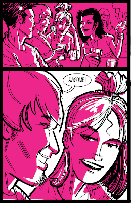
In 2004 Camper Van Beethoven reformed and released "New Roman Times", a key track was "That Gum You Like is Back in Style." One of my first editorial illustrations was for an article in The Rocket, on Camper Van Beethoven. I was assigned that illustration by Grant Alden. Years later, in 2004 to be exact, Grant asked me to do this extended editorial illustration in No Depression for the new CVB release. How could I resist! Grant is one of my favorite, and best art directors working. The trick to this comic piece is how little I wrote! As I recall, I used the CD track titles and notes only, in order! A tribute to how well CVB did in creating a story. We wanted to to do a comic that had a bit of flavor from the old men's magazines of the 40s and 50s. You know, the ones where badgers are ripping the flesh of a guy.


So, a healthy dose of dry brush, aggressive brush work and garish lighting were called for.
The first panel is a movie like double-truck (I love that old term!) From left to right there is; the cabal of evil old Texas Oil-men, our young GI Joe-ish/ Texas Ranger hero, and finally the warring hordes raising their guns to a Hellion in a red dress. All that's missing is the badger! While the colors are my normal garish, (red and yellow) they are muted somewhat. I think that helps the colors to work better when I pull out the more stylized monochromatic palette for effect, as in panels four, five and seven. The brush work is slashy, bold and rough, I was aiming for movement even in the static panels. All the characters are definite types. My favorite in the spread are the Old Texas Men, which I did have reference for!

Panels two and three work as one, a moment in time, divided, our attention split on two characters. In two, the old spy (who's gum that he likes, is back in style) and in three, the jittery bar keeper/informant/contact. I like drawing old men and junkies. This was actually the first image that came to mind when I got this assignment, and of course contains the comic title. It also mimics the top tier of page four, good circular storytelling.

Panel 4 is another dose of Men's pulp art. The monochromatic panels are the most obvious nod to Men's magazine pulp illustrations. The colors and the line-work. I wanted the ink brush lines to sort of have the same feel as the brush strokes in the old illustrations. At times like this I think less of what I'm doing as line-work and more like painting with one color. After that, the color goes on, with the same sort of treatment, with a cohesive textural effect. I hope.

Panel five, the background references riots in I believe LA during the 60s. While I'm working on these I am very particular about what my references are and where they come from. There can and usually are a lot of subtle and hidden connections between the reference and what I'm working towards. In fact I tend to have a large file of reference or scrap while I compose the art. Small subtle details, in my opinion create a richness and connection wit the viewer. It's not always noticed but, I like it, and when it is noticed, well, it's that much better. When the piece is done, there is the somewhat ceremonial trashing of the reference folder. Some of the scrap goes into my file cabinet/morgue, and the rest into the trash. All of it tends to go out of my memory, sadly.

Panel six. I think in this panel the two guys, (spies no doubt!) really look the part of Eastern Bloc spies! I can just see them in some 60's new cinema cold war spy movie. I know I used reference for both of these guys, they were the focus of my attention. And what says R-n-R better than a Eastern Bloc blond in a red dress? Or is she Octobriana in disguise?

Panel seven is another sort of Men's mag spin. If you look close you can see how little there is to the drawing most of the lines radiate to the point of light. That sort of restrained drawing is not something I normally do. It's akin to Dennis the Menace's one line neck.

Panel eight starts to slow things down a bit as we move from the album/discs main characters wild youth to his gradual enlightenment, via drugs! I thought the cactus was a nice mirroring of the characters lost limbs and loneliness. I wanted the spare composition to sort of slow things down and signal a change of pace. Lucky me that it fell just right so that this spread was a very masculine and boxy thing.

Panel nine, like all good last panels is intriguing. I used the same loose brush work but here to give it a more fly away, dreamy feeling. As much of a fly away dreamy feeling as I can create with my stuff! The color in this borrows from panel eight and ads some pink for effect, because they're POPPIES!! You might also see a little Kirby in this panel.

PAGE THREE
Panel one and two, more double spread goodness! This time I work both side to show the split and growth of the character, from soldier to hippie. This is another time when I so loosely use reference it looks like I just made it up, at least to me it does.

Panel three I can remember listening to Eric Clapton as I drew my famous smoke clouds. I should have gotten them out of my system before then! But no, for some reason I always think they're a good idea when I start but later, like now…ugh, not so much!

Panel four worked out well because I get bored sometimes and this was a perfect opportunity to switch up the styles. Notice the Native American influenced sun symbol, and yes, diamonds in the sky!

Panel five actually gave me a hard time. For some reason It was tough getting the image I wanted/needed into the space and having it read visually. It turned out okay enough. I think the best part is the color, which went very quick. It's amazing what I remember after all this time.

Panel six is my shame! This one falls like a clunker! There is not one thing I like about this panel. Most of the time as in panel five there is something I like, something I feel went well. But this one lacks any sort of merit. I'm not sure why it exists the way it does, other than due to my own laziness. Note to clients, avoid lazy artists!
Now that I think of it, I must have been at a low ebb as I was winding this page up. Both the last panels are not that inspiring to me.

However, PAGE FOUR starts with a good panel! Another spread, (Mmmm, gotta love those) Plenty of fun stuff to draw. Crazy old men, a craggy ex-spy and an Invaders type flying saucer! Topped of with better clouds than in panel three on the previous page. I think I obviously had a clear vision of what I was aiming for on this page. It seems to skip the herky jerky creative mess of page three and pick up where the double truck left off. I mean look, I even pick up the hippie theme and gradually disintegrate the figure over the remaining four panels. The lines going dead, images overlapping, breaking panel borders. Going from Captain America to a suicide bomber, all the while keeping it light and happy.

I do like my little graphic, the Peace symbol with "The end is near have fun" written around it. Of course without punctuation it could as well be read "Have fun the end is near." Is the glass half empty or half full.

NEXT WEEK in "Hey Kids, Comics!"…advertising comics, the amazing BTS Master, or how I got away with one long inside joke!

Monday, June 08, 2009

Hey Kids, Comics; 9/11 Page


Shortly after the attack on the World Trade Center, a call went out to cartoonists for art to be used in a benefit/memorial anthology. This was done for Dark Horse Comics' anthology. However, in the rush to secure content, not all the art received saw print. This is one that didn't make the cut. Never found out why.
I sometimes look at things I did and wonder "what was I thinking," and "how did I do that." In this case I remember.
My first attempt/idea was sort of a piece about a guy who gets mistaken for a terrorist. That seemed kind of knee jerk-ish to me and was later pulled off better in an issue of Captain America. Patriotic fervor, now there was something. At the time pride in our country was very high, and things were a bit confusing. So what would be more appropriate than to put that into a page. I have always had the sneaking suspicion that a lot of Americans get the Start Spangled Banner and the Pledge of Alligiance mixed up. I can remember mumbling the archaic terms myself in school and in military Post theaters before the movies started! Very patriotic and at the same time confusing. So, like the former DJ I am, I did a remix.

O' say can you see
I pledge allegiance
to what so proudly we hailed,
from sea to shining sea.

By the republics gleaming,
and over the rockets red glare,
one nation
gave proof,
under God,
and spacious skies,
that the flag ,indivisible,
was still there.

O say does that star spangled banner yet wave,
with brotherhood,
liberty and justice,
o're the land of the free
and home for the brave.

As for the art, the airbrush, black and white is my weapon of choice! I wanted the art to have some emotional weight and gravity, so I used my illustrative style instead of a comic book style.
Each panel is like a stripe on a waving flag, the values alternate like the red and white. Each panel focuses on a segment of American history, a part of history, good or bad, that helps define what America is.
Panel one, like the beginning of the universe, just stars. Also there are 13 stars, one for each colony. They sort of come out of darkness, groping and moving. This was a good set up for me, I feltl it was sufficiently evocative as opposed to being literal.
Panel two is sort of Francis Scott Key, a nod to the influence off the page and the role of creativity in the birth of our nation. Plus it's got bombs bursting in air! I always wondered what that would look like and why they would burst in air. I worked to have the focus of the panels move from left to right, alternating down the page.
Panel three is breaking the chains of slavery, and uniting our country. An important step for a lot of reasons. In this panel I tip my hat to some of the great artists of The Harlem Renaissance, including Aaron Douglass, one of my favorites.
Panel four, a break in the pace and a chance to show how precarious the growth of a nation can be. I placed the flag small in a black field, the same size as the narrative blocks. The remixed copy reflects a turning point. Okay, I know that all this is not in any kind of correct order, but that's part of my point and the fun. America is a real mash-up of people, cultures, races, times and eras.
Panel five sort of brings us to current (at the time!) time frame. Does that banner still wave? Is Uncle Sam there? Yes after 911 he is there, still the superhero/mythical figure he's been since James Montgomery Flagg cemented him in our visual memory. In this shot he appears as he has in tons of comics, sleeves rolled up and ready for action, moving out of the clouds, actually to stage left. This allows me to have sort of static action with Lady Liberty in panel six. Even though there is no motion the composition moves to the right, forward. this allowed me to take some, well, liberties with the figure. My interpretation of Lady Liberty is of her more as a mythical figure than an actual statue.
This was a quick piece. A simple page that reads very very fast. More than most of my other comic book work, this is the closest to an editorial illustration. Looking at it now I still think it holds up. Although I did think of redoing the lettering for this post. But, that would be cheating.
NEXT WEEK on Hey Kids, Comics…Camper Van Beethoven comics! and That Gum You Like!

Sunday, May 31, 2009

Hey Kids, Comics: The Flitcraft Parable!

Well it's comic book time kids! We'll start with a project I was incredibly happy to do and proud to say it's not too shabby. There are things I'd do differently, but that's hindsight for ya! "The Flitcraft Parable" starts on the cover. I always consider the cover part of the story. It works to set a mood and generate the first spark of storytelling magic for the reader.
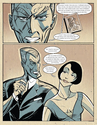
The cover portrait illustration of Hammett was done twice. Like any good Op, Hammett had more than one face. The first likeness I did had much more personal influence on it. I was calling heavily on the fact that Hammett was a private detective. It was a moody, stern-jawed likeness, that evoked him, but didn't look like him. Since the lead article was about Hammett, and more revealing, I thought it would work better to see him how he was. His face had a softness to it that was hidden amongst smooth flat planes that denied detail. The classic photo of him getting of a train shows that, his face is a group of stark black and white planes beneath a wide hat brim. The map came late from the article's writer, Michael Sullivan. It's a map of Tacoma, made during the time that Hammett lived here, showing some of his favorite places. I think it was drawn by Hammett. My initial likeness lived on as the face of Flitcraft himself in my adaption, adding another subtext.
A bit about the layout. I may go into this more with the other posts. But, for Flitcraft I kept it simple. My reason being the audience was not made up of comic book fans, but of non comic book readers. I think the difference is that regular readers have a small set of expectations about comics that they are willing to have broken and expanded upon. Most often it's because a regular reader doesn't expect much from a comic book, the bar is set pretty low. Interestingly enough they seem quite open to different styles of art. Comic Book readers are more sophisticated about comics and what they can do. They expect more, but also seem to hold the comic book to, at times, a more rigid standard of what constitutes a "comic book". I remember a quote from an illustration text book ("Illustration Today" by Robert Ross) that goes something like, " A successful illustrator is one who thinks his way into the minds of individuals." Blah, blah blah. So to illustrate for the regular reader, think like the regular reader. I used an old paper texture to evoke the period. The same with the coloring, which springs from old Readers Digest illustrations. They were often black line work with a couple of process colors roughly cut or drawn. Not quite the same time period, but cheap printing plus cheap paper equals 100% Pulp!


Page one, and right from the start I get to draw Spade and Brigid! Even though there's not a lot of movement, I spent a lot of time on the characters, poses and type to set the mood quickly since I didn't have very many pages. Brigid is based on a photo of a secretary that Hammett was supposed to have had an affair with, and may have based the novel version of Brigid on. The clothes are authentic, from a vintage Sear's catalog. In the first panel I had a lot to establish quickly. I did a few passes at this page, but it was the wonderfully freeing advice of the editor to change things if I had to, that put me on the right path! In the novel Spade and Brigid are not staged this way. I made the leap to position them in a sexually playful way, that's a bit antagonistic. It also made a nice pyramid structure that helped the type. The type is a modern font that echos an older style, the way I hope the art does. I had the help of a wonderful designer Colleen Gray (the "In House Art Director") and the input of my good friend designer Jesse Reyes.
I gave the word balloons a squared off tail to make them different from American comics and something a bit special. The tails are like some of my favorite European comics. I figured the audience would be open to that. The last two panels immediately take us into the first level of flashback.


More authenticity on the second page with housewife style dress and the Davenport Hotel in Spokane. The hotel had been remodeled recently and their website is full of great images of the lobby and front desk. Here I used my original take on Hammett as the character design for Flitcraft. The second panel shot of Flitcraft is based on a photo of Hammett. The visual theme of the "beam" starts in the last two panels. First, I used the beam shape to focus light on Flitcraft's eyes, like in old films. Then I used it to set the light and shadow in the background of the same panel. Again, the beam appears in the last panel as a silhouette, like Flitcraft himself. I was hoping the silhouetting would tie the two together, like fate had. Get the hip waders 'cause it's gettin' deep!


Page three goes into the flashback within a flashback! I took the liberty of having Flitcraft tell his own story. That's the reason for the wonky structure. I stepped into a different color scheme and the art is a much more symbolic and illustrative. Panel one is a bank building (The Washington Building) that was being constructed around the time Hammett was living in Tacoma. If memory serves me, it had the dubious distinction of being part of some big swindle that halted construction and caused a national scandal. It was in the right place at the right time to drop a beam near Flitcraft. Panel two, I thought the beam acted like a bolt of lightning (from God?) so my beam hits the ground bending and crumpling, transforming to a lightning bolt like shape. I gave the bolt and Flit the "jitters" like Horror type. Panels four to eight we see as well as read how his life and thought begin to crowd him, forcing a new direction. Relief come in the expanded ninth panel, his face a clear, blank slate.
Panel ten, all the other possible lives, chances and changes represented by beams. The scar is prominent on this page as a marker for the character, like Johnny Quests hair, a good strong visual cue.


Page four ends the flashback and works to get us back to the story proper. In panel one I wanted to show how Flitcraft was shaken and separate from his fellows on the street. I showed this with a thick rough key line around his figure. Somewhat like the blank slate he think he could become, his face is basic and stripped bare. In panel two he talks about ordering his life. Somehow that made me think that all he had done and accomplished was by the hard work of his hands, in a metaphorical way. So I separated him (his face) from his hands. The narrative box also is the middle in the three panel descent, so that in panel three, when things are calmer, the narrative box is at the bottom of the panel, creating a nice progression that really connects all three. Panels 4 and 5 work to bring us back to the first level by a shift in color, and the change of Flitcraft and the identifying scar. Panel 6 we see Flitcraft/Hammett talking to Spade. The angle is on Spade so as to make a smooth transition to…


Page five, panel one. A close up of Spade similar to Page one panel three that took us into the flashback. The "photo" of Flitcraft is again taken from the photo of Hammett same as page two, panel two was. About Spade, he is described as looking "rather like a pleasant blonde Satan". I work to get the characters set and stay on model but this last page is the better Spade.
The bottom panel is a nice half page that mirrors the start of the adaptation.
I try to make (at least for now) circular stories, where the beginning and the end echo each other. Here we have Spade and Brigid in a pyramidal composition similar to the first panel of page one. The body language is less aggressive, and adversarial but more playful and cozy. He did tell her a nice story after all.
I like the adaptation. I think of it as "Noir", and as such, I felt for a while I should have used more black shapes and areas to create a darker feel. But now I'm happier with tone that comes across emotionally without the trope of a lot of inky blackness.
NEXT WEEK in Hey Kids, Comics!…911 single page comic for Dark Horse Comics!

Monday, May 04, 2009

Hey kids Comics! Intro


Like a ton of other comic book artists, I put a lot into my work. Some noticed, some not so much. Seldom do I, or any other comic book artist, get to explain in detail what they do. So, over the next three weeks I'll be posting three comic book projects explaining what and why I did things, panel by panel. That is what this blog is about after all, the what and the why.

The projects are;

A five page adaptation of the famous parable of the falling beam from Dashiell Hammett's The Maltese Falcon, "The Flitcraft Parable" for City Arts magazine,

A four page visual liner note for Camper Van Beethoven reunion album, "That Gum You Like" done for No Depression magazine,

A 9-11 page done for Dark Horse Comics. I haven't looked at this in years myself!

An advertising five pager,"BTS Master" for Pullen Advertising, the client was Anritsu.

And a special surprise, the job I got because Mike Richardson, me and my editor at Dark Horse got mixed up, my eight page Western Fairy Tale, "Out in the West"!

Tell all your friends (and a few enemies)

I have been fortunate enough to be able to experiment on just about every comic book project I've done. Maybe posting about these dissimilar experiments will help me better understand what I'm doing and point to some creative experiments for my next comic book work.
Live fast, draw hard.

Friday, March 20, 2009

Flash ads

This is a sample banner ad done in Flash.
The movement is not as smooth as in Flash player.


This is a another sample banner ad done in Flash.
The movement is not as smooth as in Flash player.


Sunday, March 15, 2009

Octavia Butler


This illustration of author Octavia Butler was done for Black Issues Book Review a while back. I'm posting this and sending out positive vibes in hope that it results in something…really good.

Friday, January 16, 2009

Reinvent Your Commute


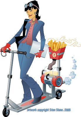
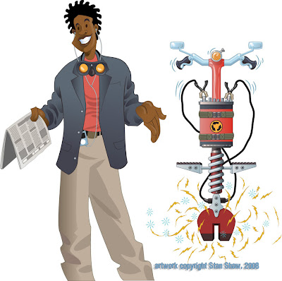
I love illustration, and the research as part of my job. I dig the behind the scenes stuff that sometimes matters more to me than the client or project. I like to think that all the "stuff" adds up to some rich images. Regardless, the entire process is fun-work. This assignmnet is a good example. Scott, an art and marketing director that I have worked with off and on over the years, contacted me with this project. My job was to create visuals for the WSDOT "Reinvent Your Commute" campaign. The illustrations will be used by Pierce Transit and other Washington State transit companies for advertising and promotion, in whatever media, print, transit, billboard, or web, to promote commuting alternatives. The visual concept was open ended. All Scott asked was I work in a style I used for game backgrounds. That was great, the style was vector and if the illustrations were to be as versatile as needed, vector was the way to go. Also, I was to do a type treatment for "Reinvent Your Commute".
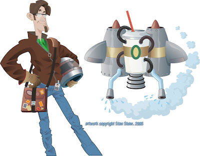
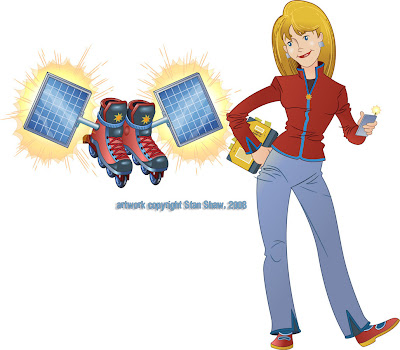
What struck me was how sort of D.I.Y. and "home inventor" the thought of reinventing your commute was. I ran with that idea. My first sketch was of a geeky science type dude standing next to a diagram for a jet pack. Scott liked the idea and we though that each of the illustrations (four that expanded to five) would feature an inventor/commuter and a mode of commuting that would fit their personality. Cool beans! I get to create characters! I always base characters on people I know or know a fair amount about. I helps to get a handle on who I'm drawing (and pinpoint the audience.) It eaier to build a character that rings true with all the little fun touches that make, well, a "Character". How they stand, what they wear, hairstyles, accessories. Even things as small as rings and facial tics, they all ad up. Viewers take it in at a glance and get to "know" the character right away. That's my theory anyway.
So I started with a mode and a general person, then I though of someone I knew who would fit the bill, and fleshed out the character. For instance in the case of the guy with the jet pack, he actually looks like that, he stands that way and used to have a beard like that. Plus, he's the kind of guy that just might build a jet pack. I think he even has a leather Flight Jacket. To my knowledge most character designers will work this way.
Next was the transport modes! They needed to be wild, fun and easy to read. The original jet pack had way to much detail on it. It started out as just about a full blown antique espresso machine! Most of the first attempts suffered from too much detail. The other problem was coming up with outlandish transports. You have no idea what crazy contraptions some people use to get around! I thought, "robot powered rickshaw, that's unusual." Nope, there is one! There are also several kinds of jet packs. Two of the wildest are a full body roller blade suit (you really have to see it in action!) and a Volkswagen Bug with a Jet engine Booster. It's street legal! I was going to do a solid fuel booster unicycle, but, after those two, how far could I go? So we shifted a bit and made them funny visually.
A really big espresso cup, the battery for the pogo stick is a 9 volt battery on steroids. Extra large fries (because they do make bio diesel scooters.) Go figure! The green wings are the only mode that doesn't have an corresponding real life mode of transportation. Maybe Icarus?
So reinventing your commute is much easier in real life than in illustration, but not near as much fun.


Off to work we go!